- 5 0 T H A N N I V E R S A R Y -
T H E A P O L L O M I S S I O N
|
To say I was excited about this project for Space Coast Tourism would be an understatement. The 50th anniversary of NASA’s Apollo moon mission was looming and a national campaign was needed to promote the events that would follow and to celebrate such a historic human achievement.
L O G O D E S I G N // I L L U S T R A T I O N // M O T I O N G R A P H I C S
- 1 9 6 9 -
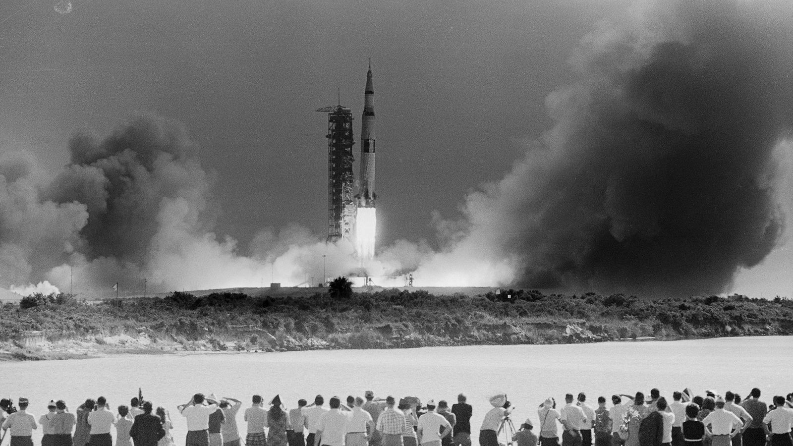
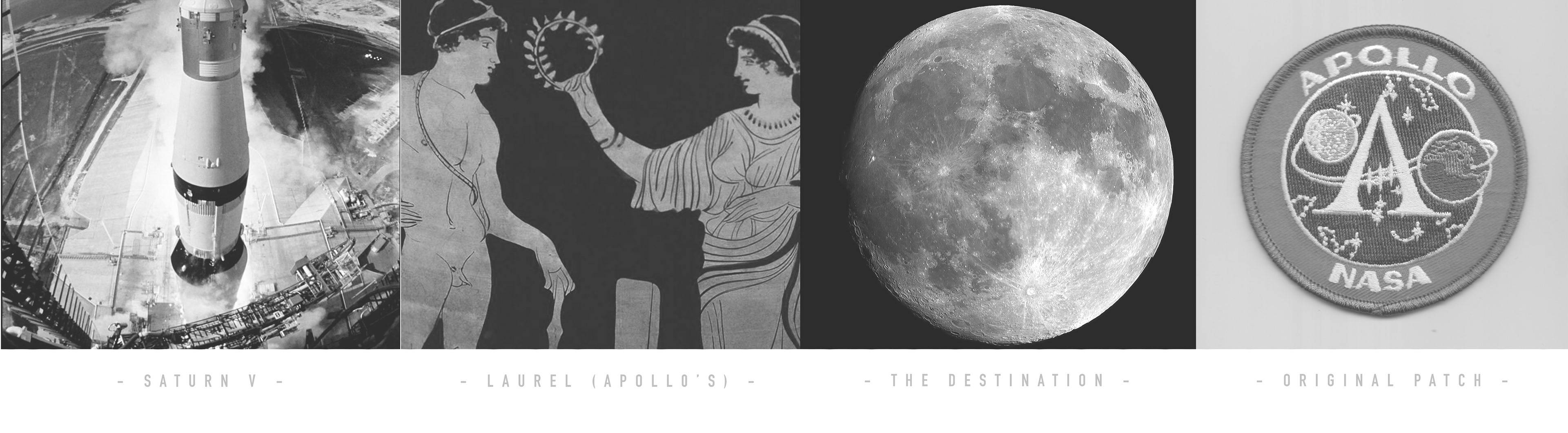
T H E H I S T O R Y
|
After fifty years, the Apollo mission has accumulated so much iconic imagery and documentation. The research and study behind this project was so fascinating that it took me down a road of pure interest and curiosity - so much so that I completed a Master Class in space exploration and aeronautics in order to better understand what I was designing. I wanted to pay my true respects to the feat of the mission itself….it also just sounded cool.
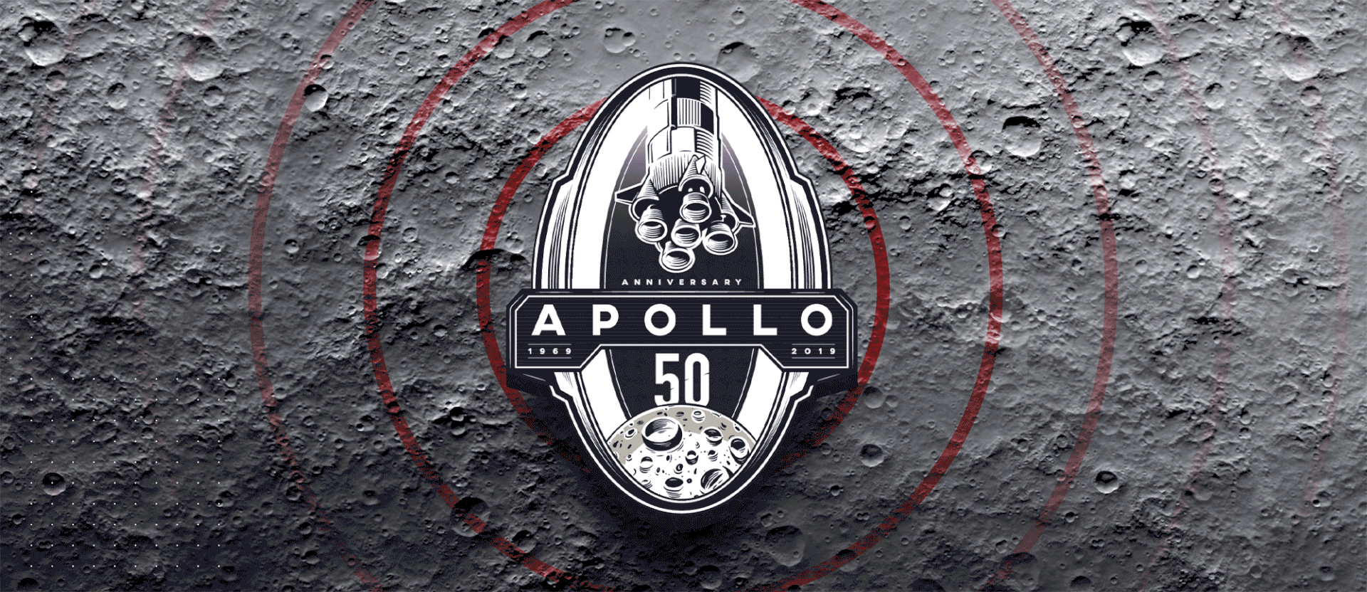
- A P O L L O 5 0 -
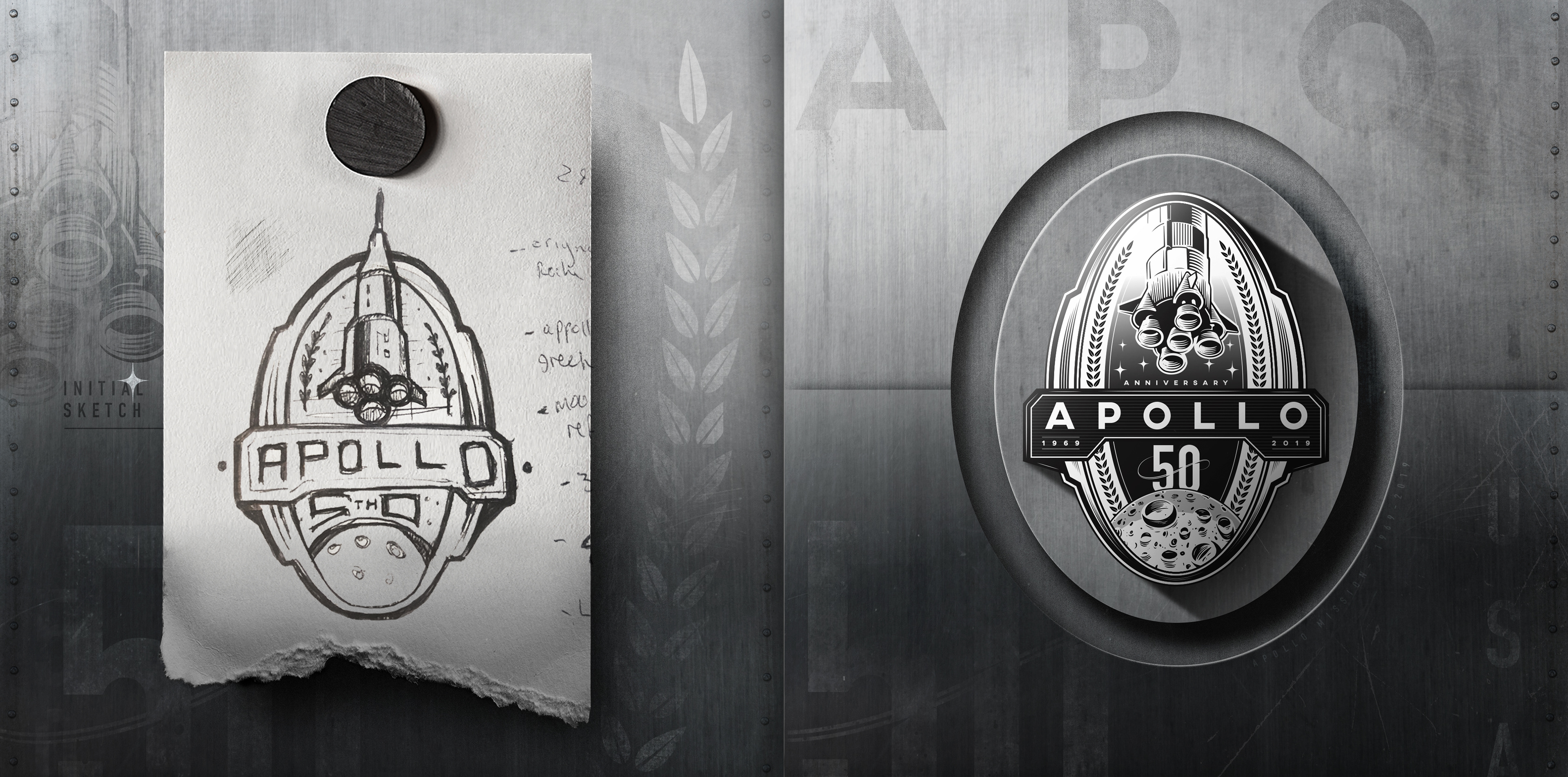
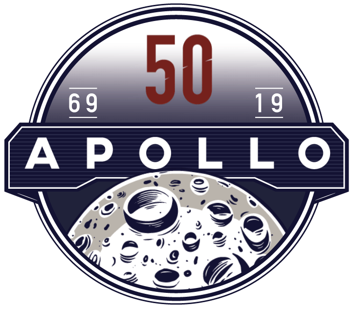
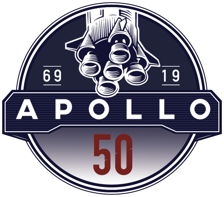
T H E L O G O
- A P O L L O 5 0 -
T H E L O G O
|
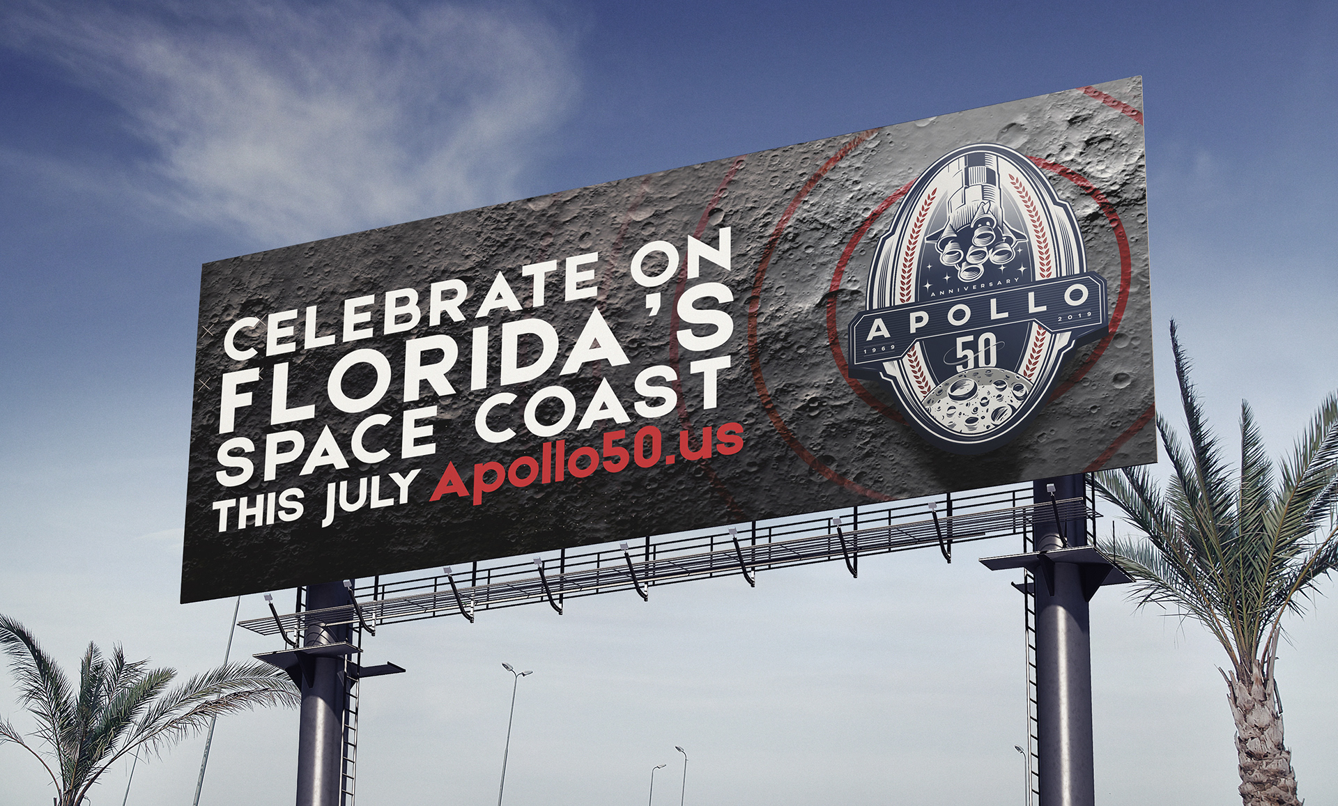
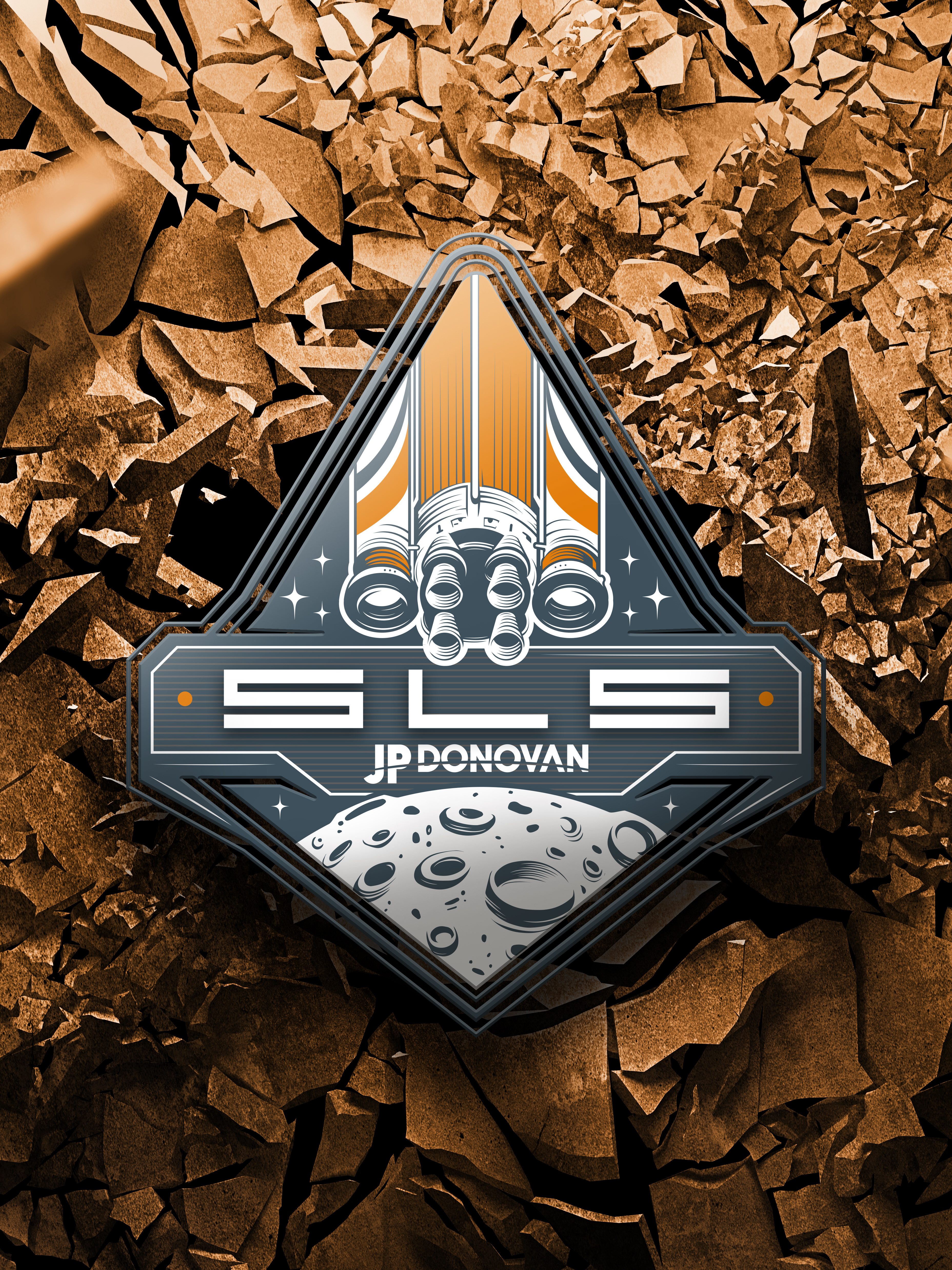
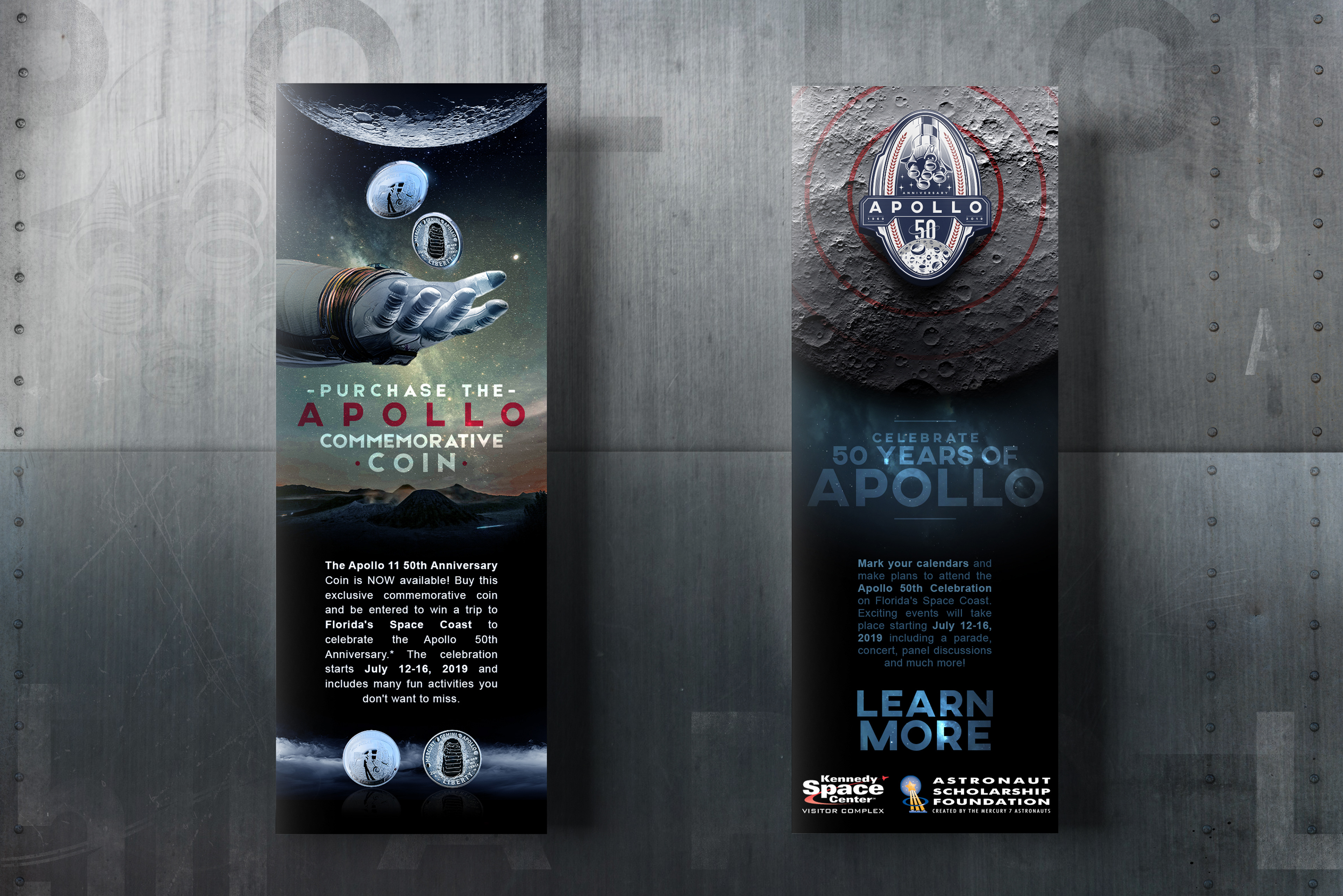
I wanted the logo to include as many aspects and details of the mission as possible. There were four main components that I wanted to refer to: the rocket, the destination, the name, and NASA’s original 1969 logo patch. I also wanted to honor the three astronauts aboard the Saturn V rocket by having three stars on each side of the logo. I hand drew the most prominent components with a focus of making it look like the mission patch as much as possible.
- A P O L L O 5 0 -
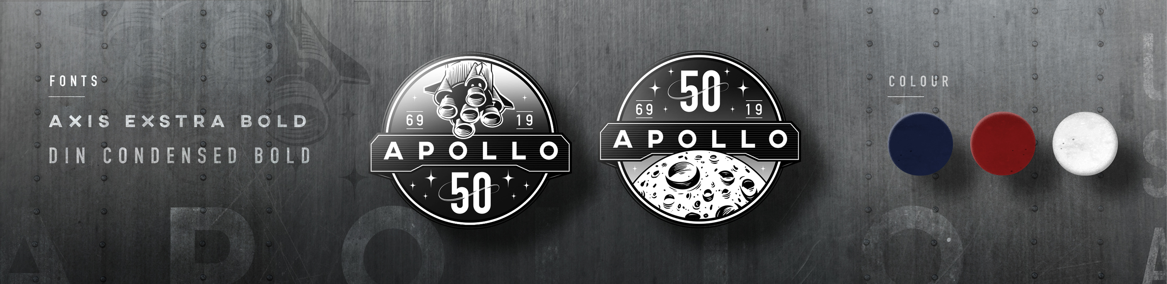
M I S S I O N P A T C H E S
|
Given the popularity of gifs on Instagram and other social media platforms, the logo was turned into an animated graphic. Since the main logo had a lot of detail, I wanted there to be additional versions suitable for Instagram Stories that focused on the two main assets within.
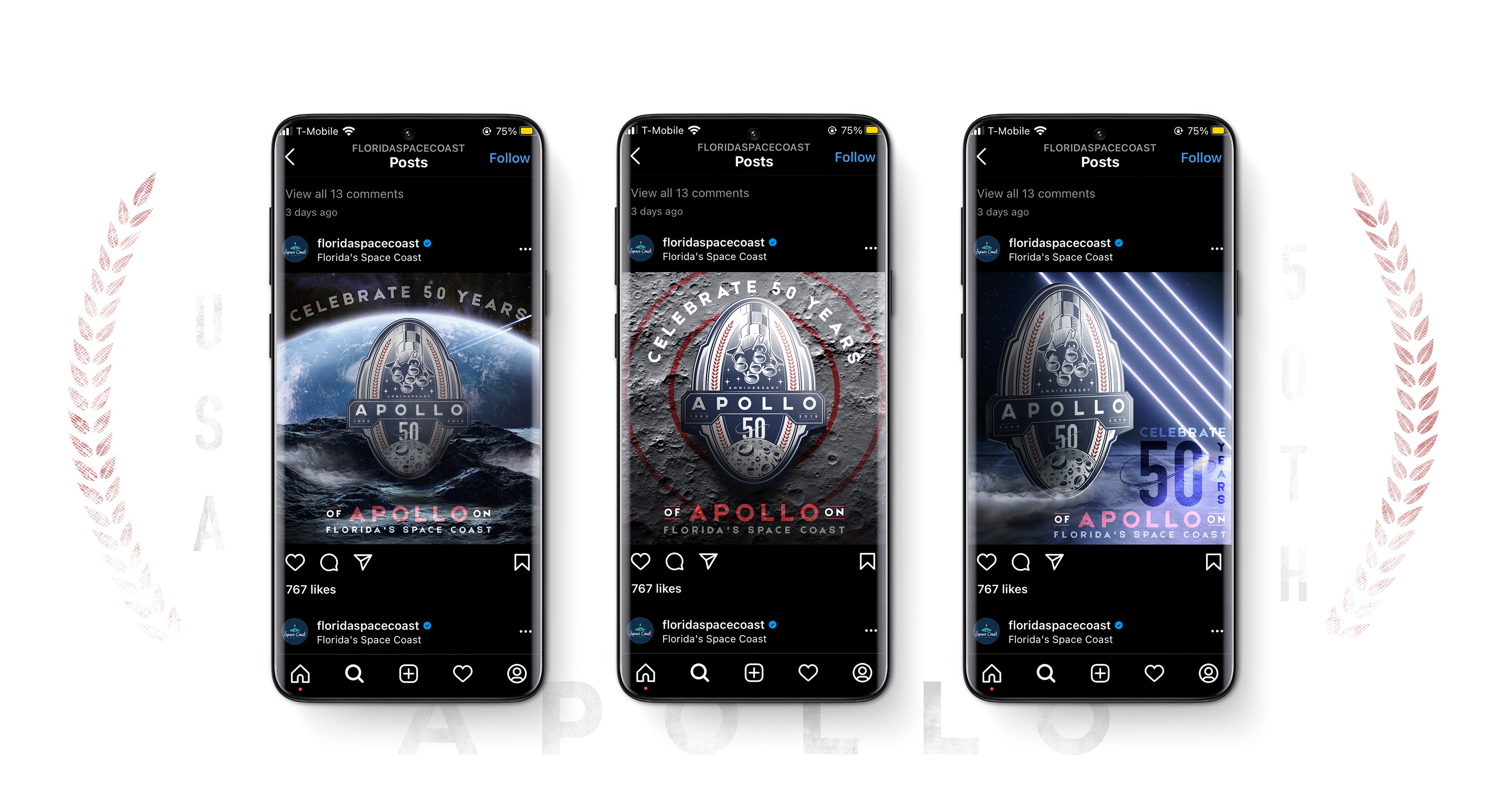
- A P O L L O 5 0 -
S O C I A L M E D I A P O S T S
- A P O L L O 5 0 -
E M A I L S
- A P O L L O 5 0 -
B I L L B O A R D