- C O L O M B I A ' S F I N E S T -
S U P E R B I A C O F F E E
|
Born from the illustrious and fruitful mountains of Colombia comes Superbia Coffee. With a proclamation of “Colombia’s finest” must come a brand strategy that matches and supports such status amongst its many competitors. It was a challenge and a great pleasure to create a brand from the ground up that has such texture, multimedia, craftsmanship, and heart. And it was an honor to translate that into what would become an award-winning multi-platform campaign.
L O G O D E S I G N // I L L U S T R A T I O N // P A C K A G E D E S I G N // W E B D E S I G N
- C O L O M B I A ' S F I N E S T -
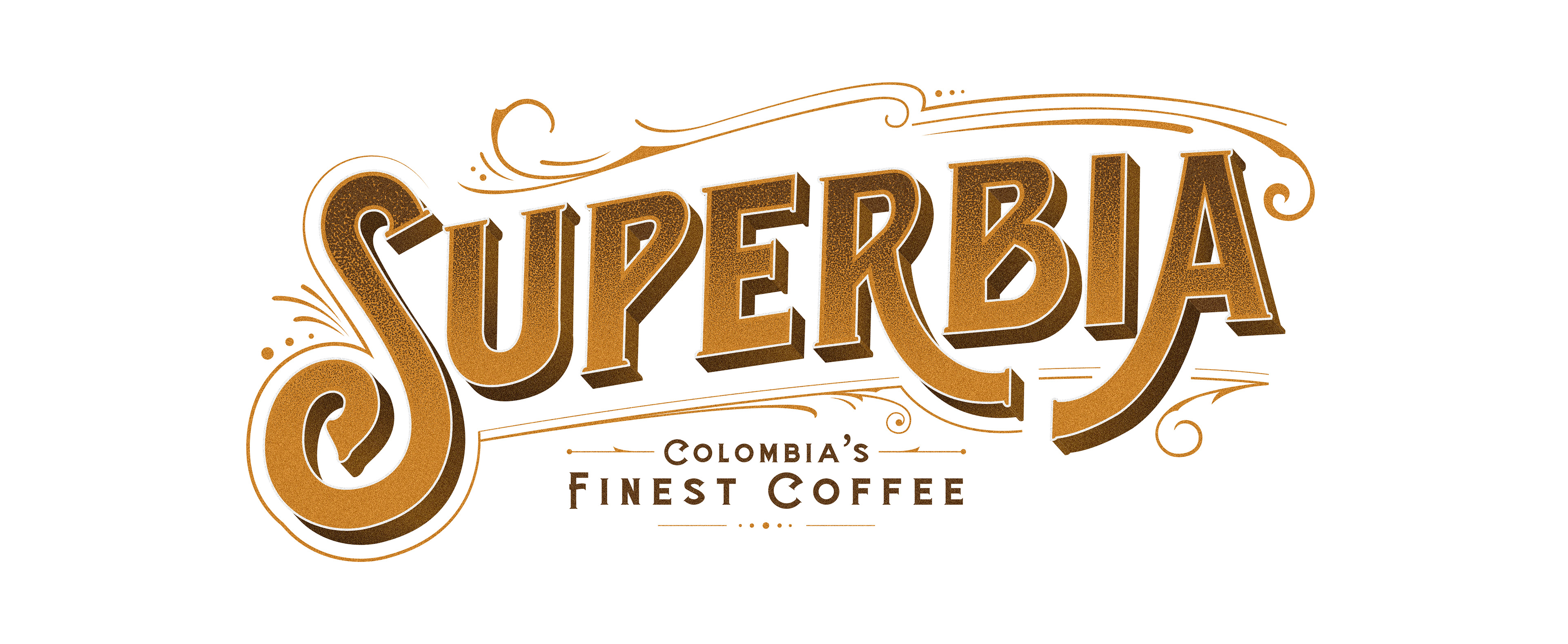
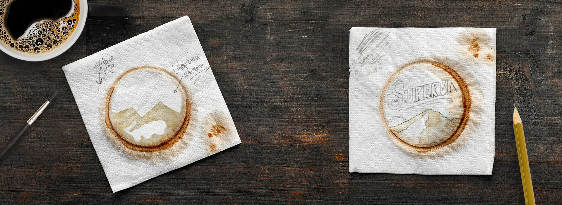
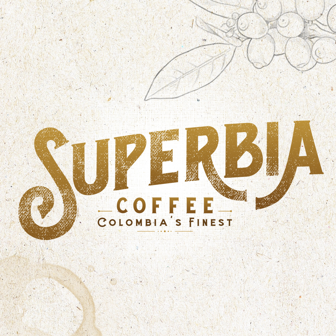
T H E L O G O
|
For a process as attentive as harvesting and crafting coffee, I wanted a logo that spoke to that level of care and detail; a logo that could visually illustrate the craft and heritage of such a trade. A custom word mark was created that depicted the warmth and history of the product and its origin. It’s able to stand alone, titular and strong, but also adapt to be a part of much more.
After experimenting on napkins with real coffee and a paintbrush, a landscape was created that would sit beneath the word mark. As the actual meaning of the word “Superbia” is pride, it only seemed fitting that it would serve as a crown amongst the mountains of Colombia, standing above its competition.
- T H E L O G O -
- C O L O M B I A ' S F I N E S T -
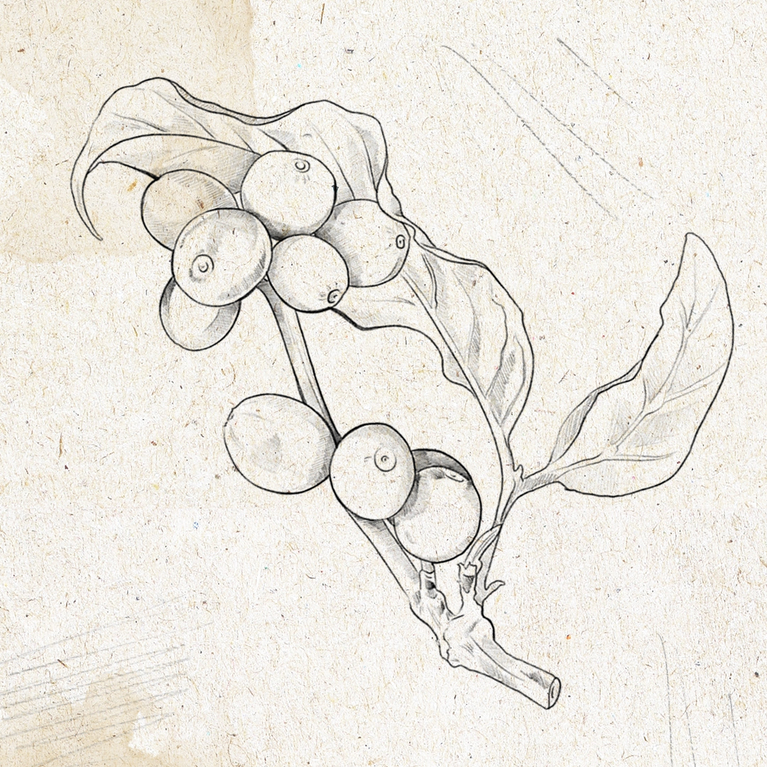
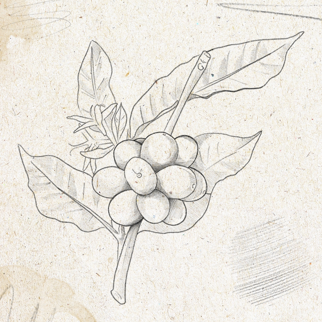
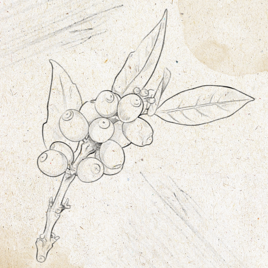
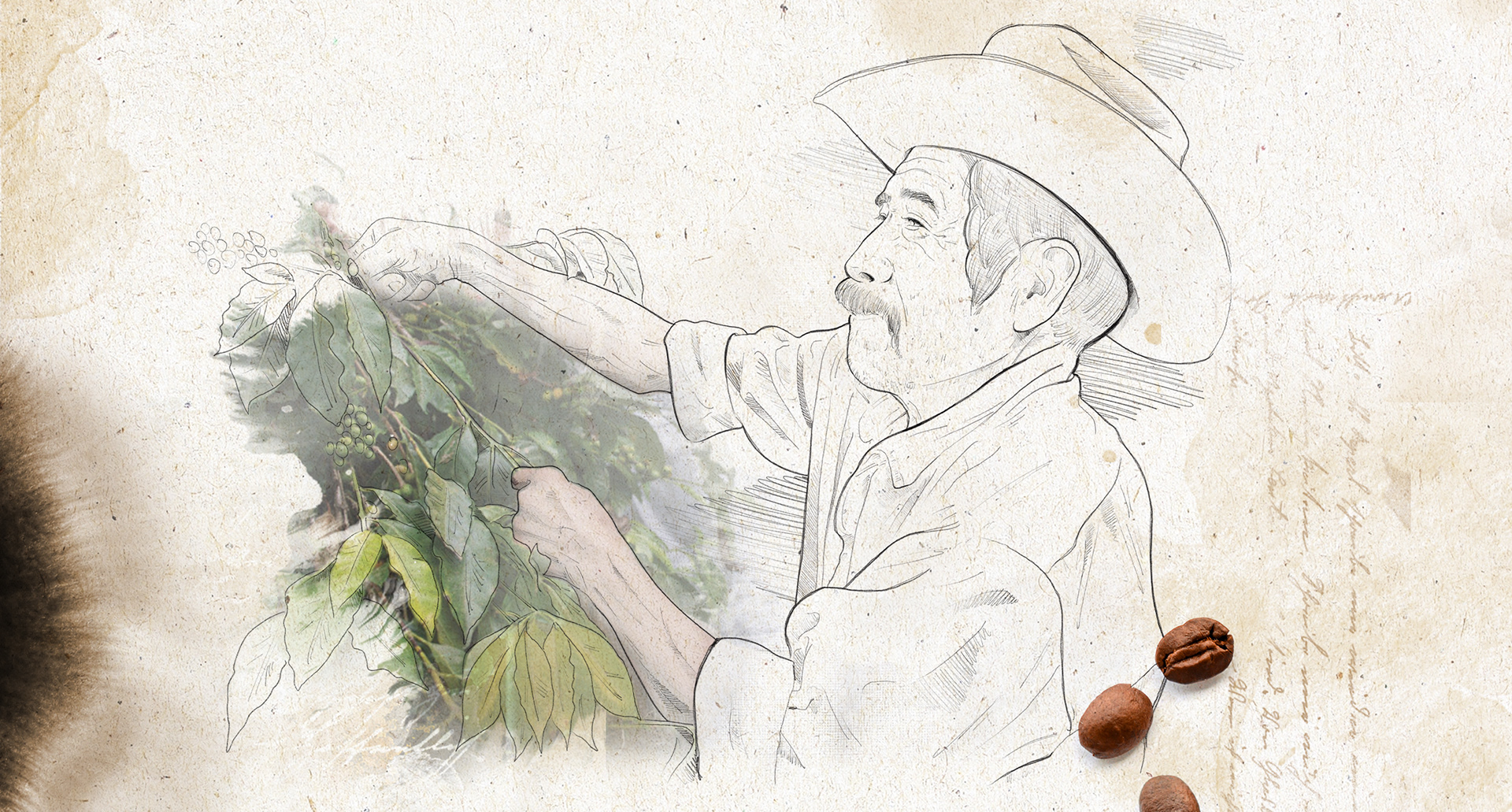
C U S T O M I L L U S T R A T I O N S
|
To broaden the sense of an artisan brand, I created hand-drawn illustrations that would appear throughout the branding. Several coffee tree branches were drawn to differentiate each of the three coffee brands offered by Superbia. Other drawings would illustrate the people behind the craft that created such a great product: the workers. These workers are celebrated throughout the branding on multiple platforms as the artists behind the coffee.
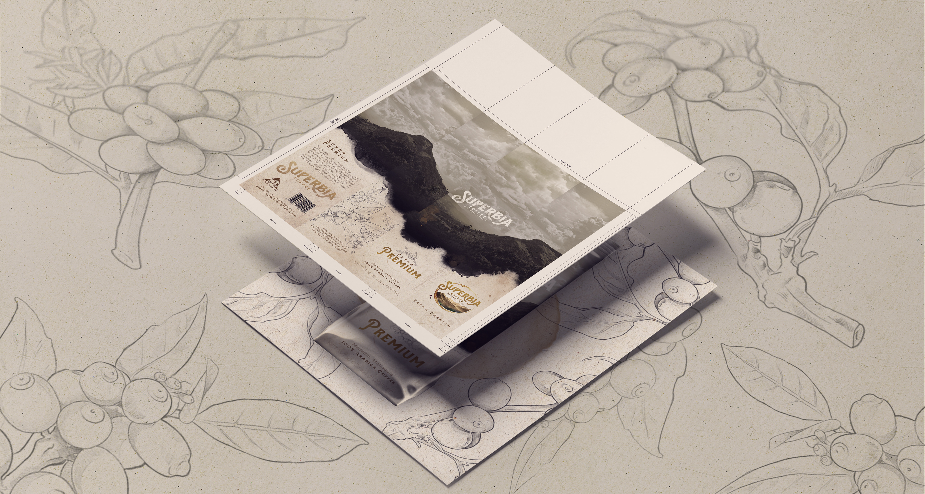
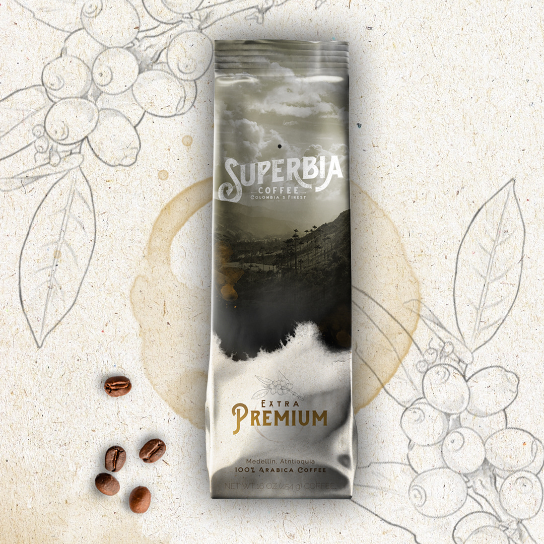
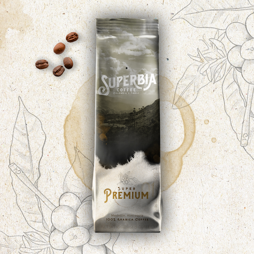
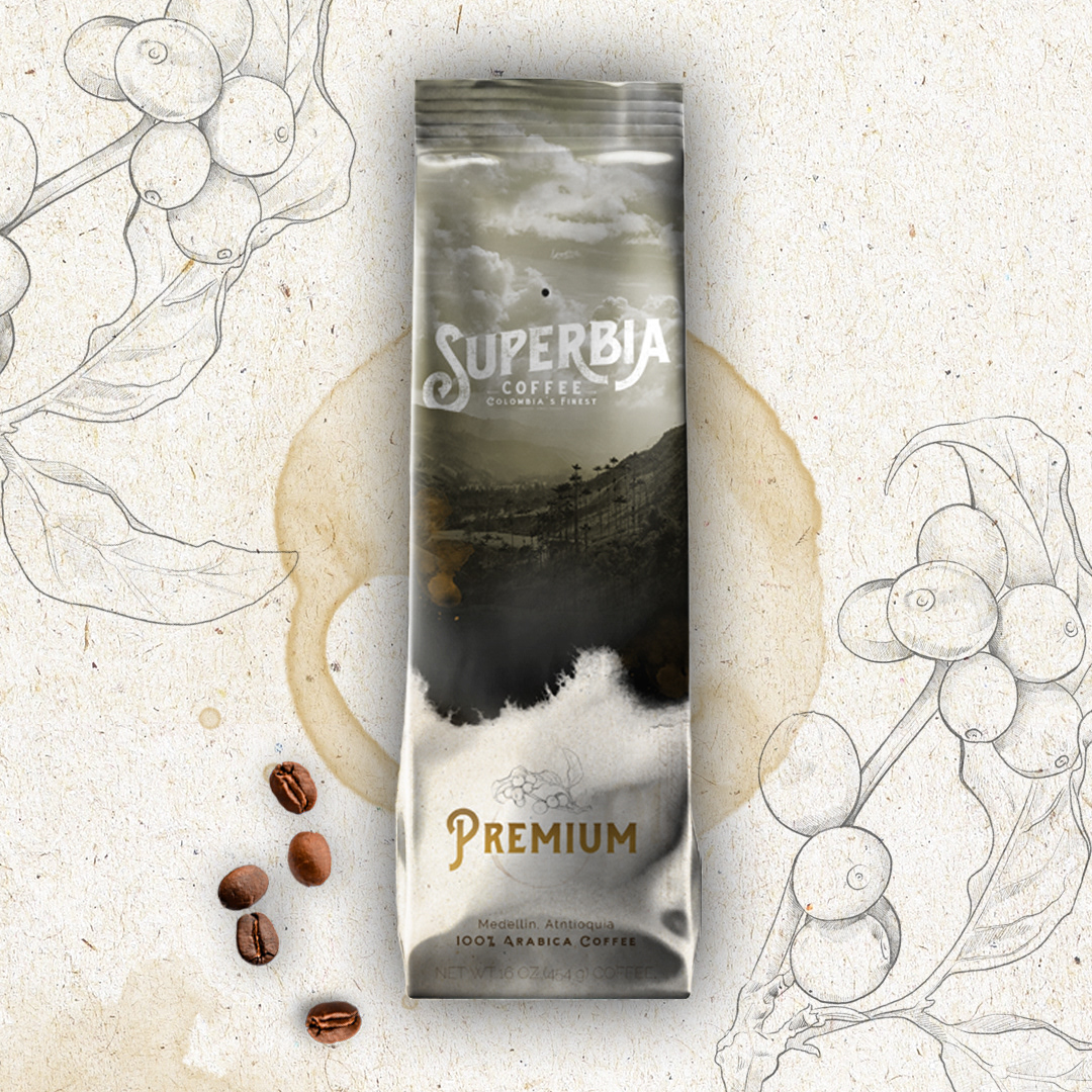
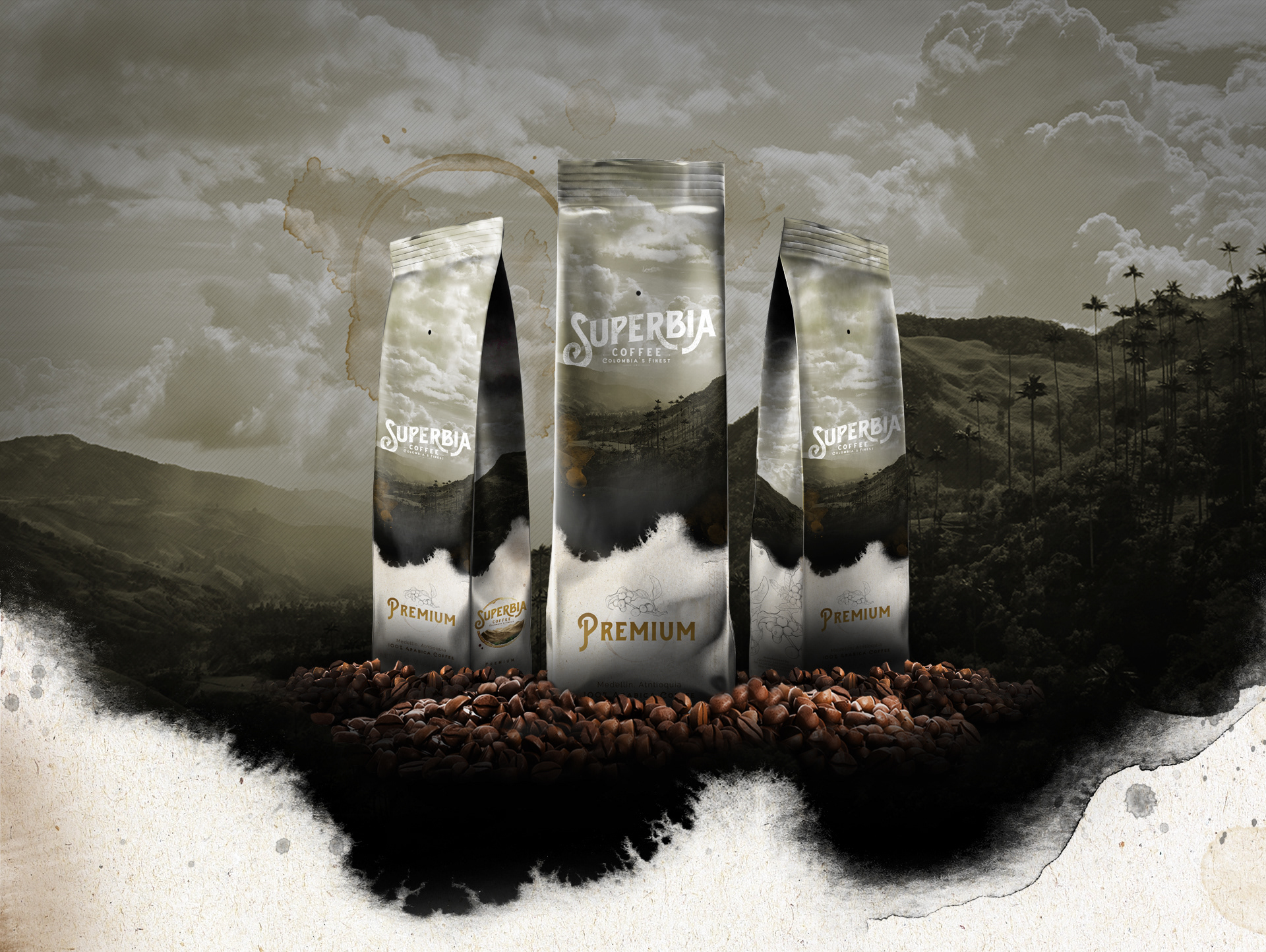
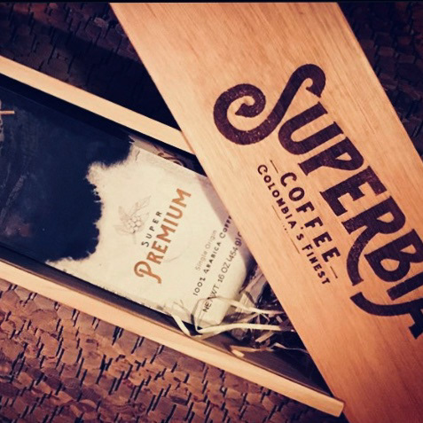
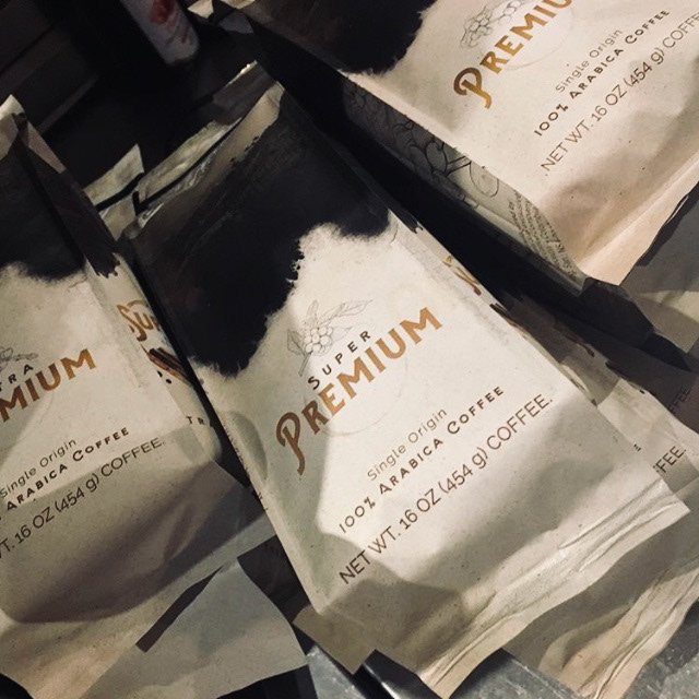
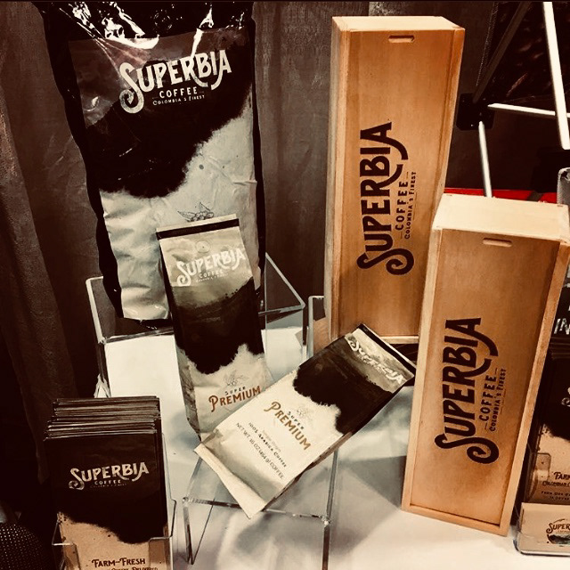
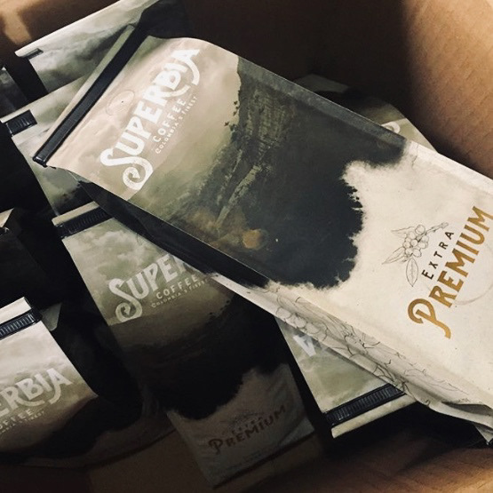
- S U P E R B I A ' S -
P A C K A G I N G
|
While each of the coffee brands had their own custom illustrations, something that held constant throughout was the visual of the Colombian mountains from which the beans were harvested from. The bags create a seamless 360° visual of the landscape, once again paying homage to the origins.
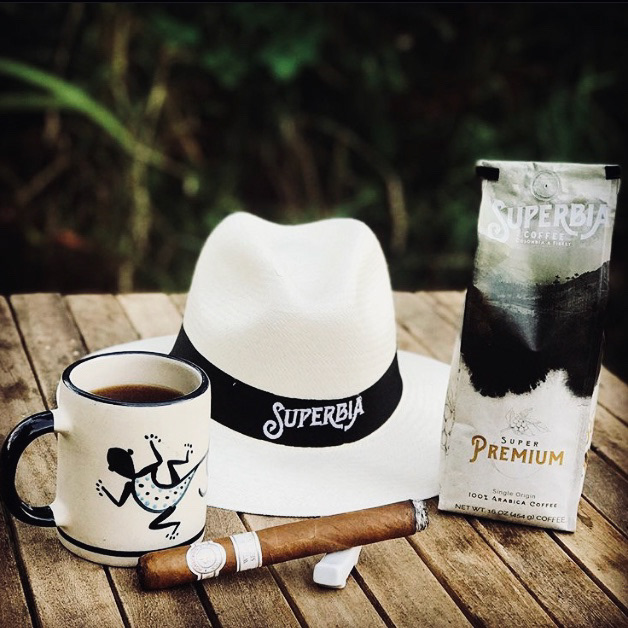
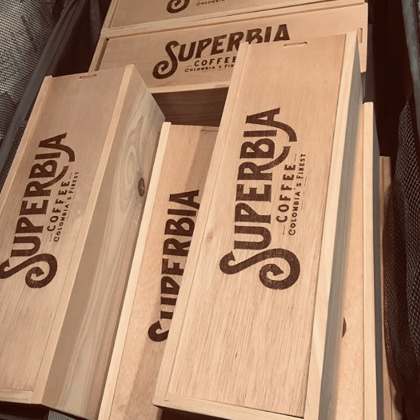
- S U P E R B I A ' S -
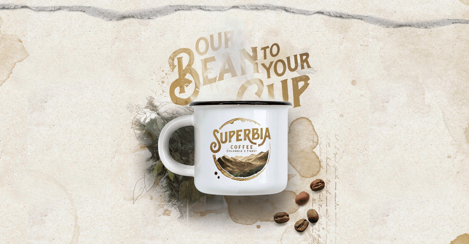
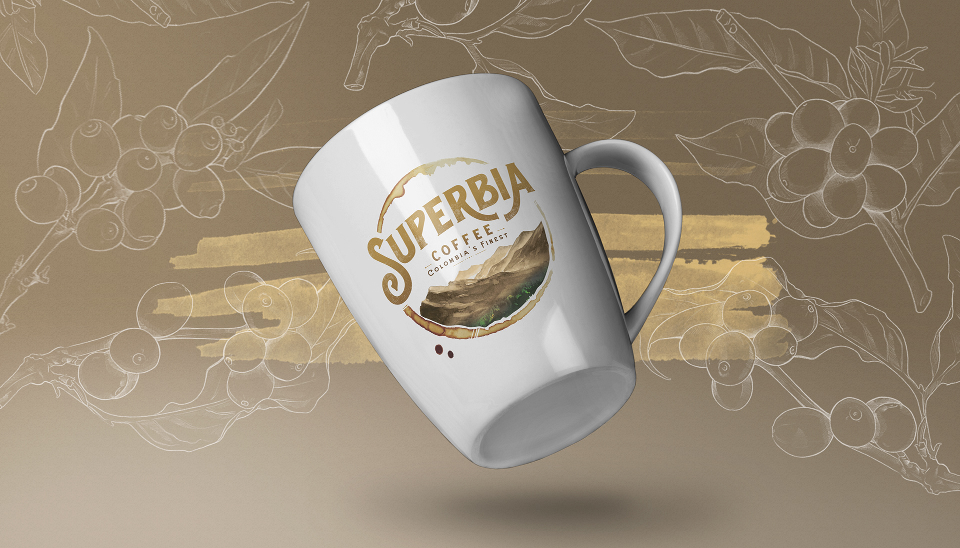
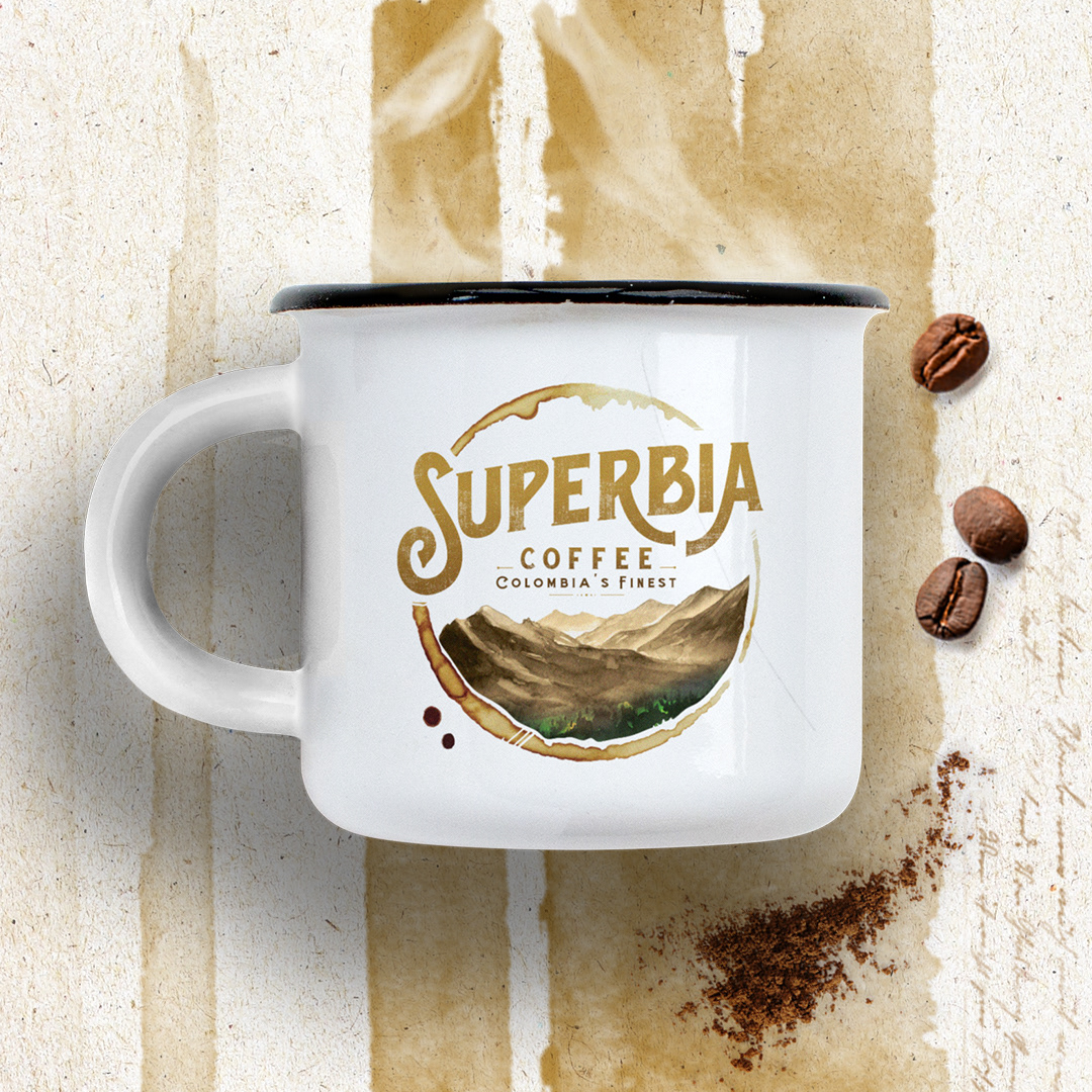
T H E P R O D U C T
|
The word mark made its way onto apparel, boxing, mugs, and even coffee bean sacks. All of these uses successfully proved the brand’s versatility and the logo’s easy application onto multiple materials.
- S U P E R B I A ' S -
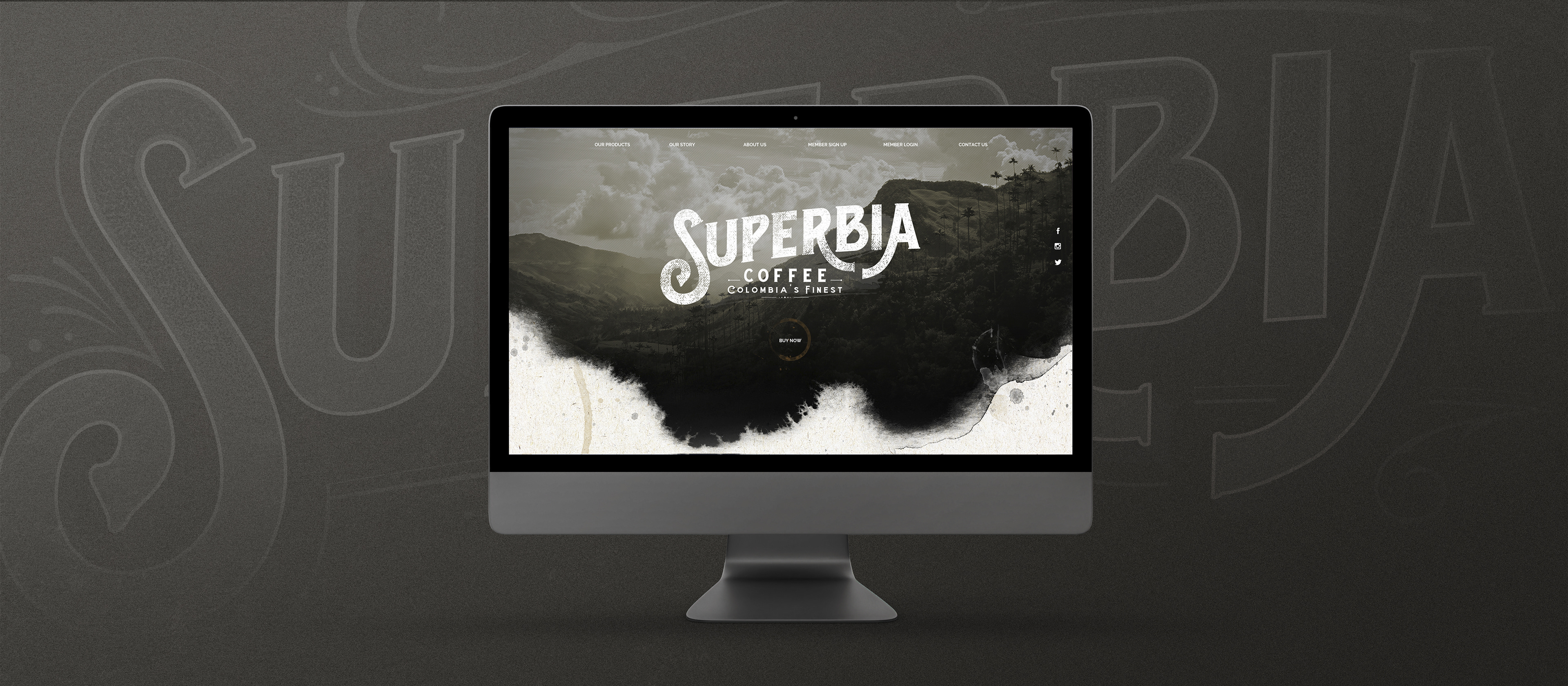
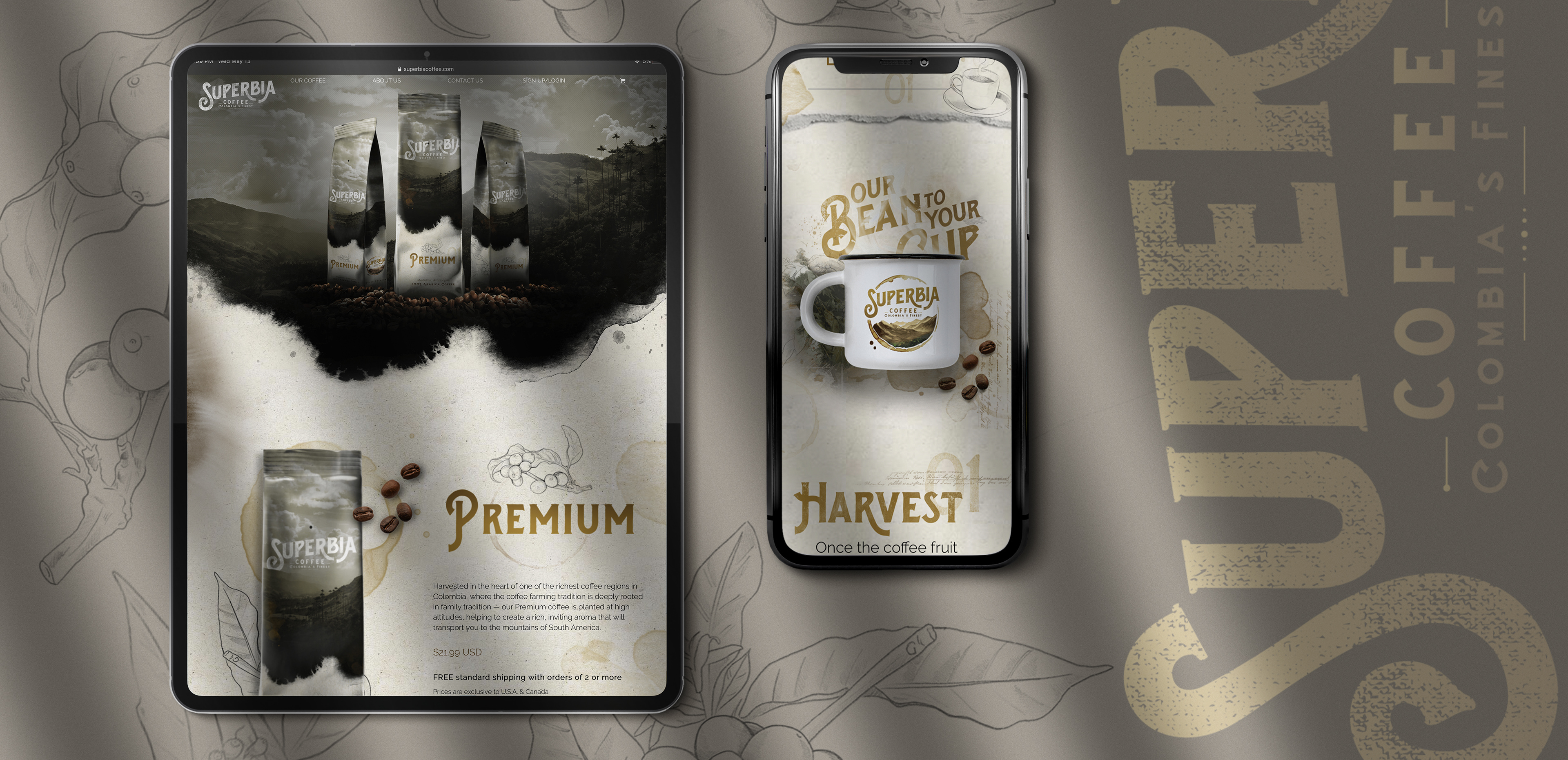
T H E W E B S I T E
|
The brand wasn't complete without a digital home. The website was a fully custom and unique experience. It gave the user the experience and taste of Colombian coffee at the click of a mouse. Leaning on the imagery and natural beauty of the Colombia mountains, it housed a unique user experience that allowed people to truly see what they were buying and consuming.