- P I T T S B U R G H T O U R I S M -
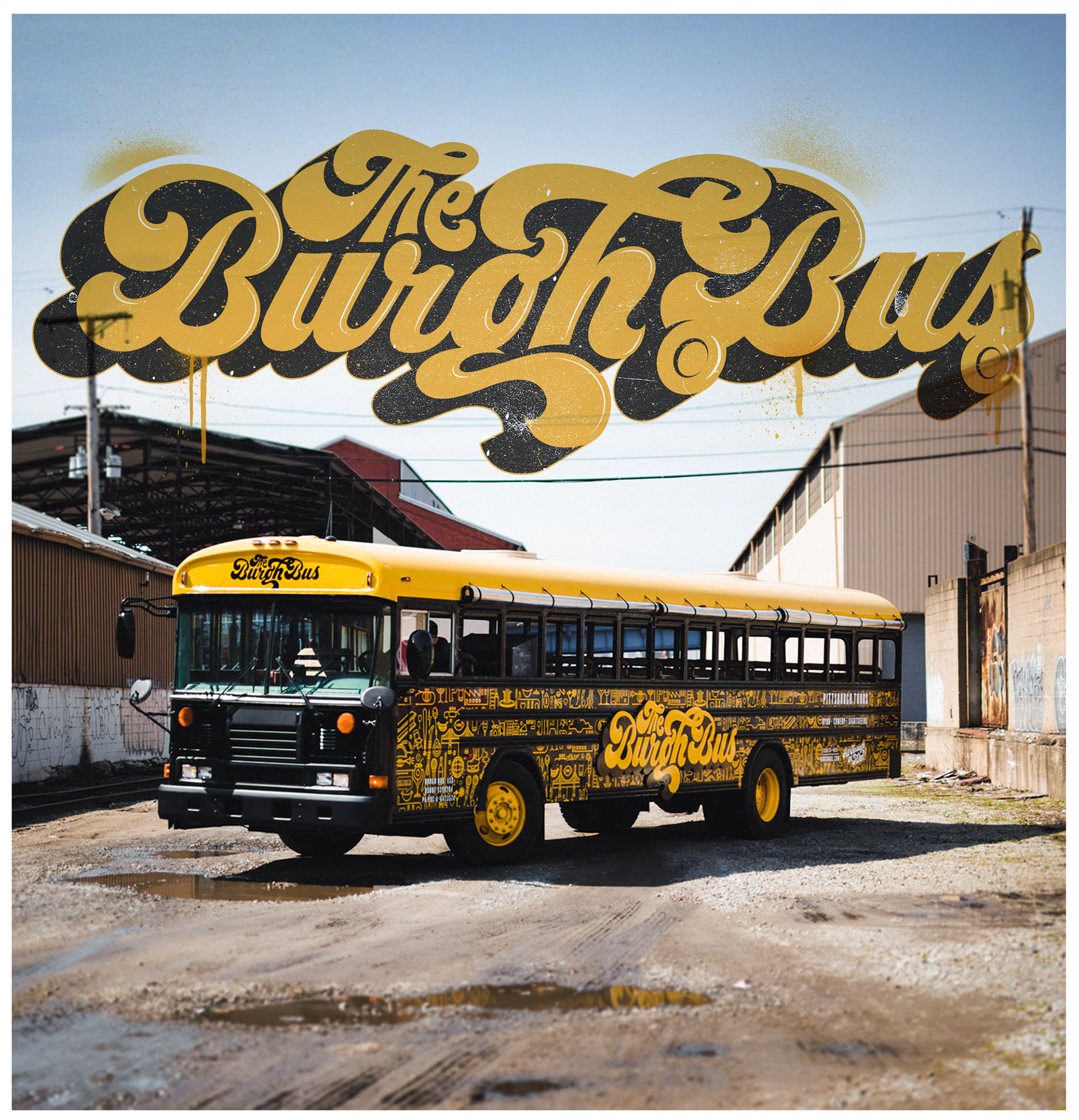
T H E B u r g h B u s
|
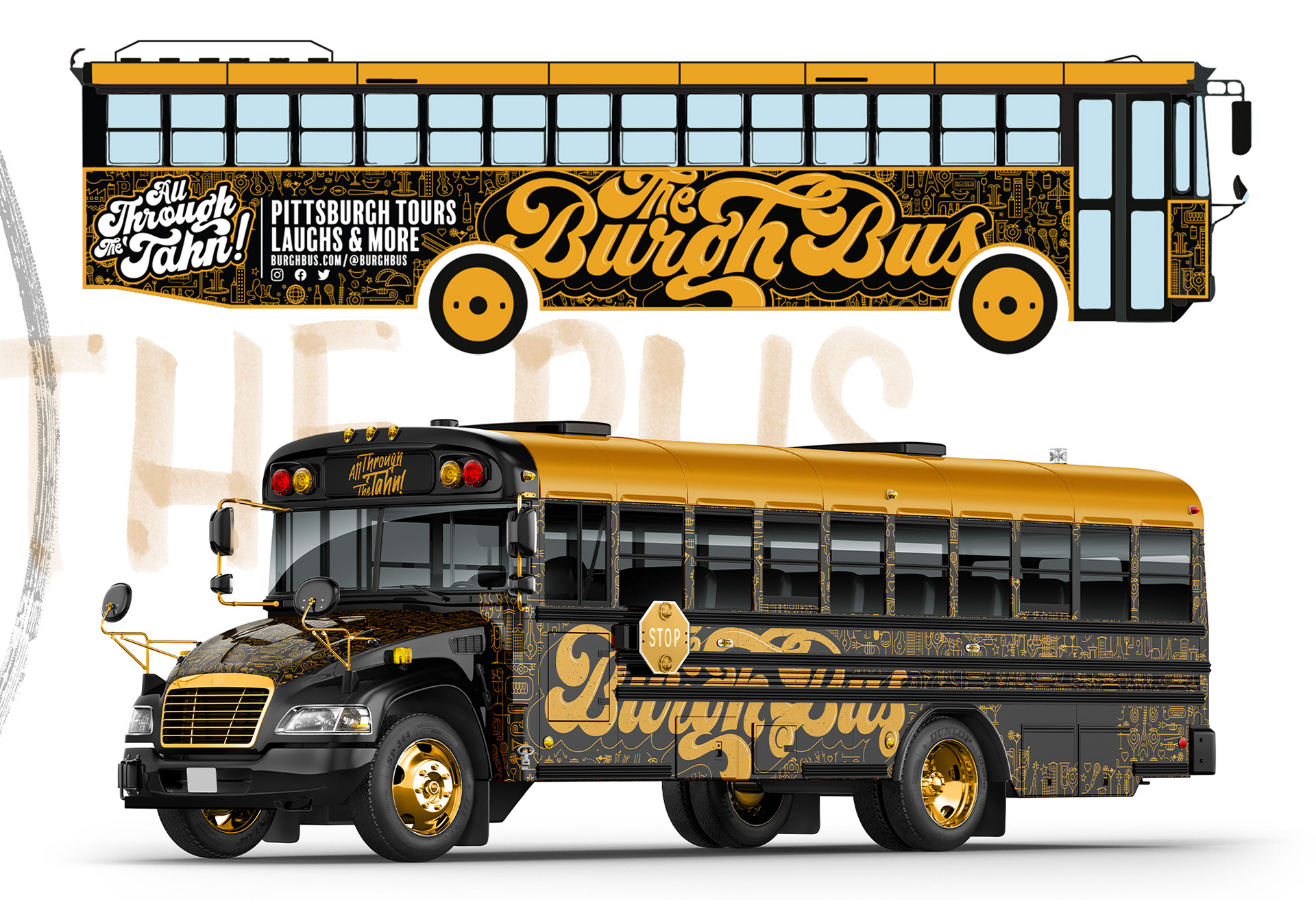
The black and gold chariot awaits. As you take a tour through Pittsburgh's historical streets you are accompanied and lead by one of many of the burghs great comedians, cracking jokes while you drink the cities no.1 beer, IC Light. The project had to emit the cities vibrancy and sound visually while appearing inviting and fun, above the experience of all other tour companies. The brand had to show an element of nostalgia and familiarity that I found reference and inspiration from old time illustrations from Mad Magazine and National Lampoons movie posters.
L O G O D E S I G N // I L L U S T R A T I O N // C U S T O M T Y P E // M E R C H A N D I S E // B I L L B O A R D
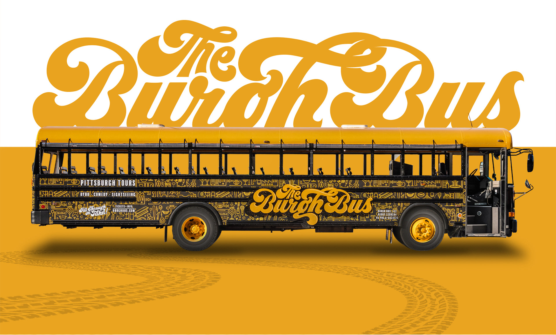
- T H E B UR G H B U S -
T H E B R A N D I N G
|
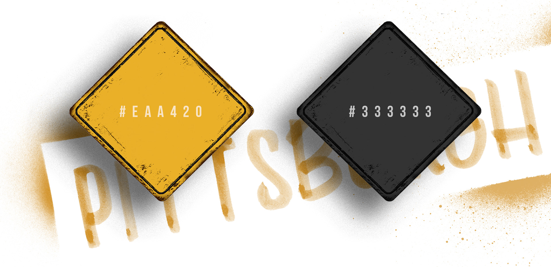
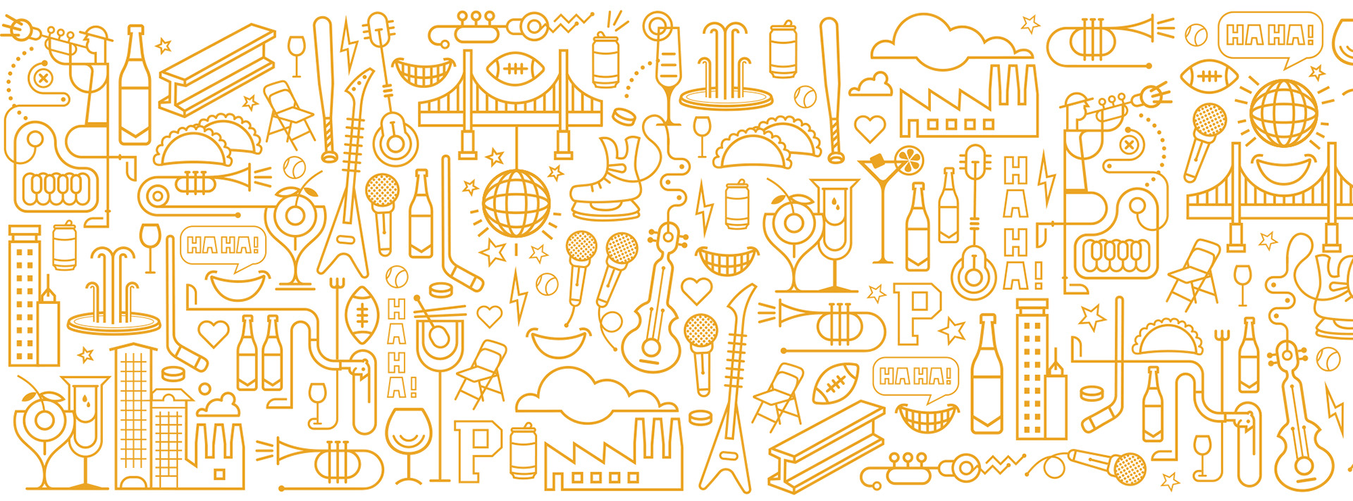
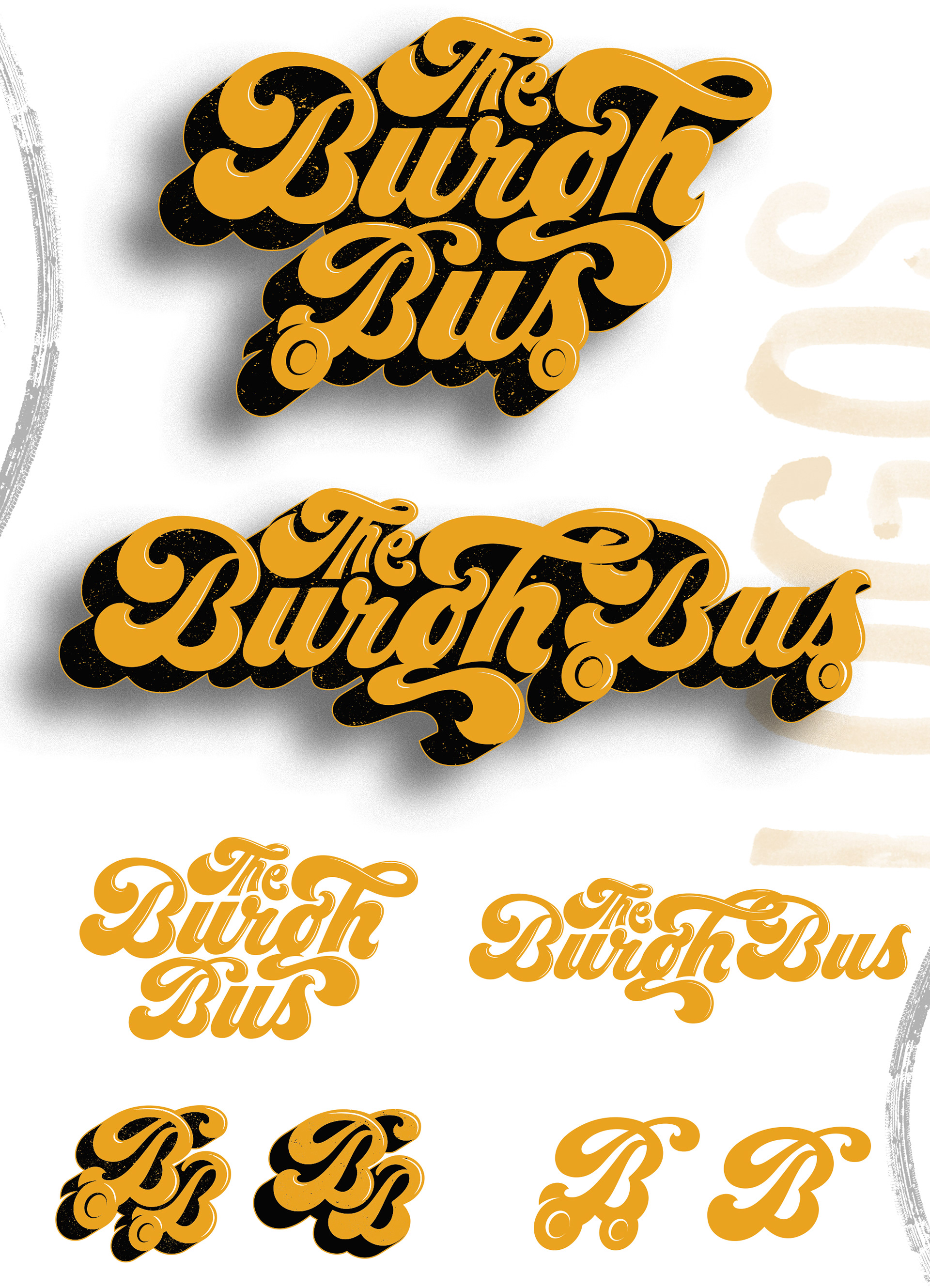
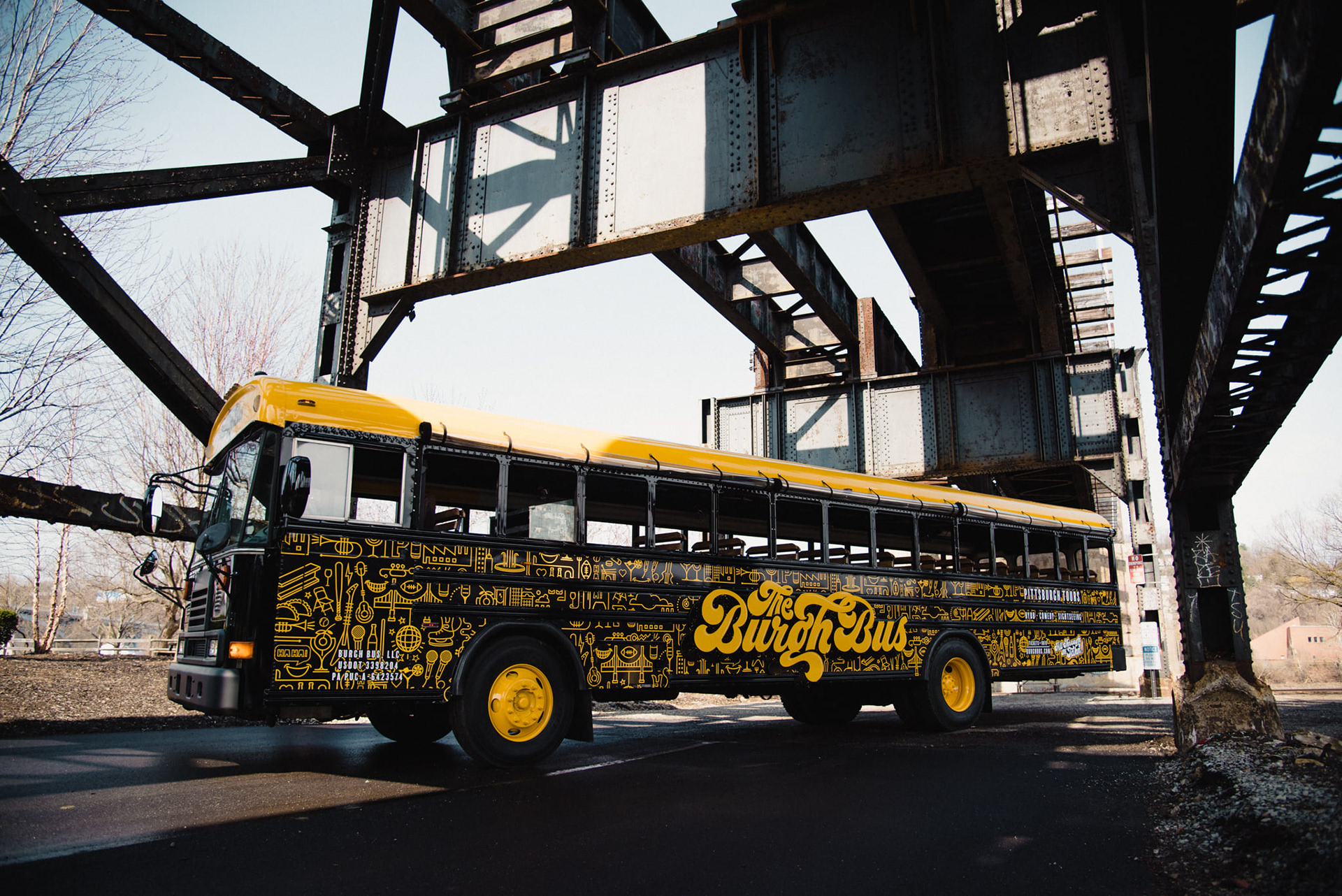
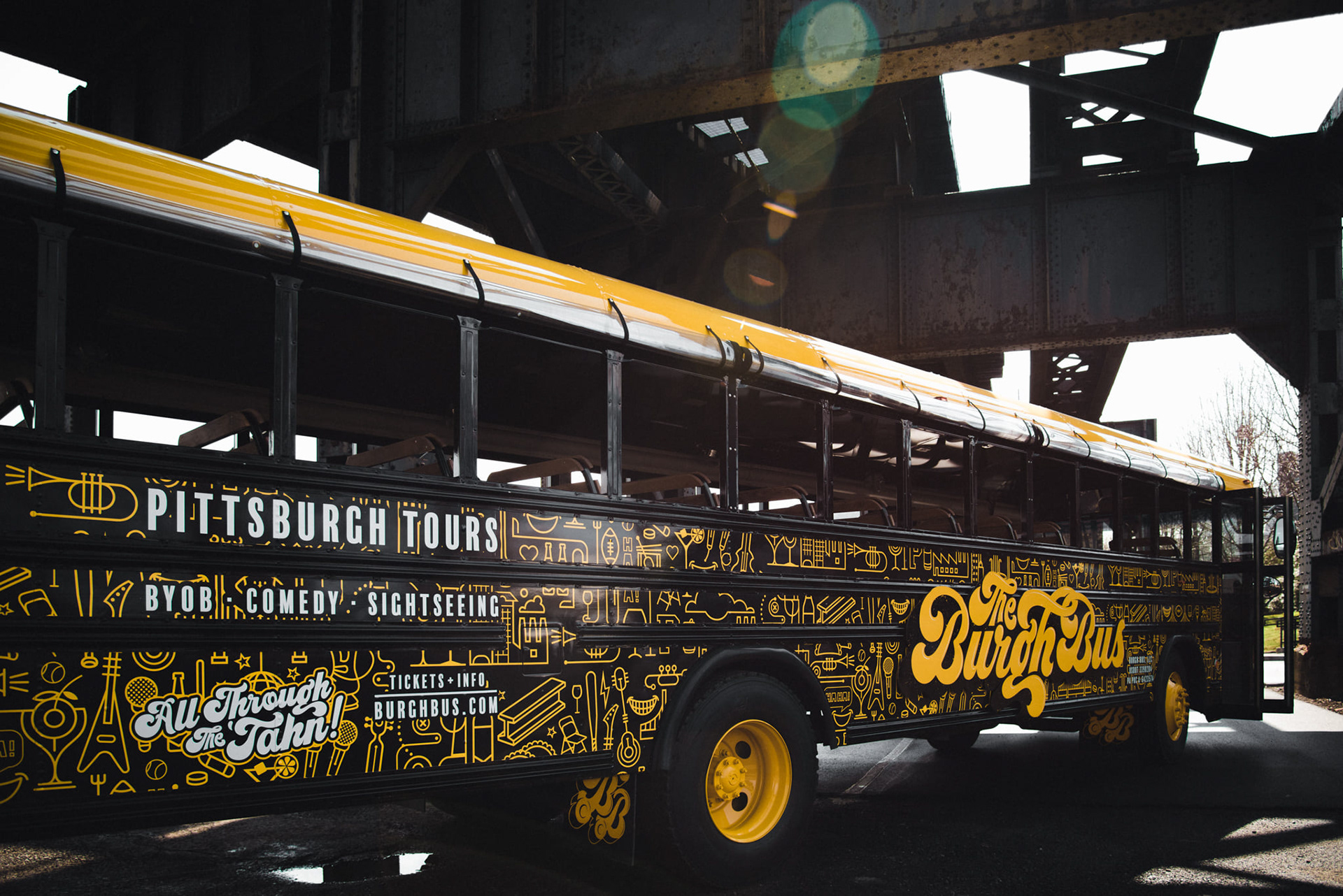
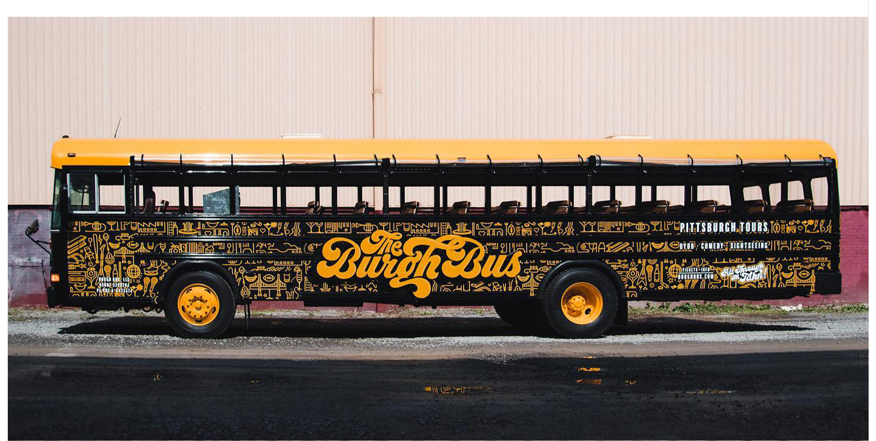
Learning about Pittsburgh was a fun experience in relevantly pulling out its strongest characteristics for the branding kit. It's one of the only cities in the states to have possibly the most identifying color palettes that they use across all their sports teams and throughout the city itself, so a clear direction was its historic use of black and gold. For the bus to pay true homage to its location, I created a series of icons that depict all identifying elements of the cities culture. For the logo itself I had to create a custom typeface logo that was fun and unique with a clear inspiration of nostalgic, groovy typography.
- T H E B UR G H B U S -
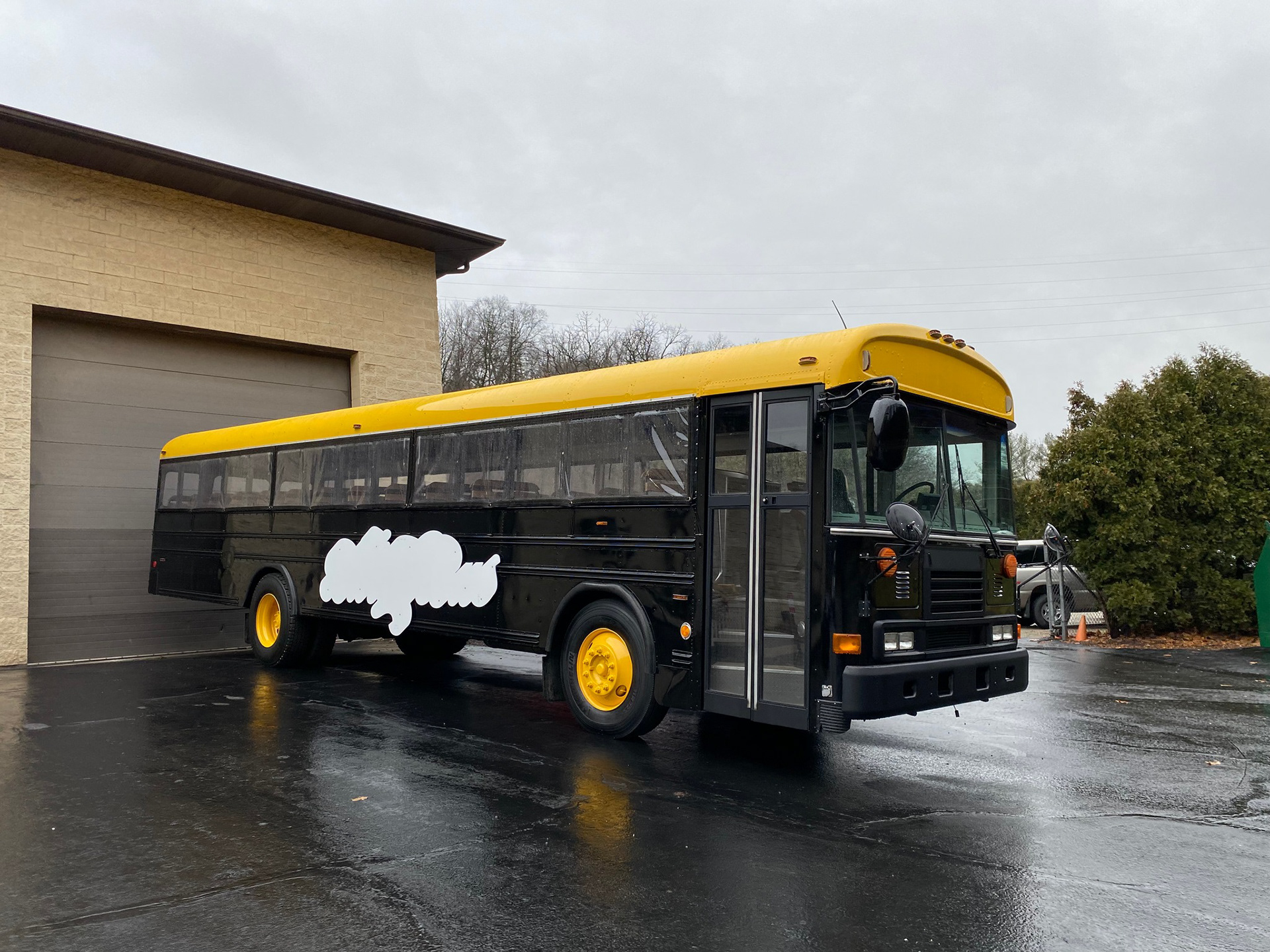
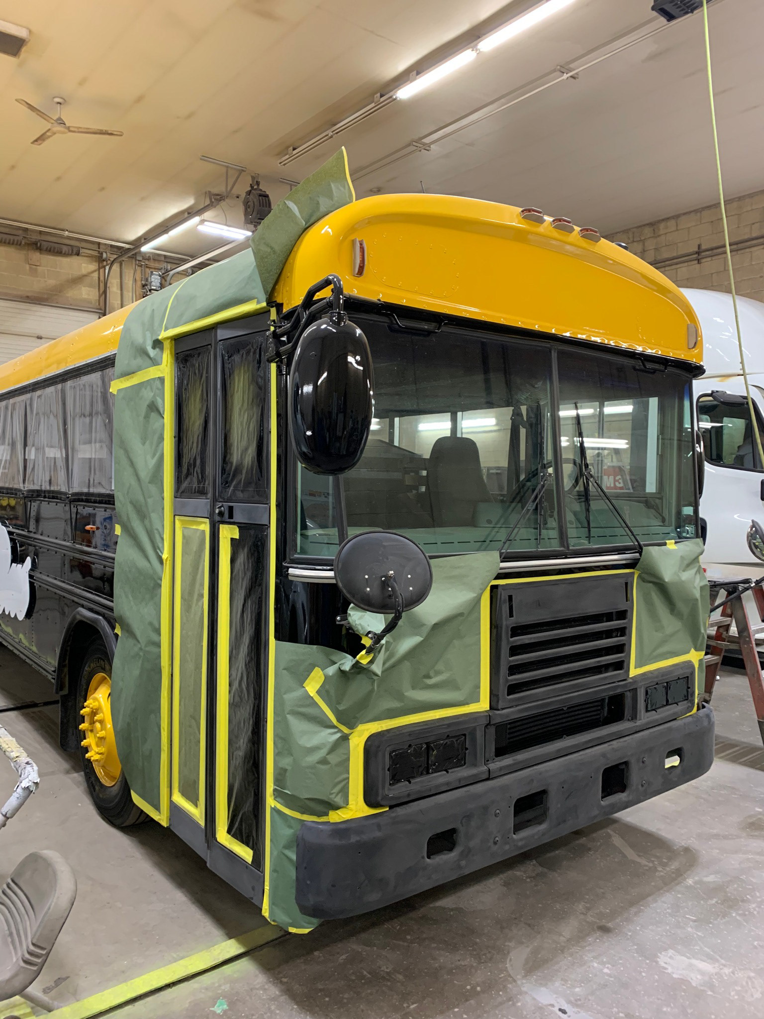
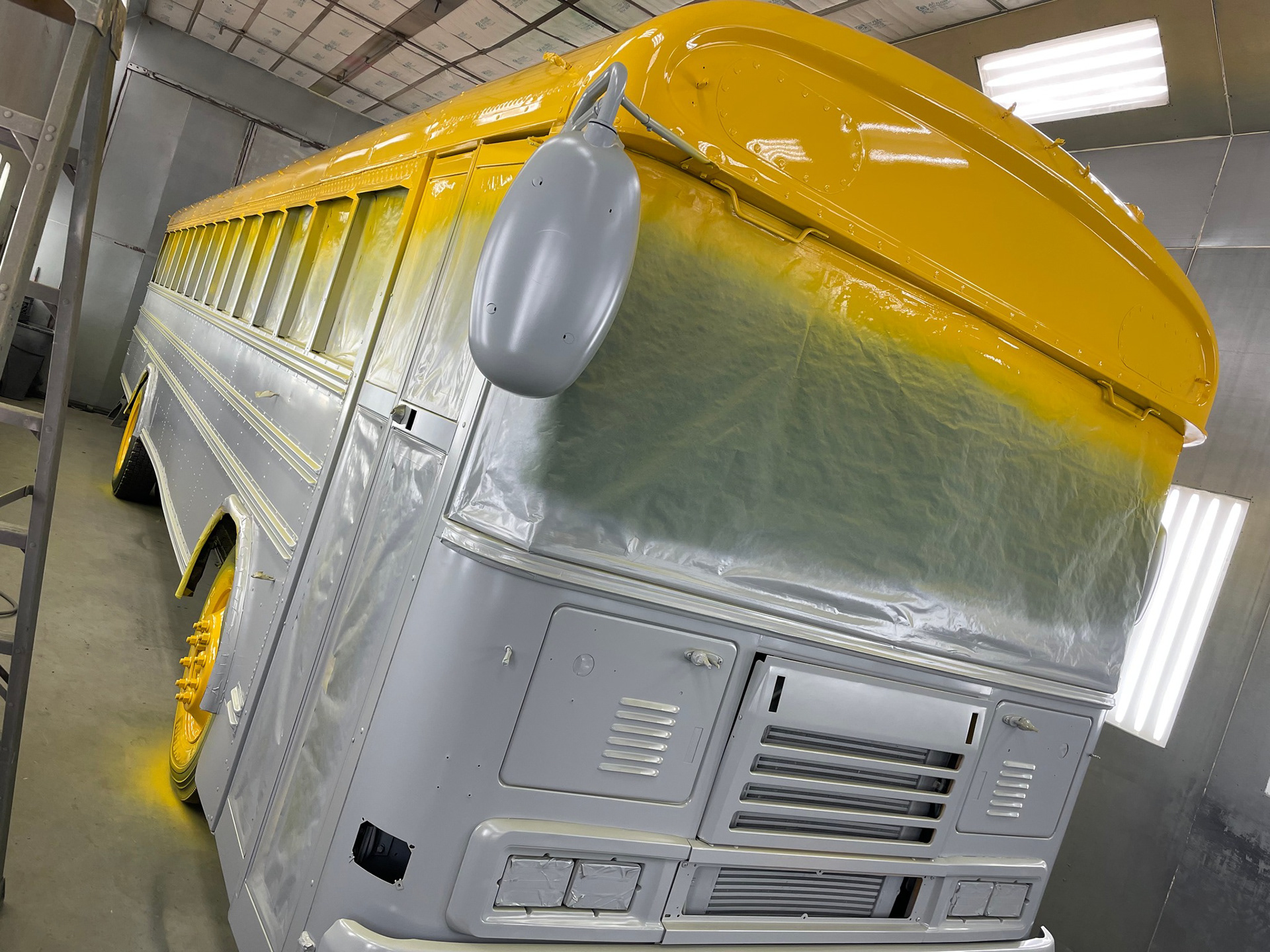
T H E B U S D E S I G N
|
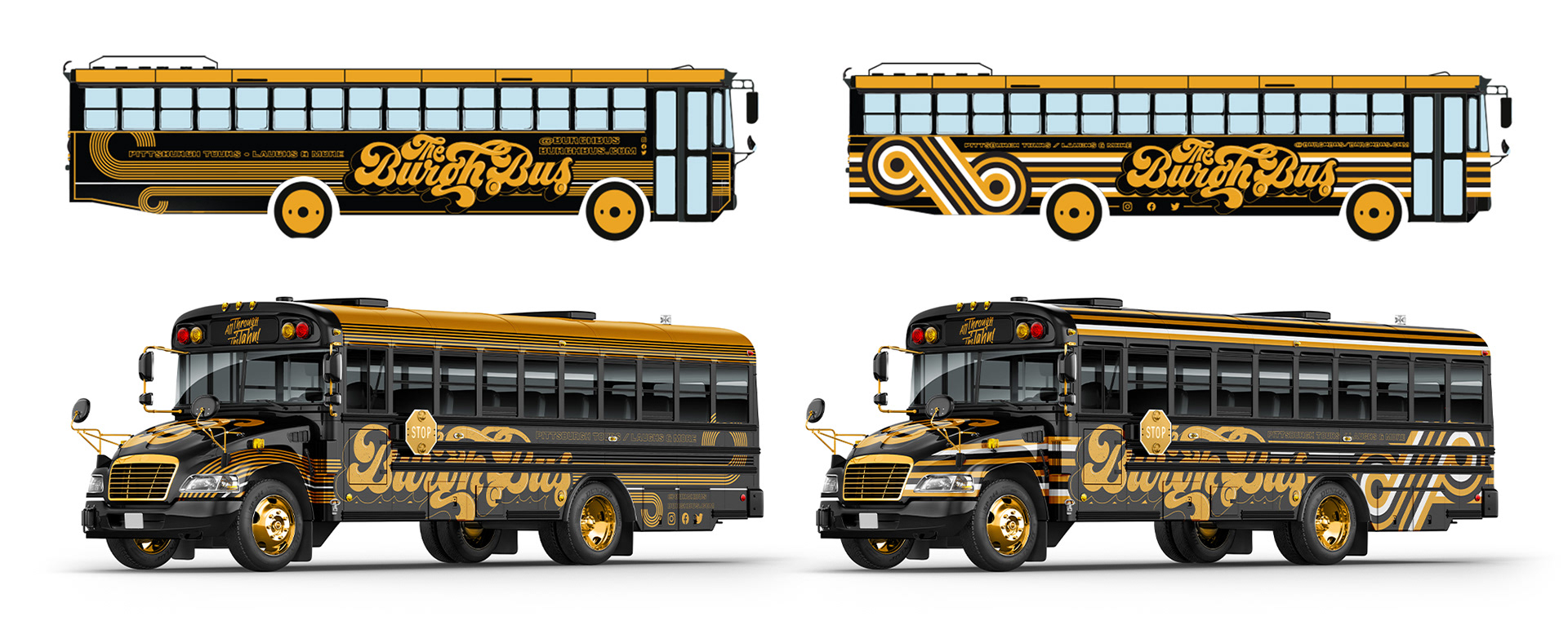
With its 60's design direction in mind, a lot of the early bus designs took shape by directly referencing a 60's/70's style that was flat and directional while using a pleasing and familiar pattern. As much as I liked these, they didn't associate as well with identifying to the cities attractions or culture so a new direction was forged by using the iconography made to show all thing Pittsburgh.
- T H E B U R G H B U S -
F I N A L D E S I G N
- T H E B UR G H B U S -
T H E R E S U L T
- T H E B UR G H B U S -
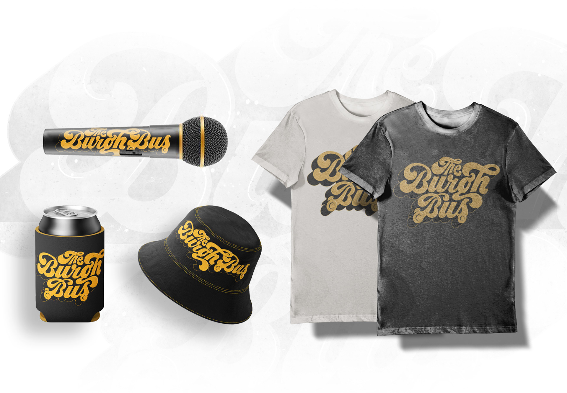
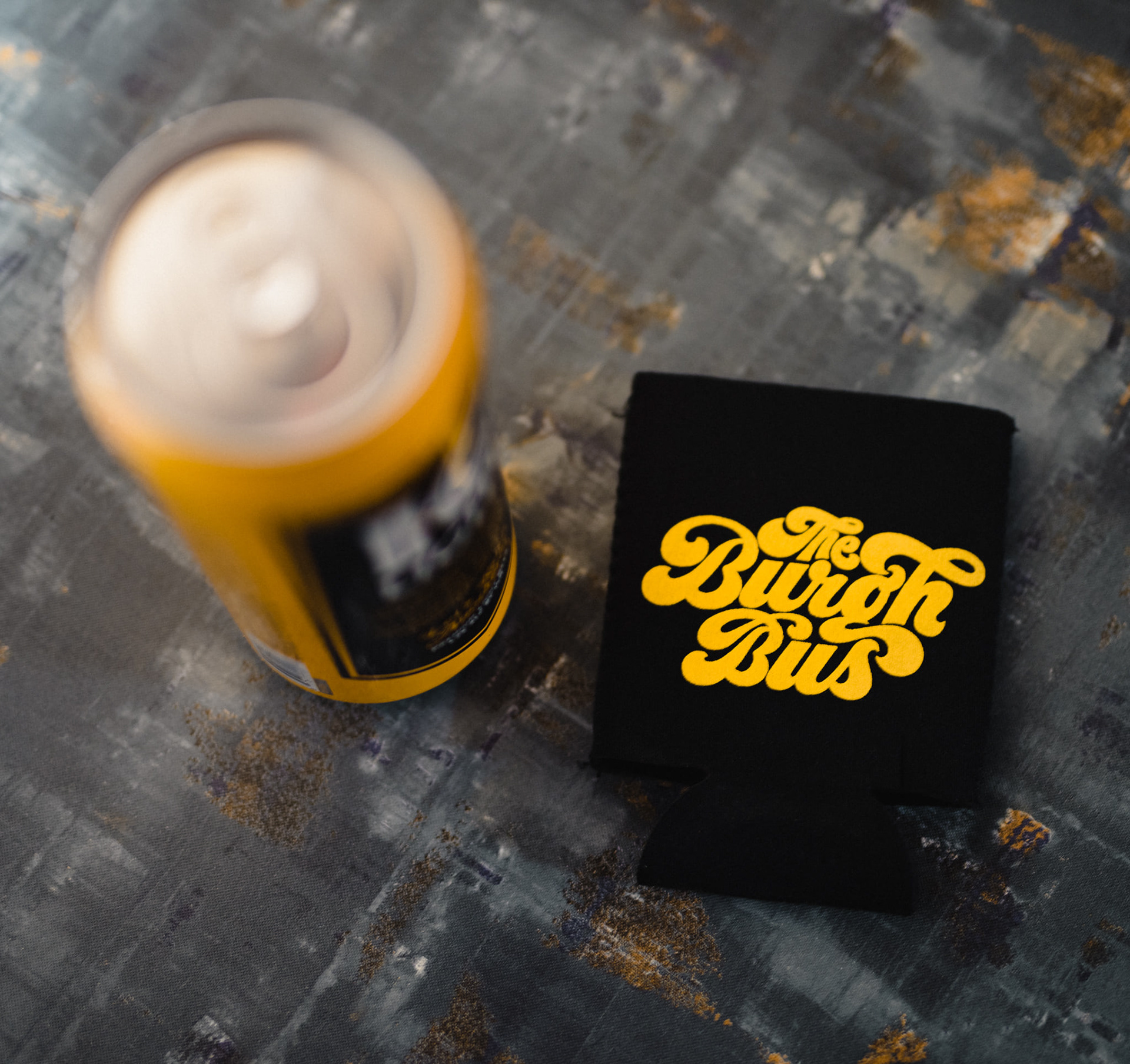
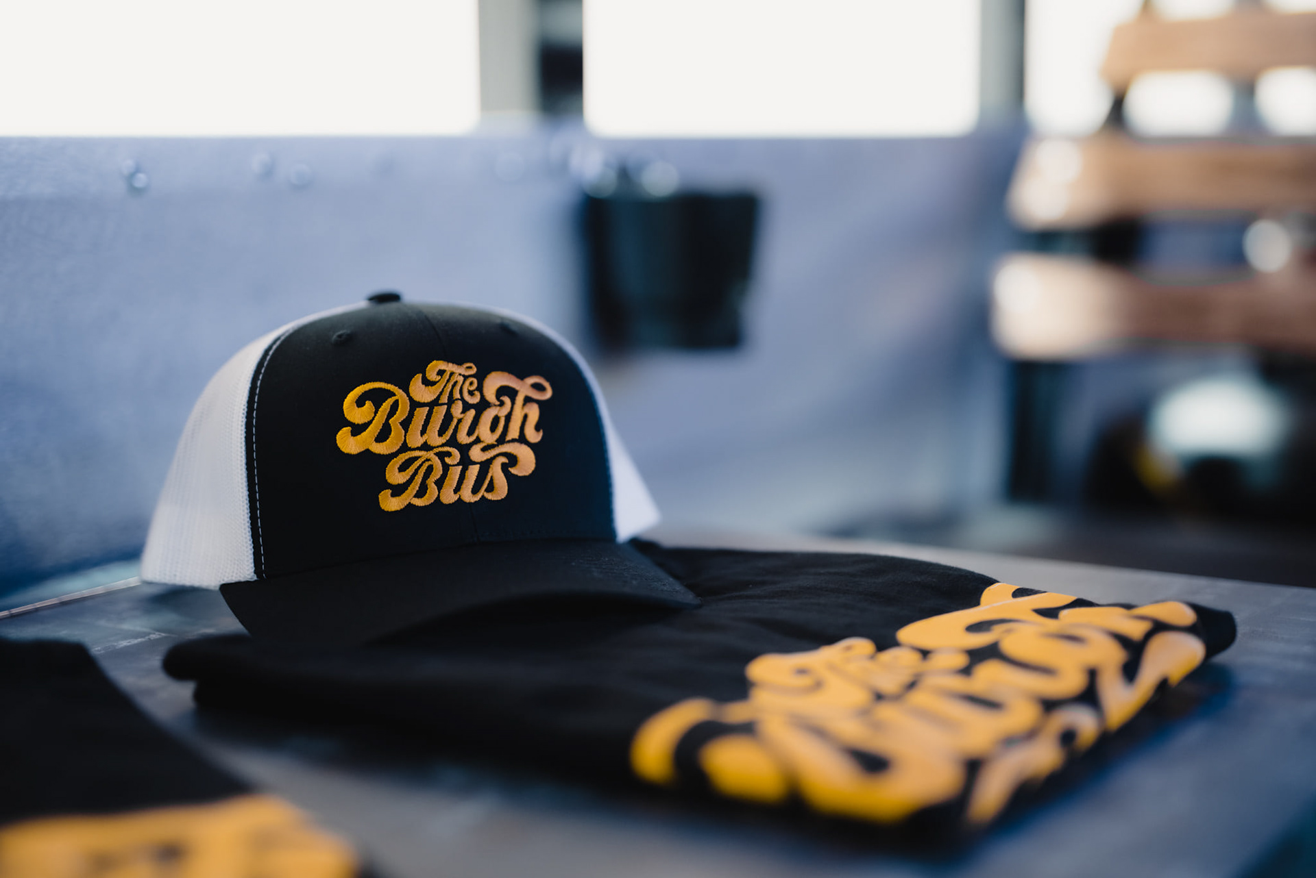
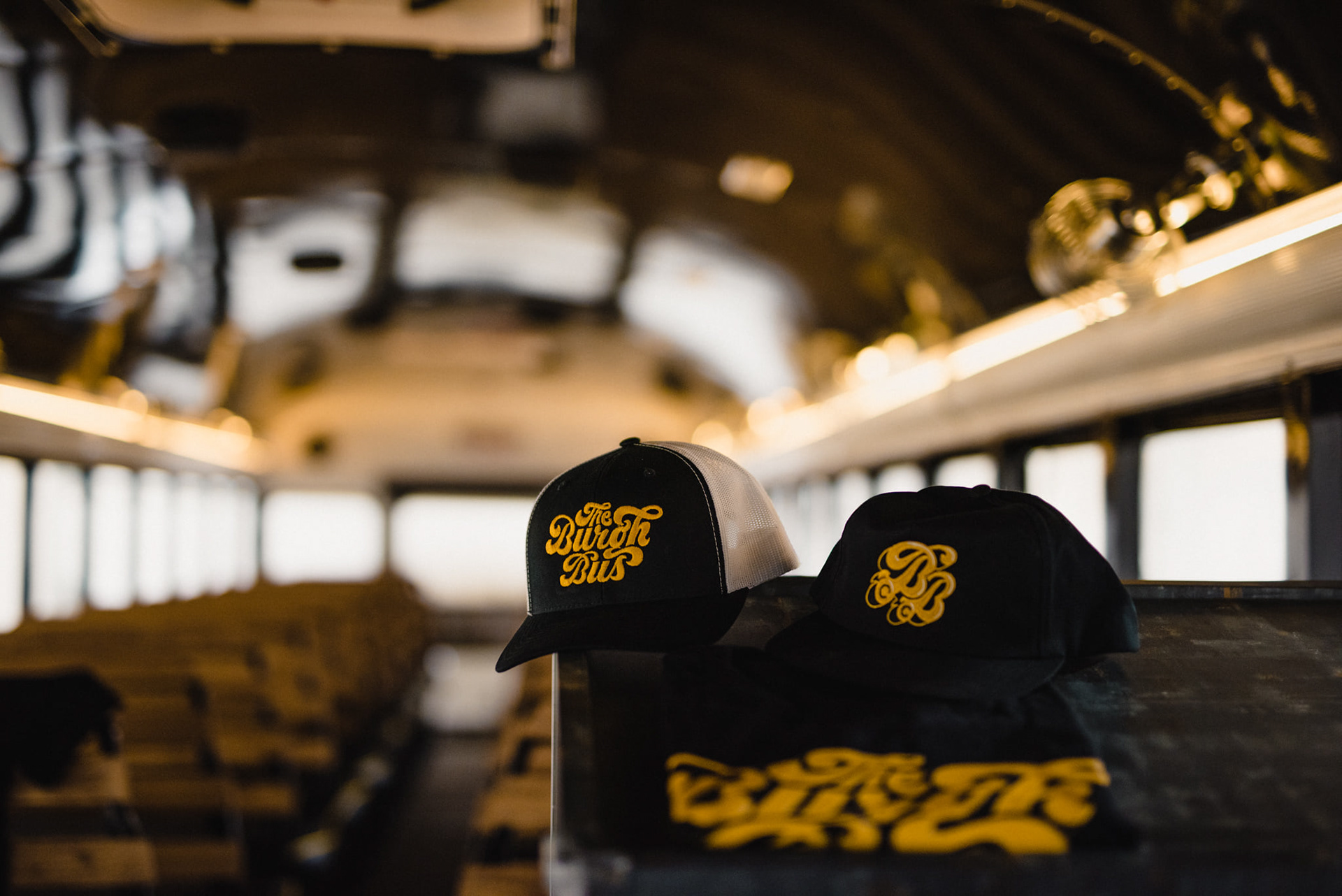
M E R C H A N D I S E
- T H E B UR G H B U S -
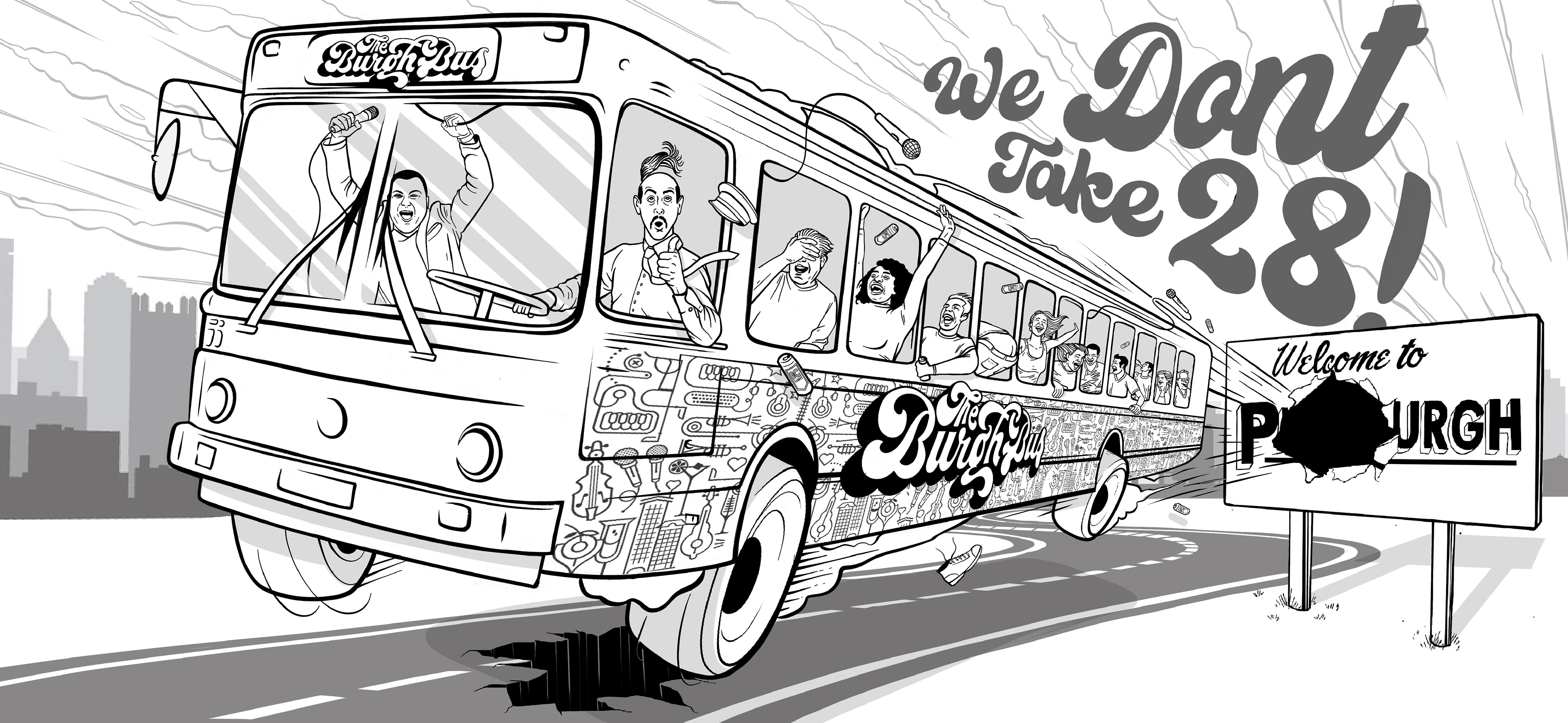
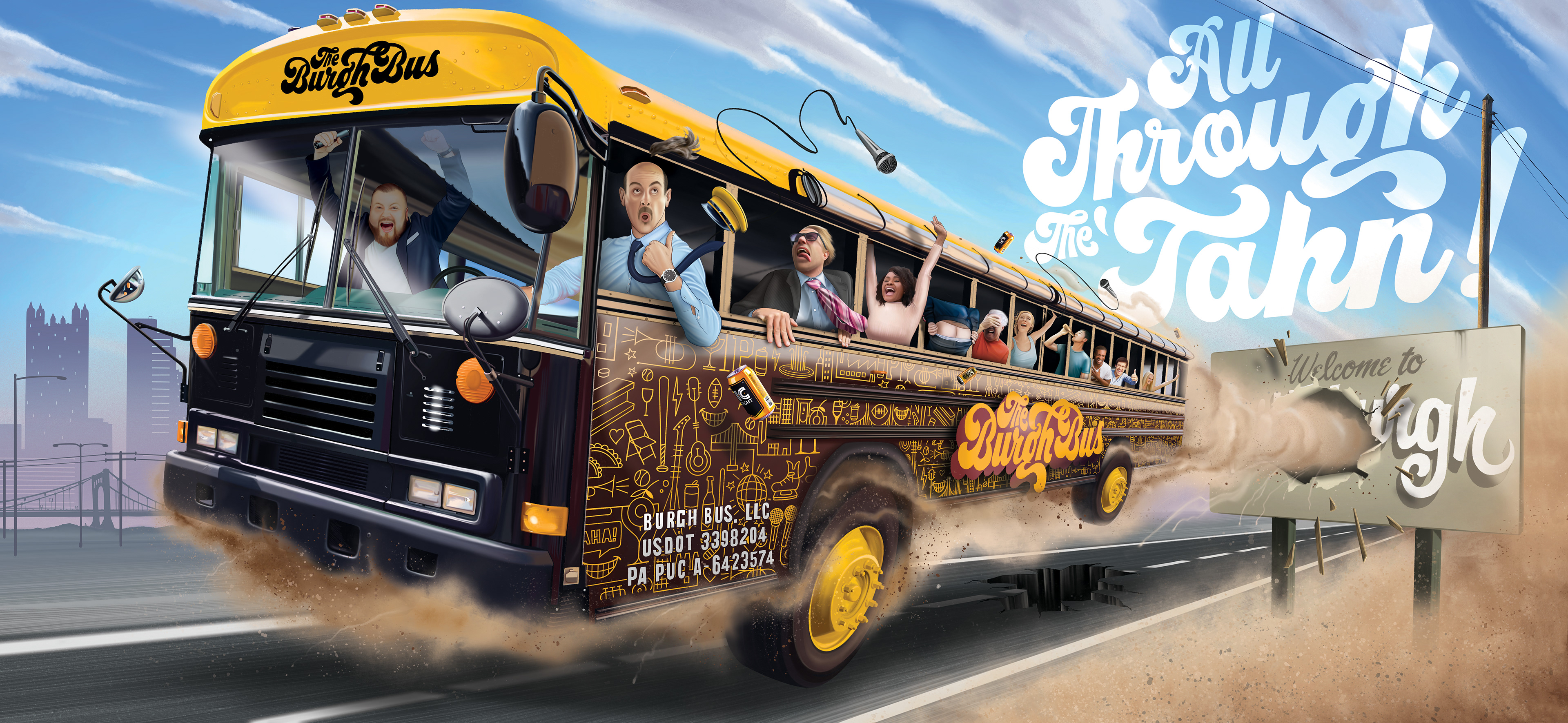
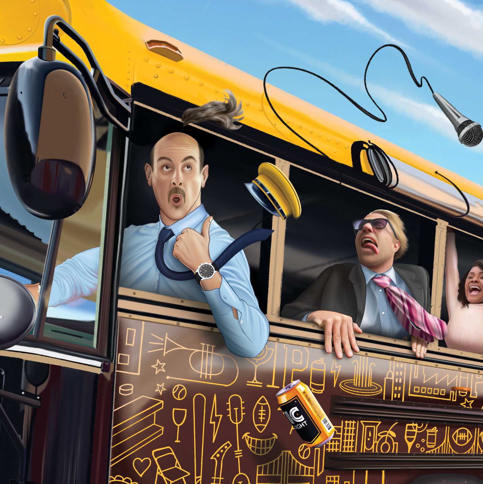
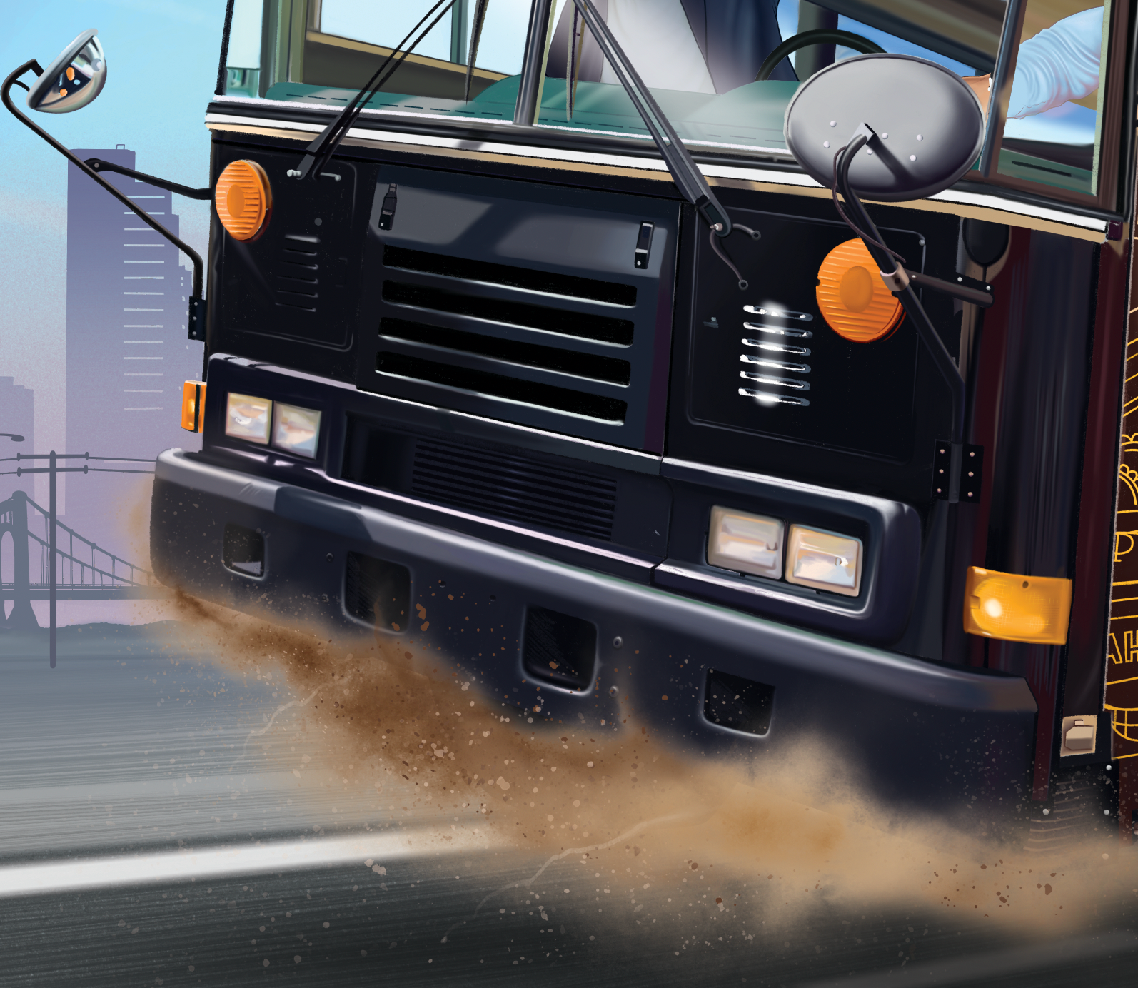
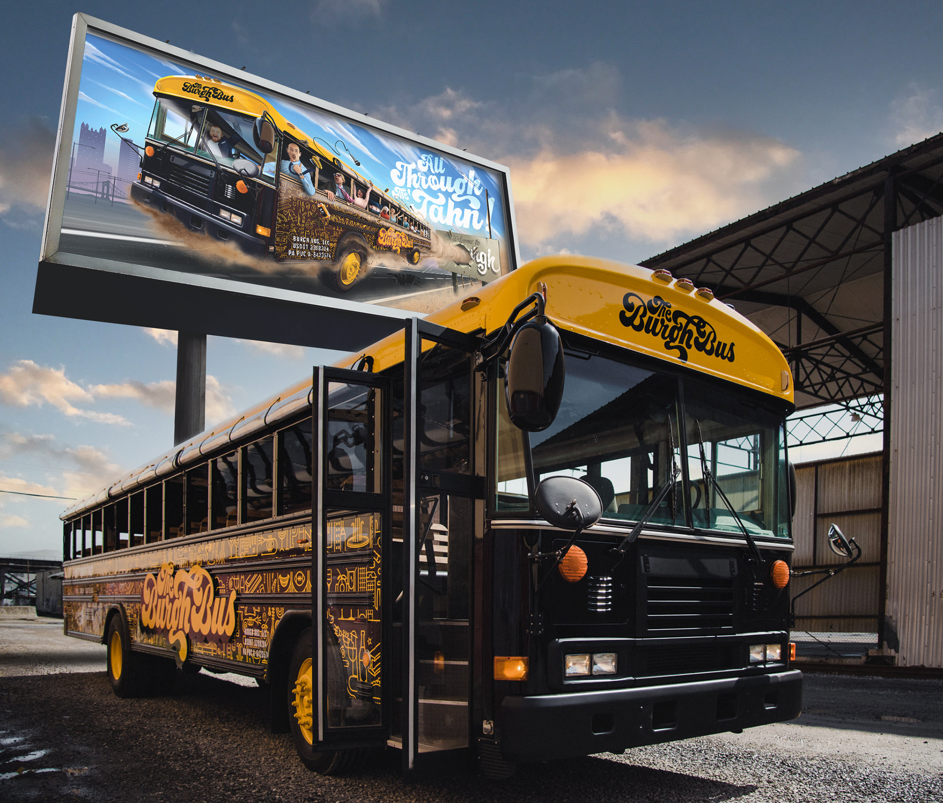
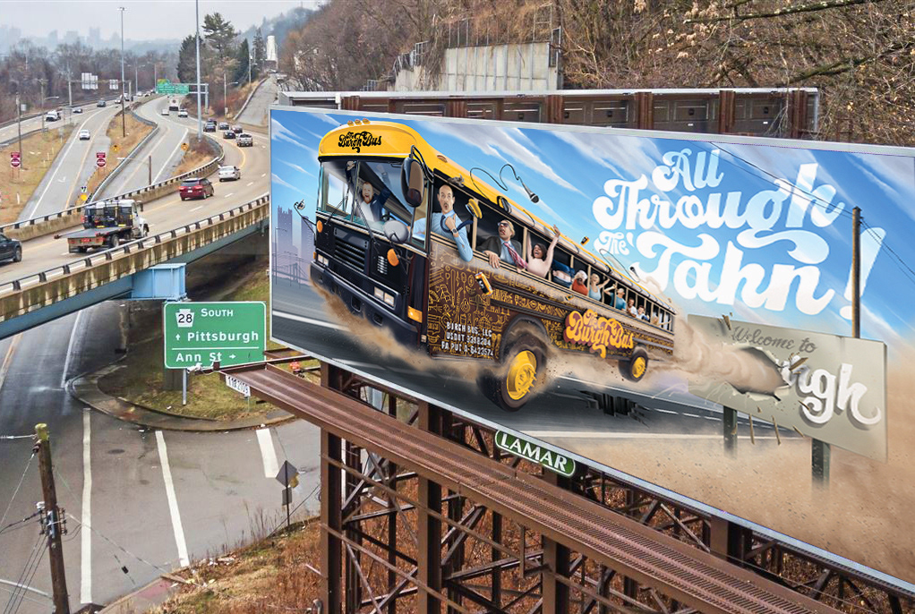
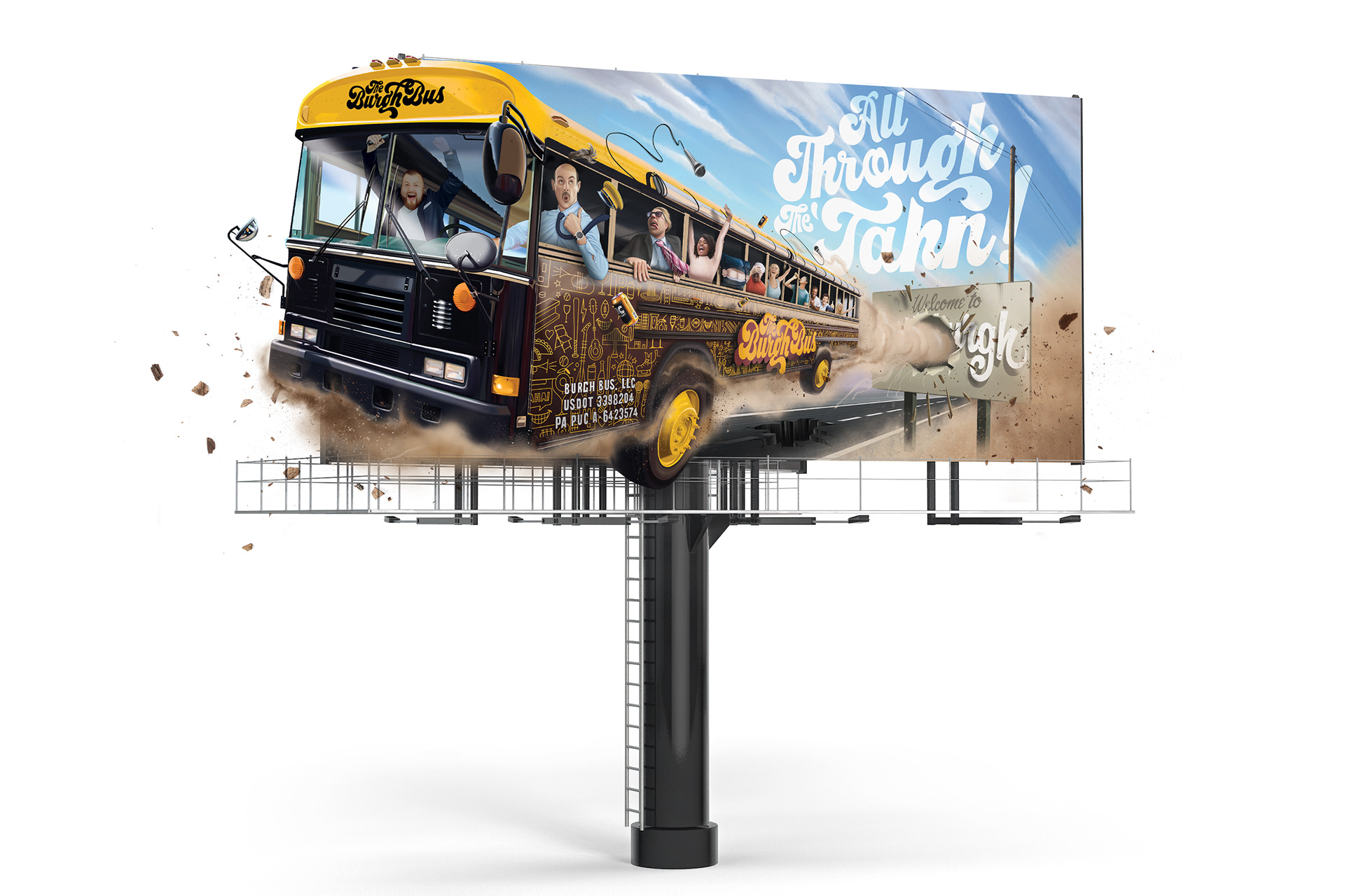
B I L L B O A R D A R T W O R K
|
The billboard was a huge project that had to introduce the bus to the city as well as showing its vibe and purpose. I wanted to draw from the cheeky illustrative style that was shown in historical comedic media like Mad Magazine and typical Nations Lampoon movie posters. These illustrations have a semi realistic aesthetic and a lot of details usually depicting a great time. I solely used procreate for this by using a mixture of colored pencil brushes and airbrush blending techniques.