- M O U N T O L I V E -
M A J E S T I C P I C K L E R Y
|
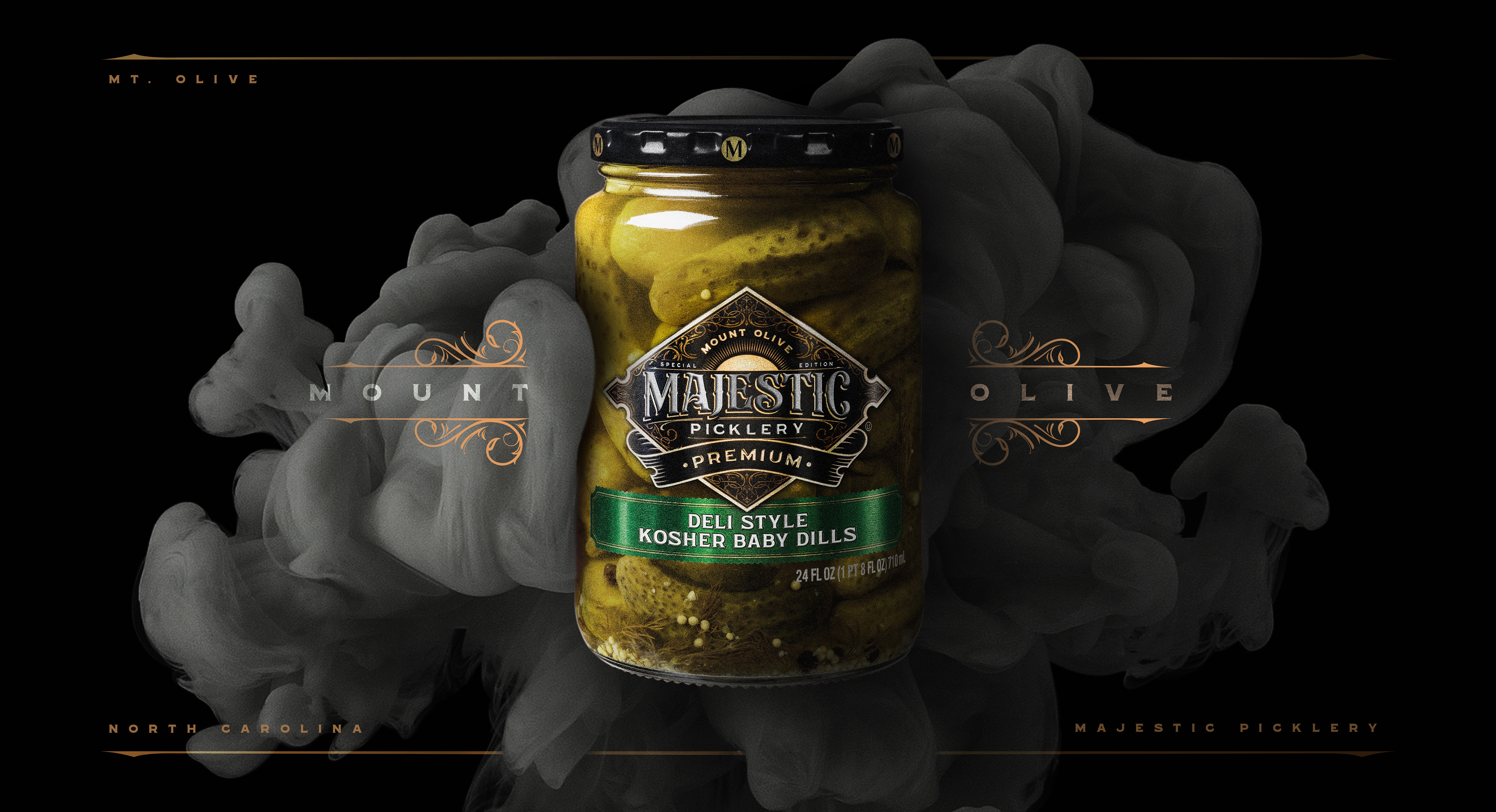
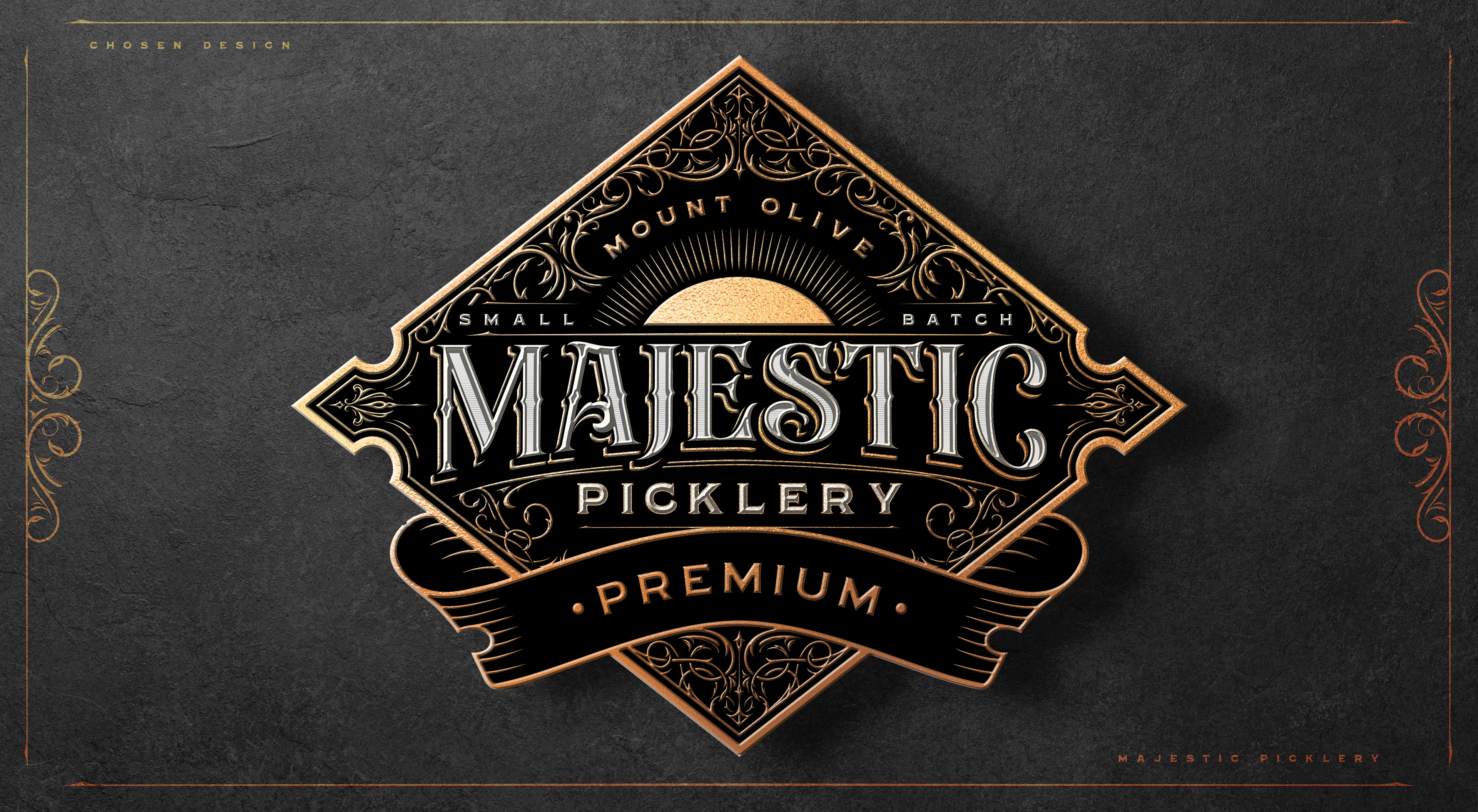
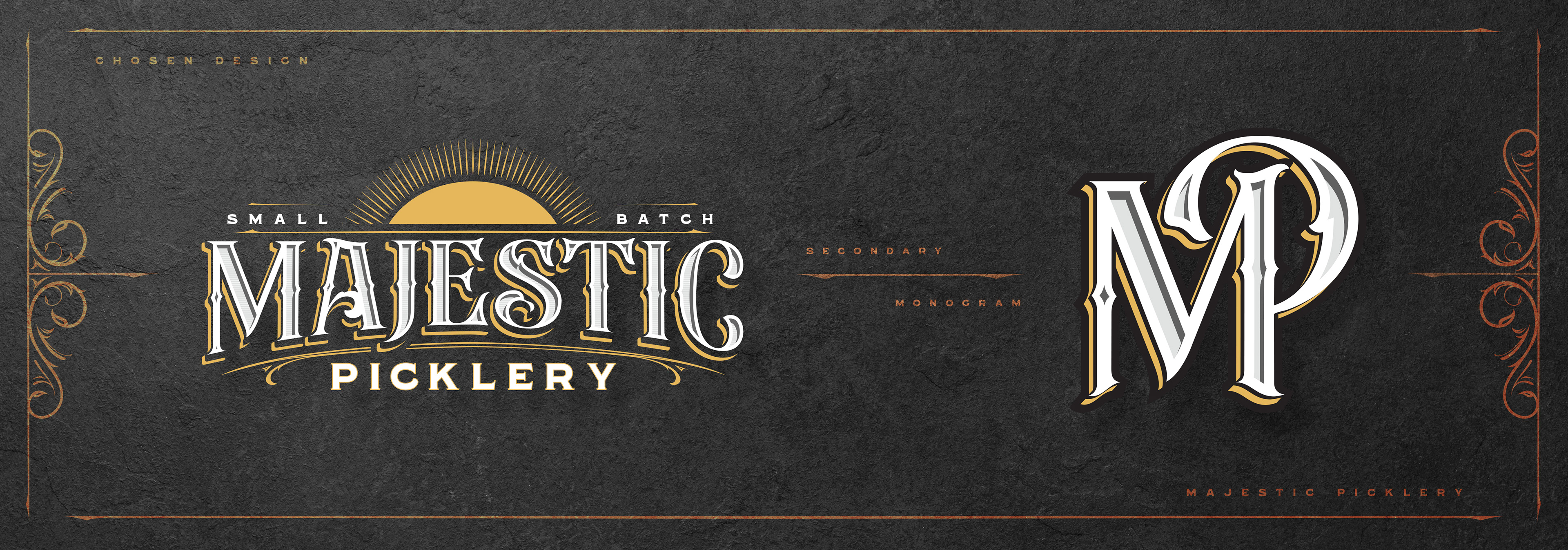
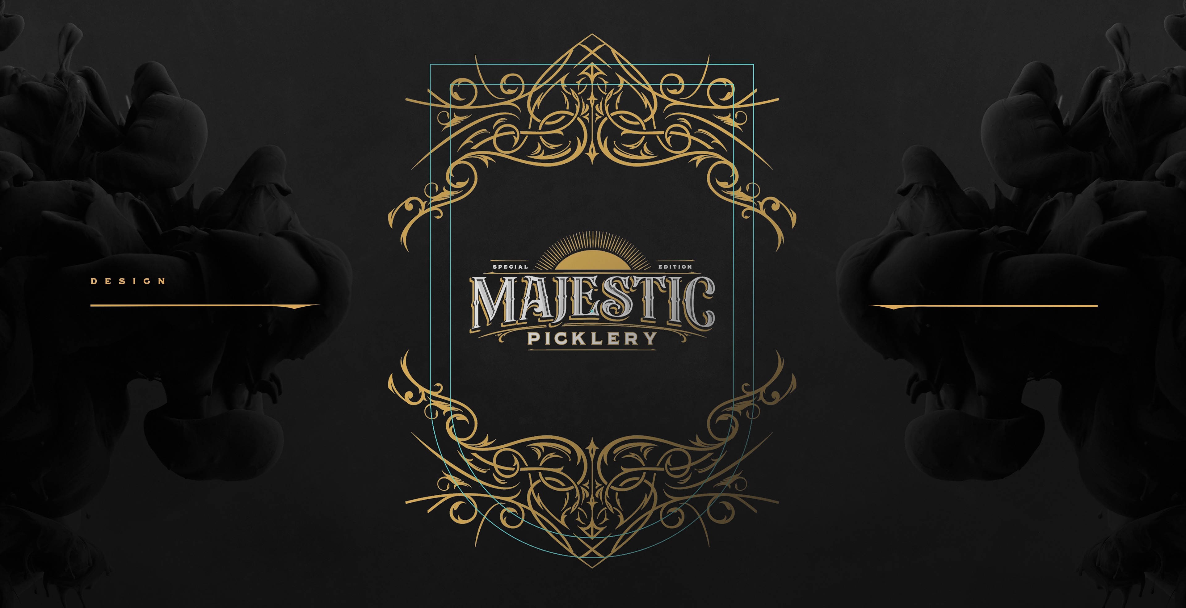
Mt. Olive, the largest independent pickle company in the United States approached me with the task of producing a line of premium pickles that transcended the aesthetic of their historical line up of current products. The goal was to re-imagine the typical pickle label by having it influenced by an elevated design typically suited to a high end whiskey.
L O G O D E S I G N // L A B E L D E S I G N // P A C K A G I N G
- M A J E S T I C P I C K L E S -
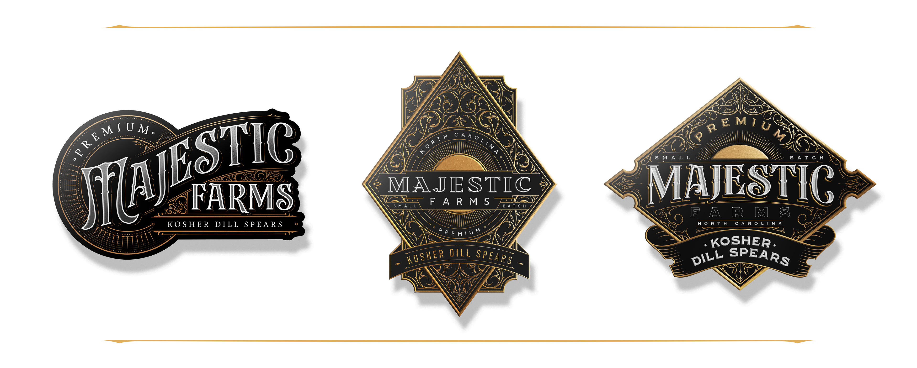
C O N C E P T S
M A J E S T I C P I C K L E S -
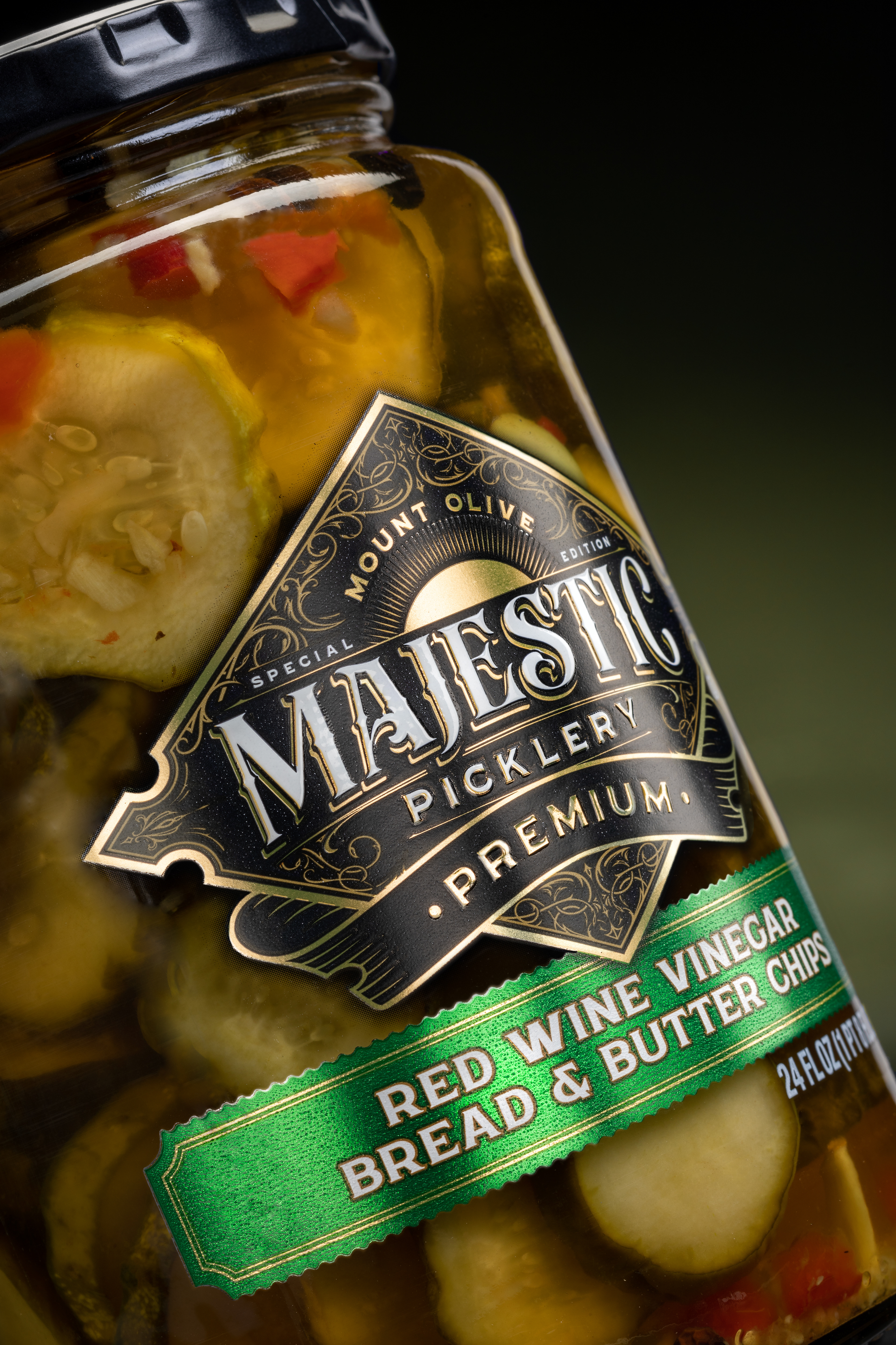
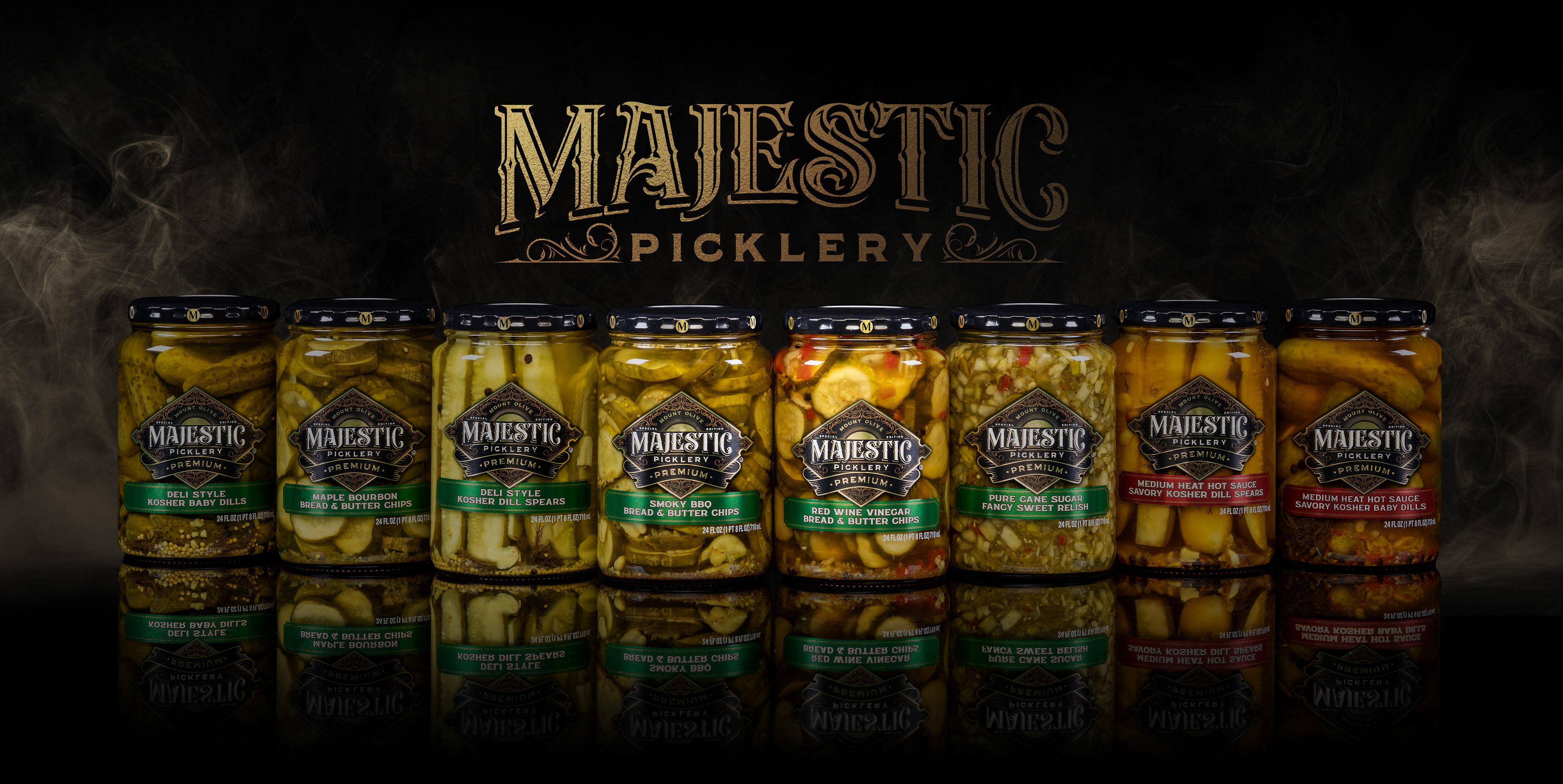
T H E P R O D U C T
|
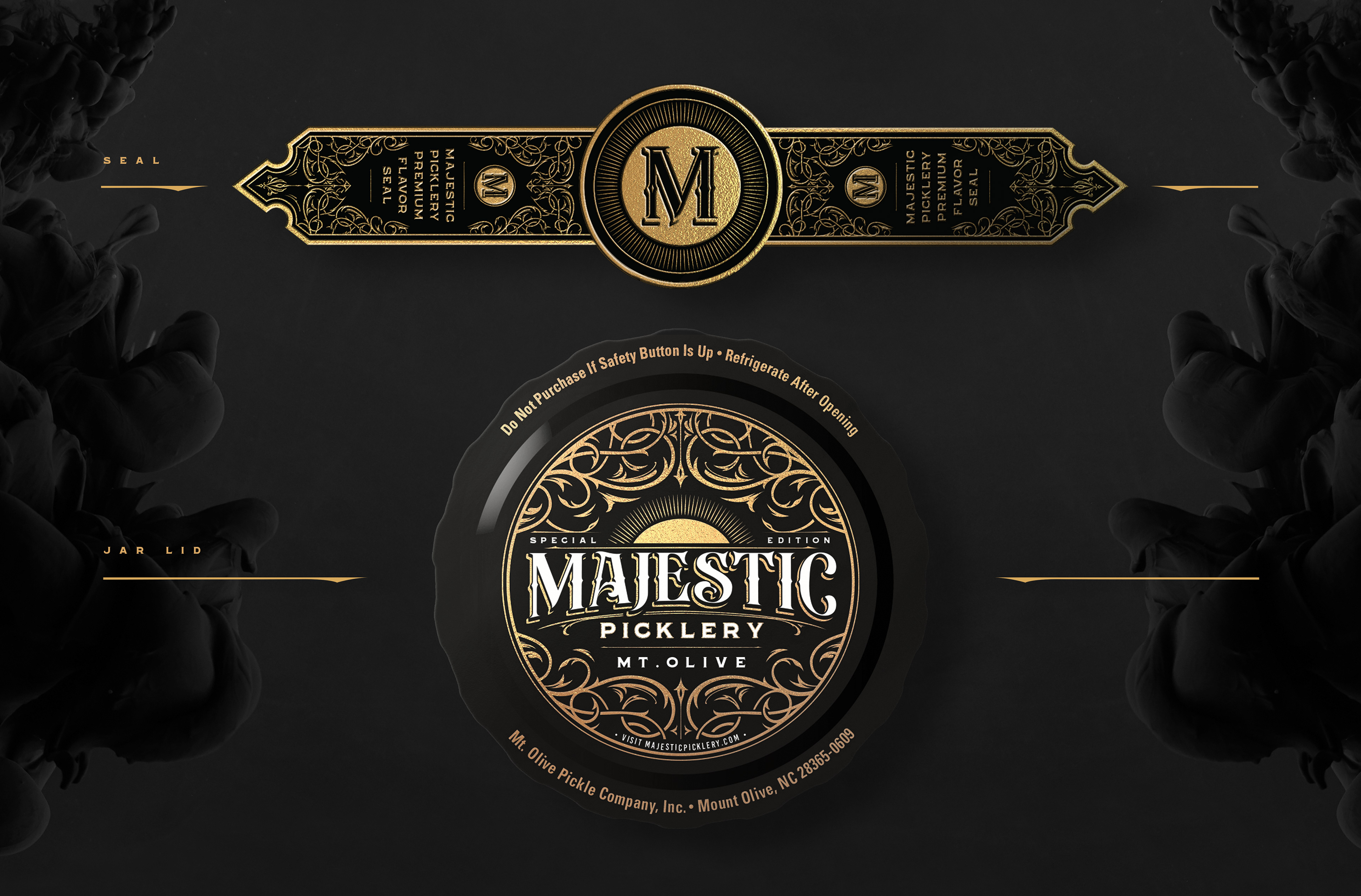
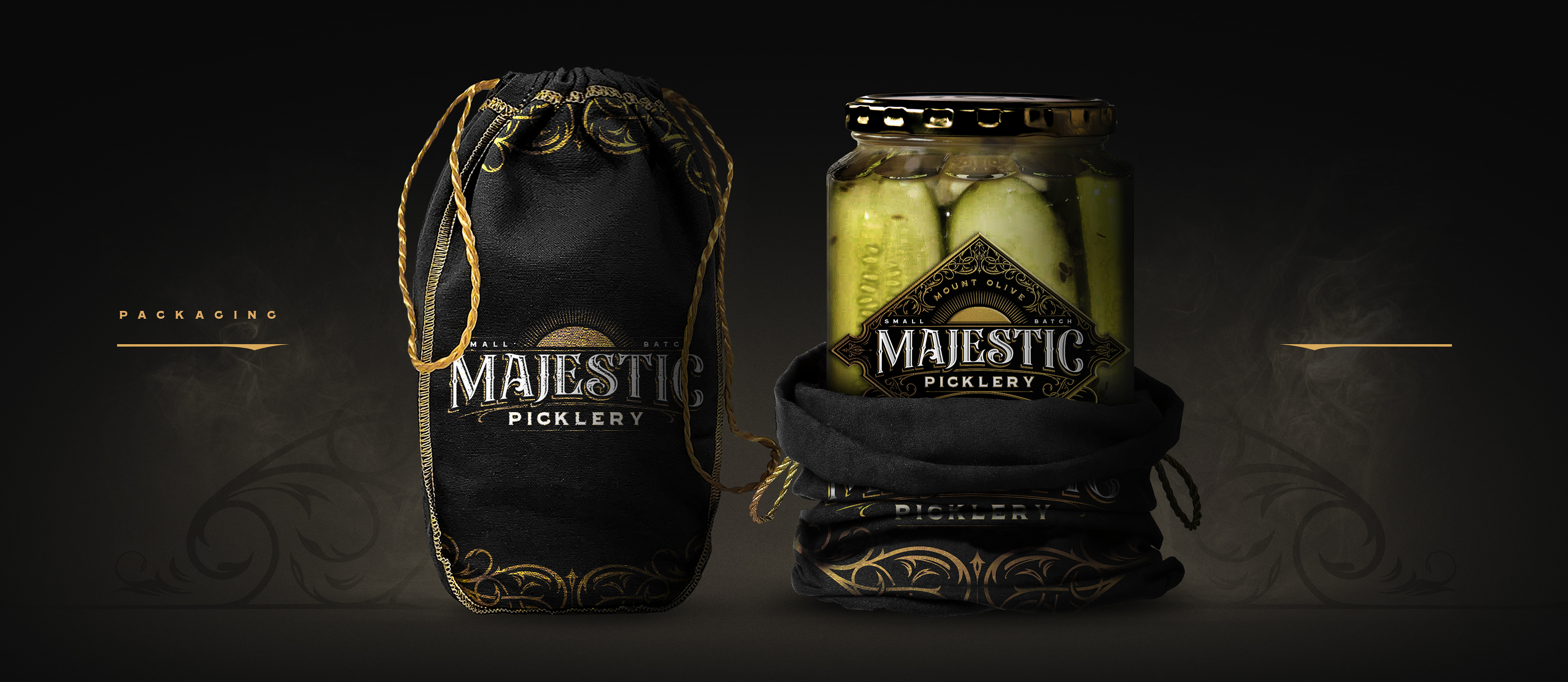
The printing process for the label was very intricate, achieving multiple layers of embossing and foil printing methods that made the jar stand out amongst its competition. A metallic green was used for its wide range of unique and premium flavours while a red was used for the hotter additions.
- M A J E S T I C P I C K L E S -
P A C K A G I N G
- M A J E S T I C P I C K L E S -
S E A L & L I D