- C I G A R S -
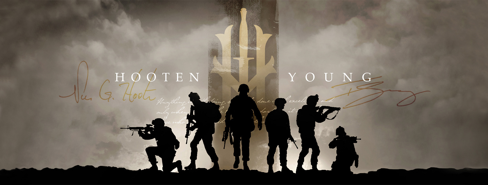
H O O T E N YO U N G
|
Hooten Young is a brand of honor and a tribute to those who have fought for and served their country. The brand was conceived by Tim Young and his business partner, former Master Sergeant Norm Hooten, whose heroic actions were depicted in the block-buster movie ‘Black Hawk Down.’
L O G O D E S I G N // I L L U S T R A T I O N // P A C K A G E D E S I G N // D I R E C T O R O F P H O T O G R A P H Y
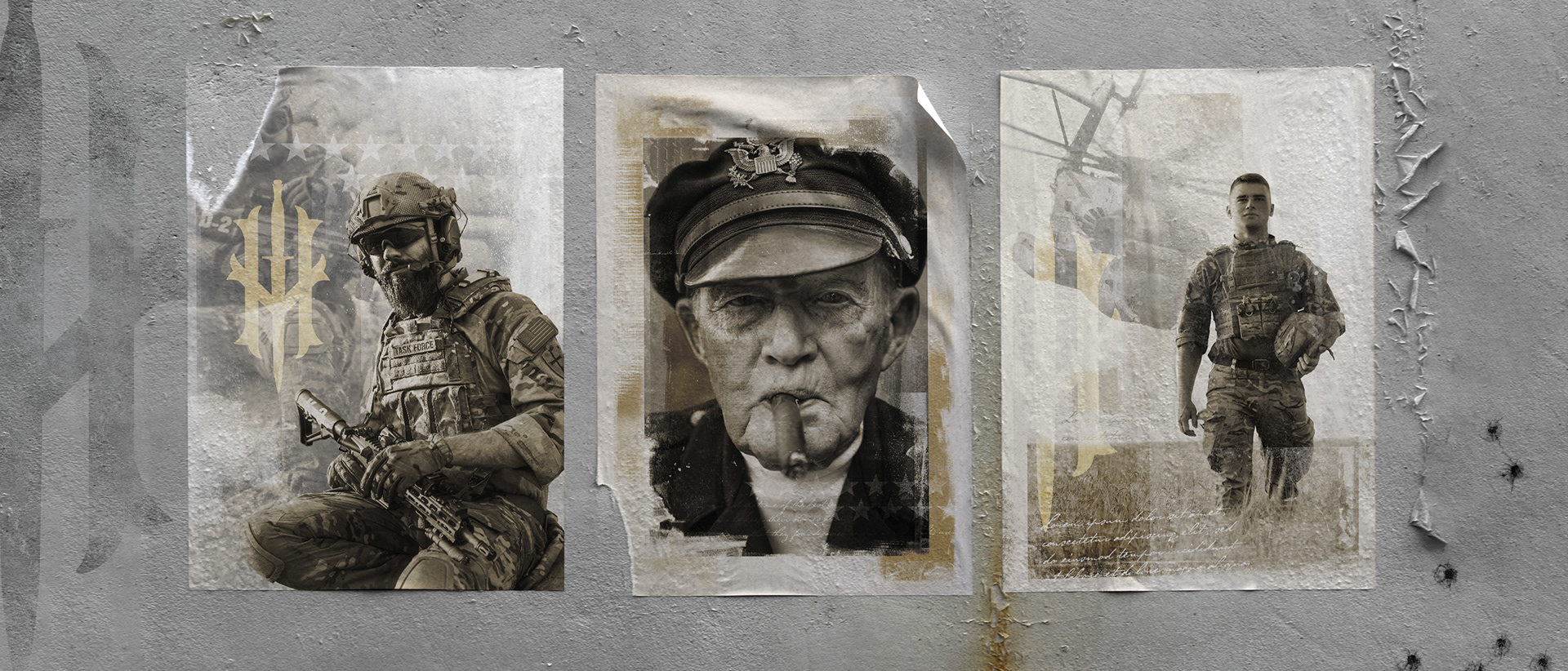
- H O O T E N Y O U N G -
B R A N D E X P L O R A T I O N
|
To find the tone of this brand, I started by creating a series of compositions in the form of posters. Inspired by historical wartime images, I found its feel by depicting service men and women in sepia tones with a slightly grunge aesthetic. With that in mind, I added a handwritten typeface to the type kit, similar to what you would find scrawled on the back of these photographs, or on letters from the era.
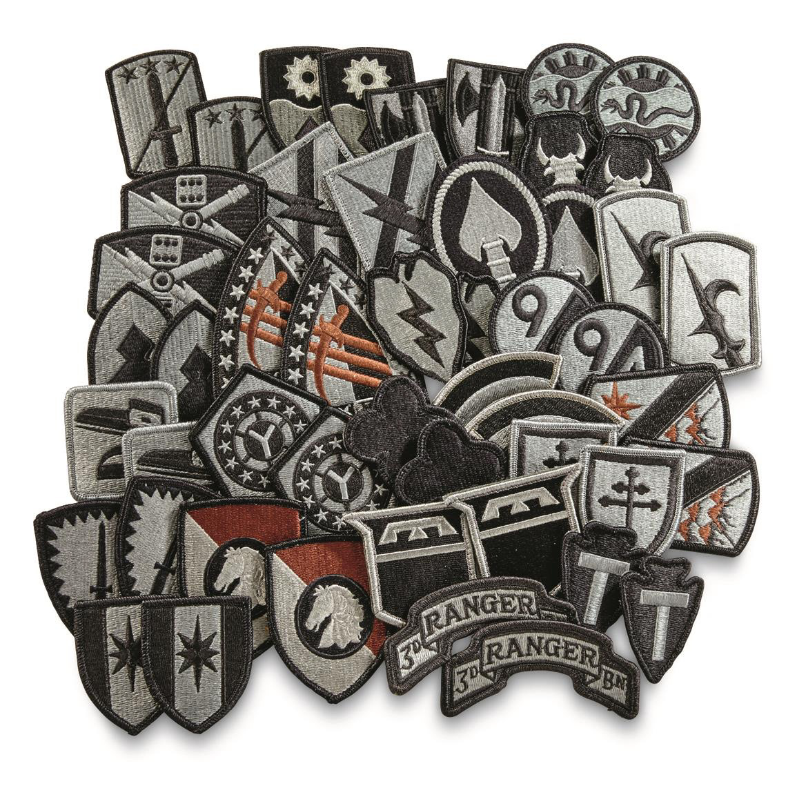
H O O T E N Y O U N G -
P A T C H B R A N D I N G
|
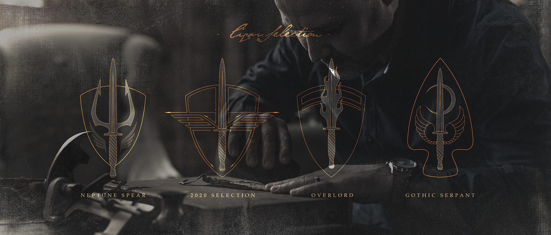
With many future cigar lines on the horizon, an approach was taken to brand and name each box after a historical military mission, honoring those who fought as well as educating the buyers. Each box was branded with a patch logo designed as a hybrid between the mission itself and the Fairbairn-Sykes fighting knife that is found in the Hooten Young logo.
- H O O T E N Y O U N G -
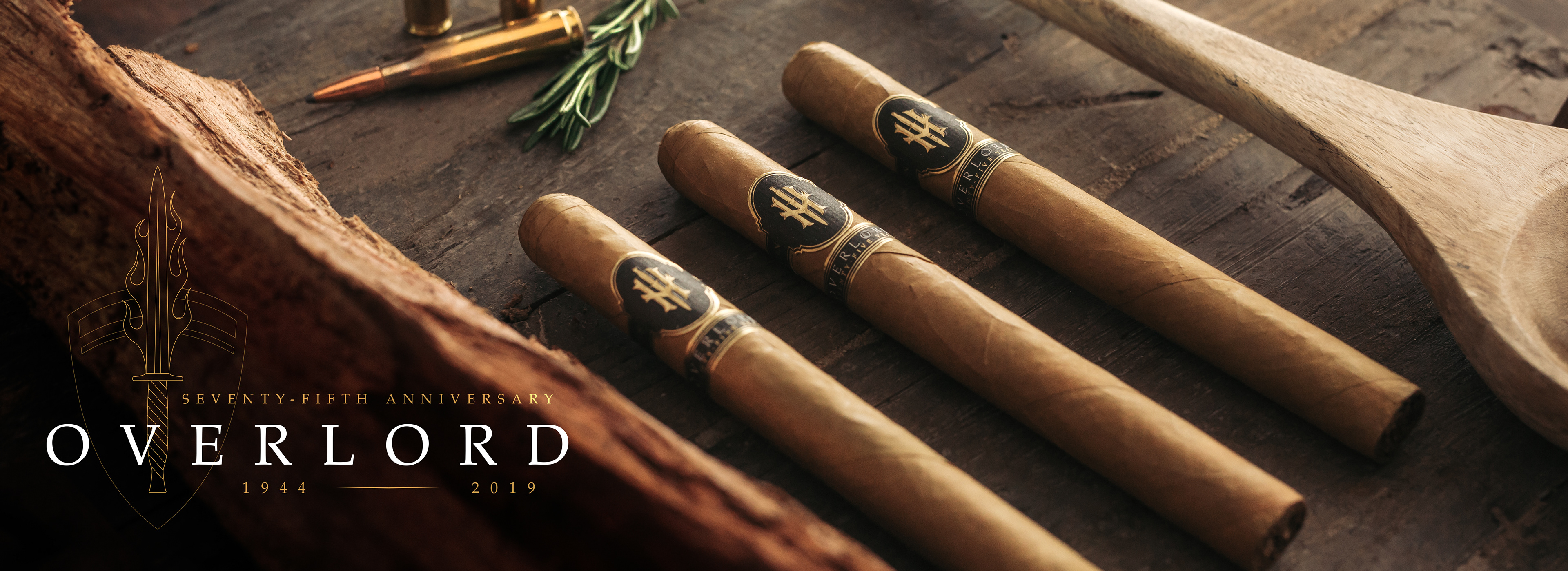
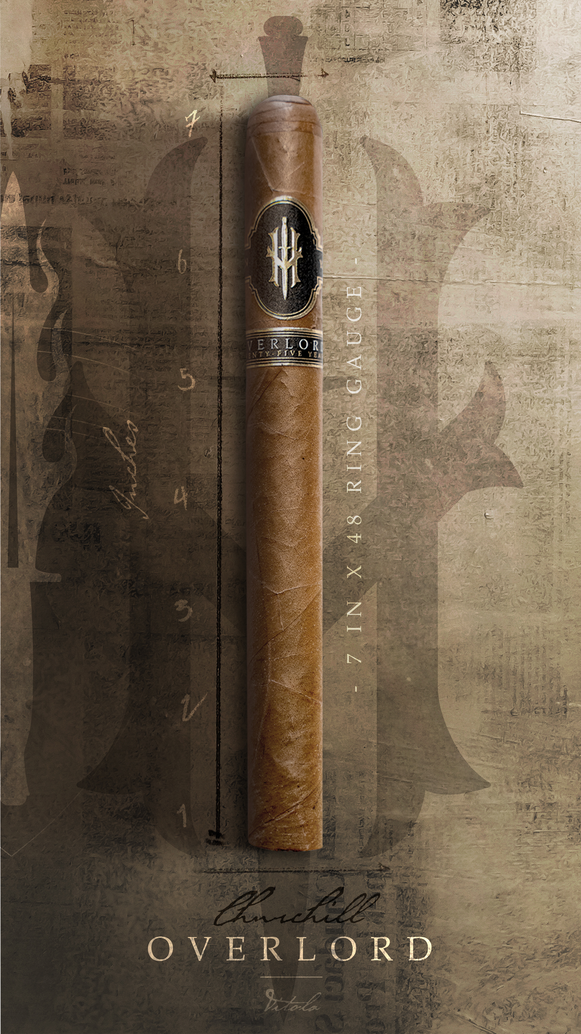
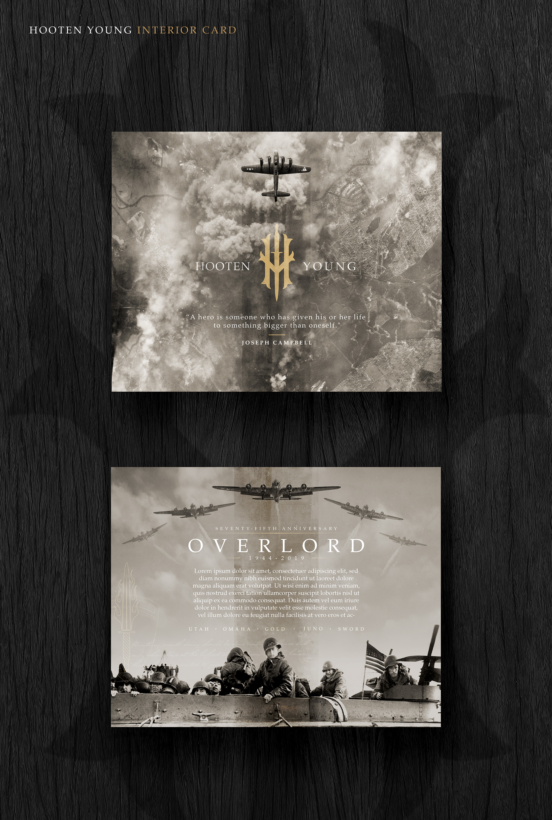
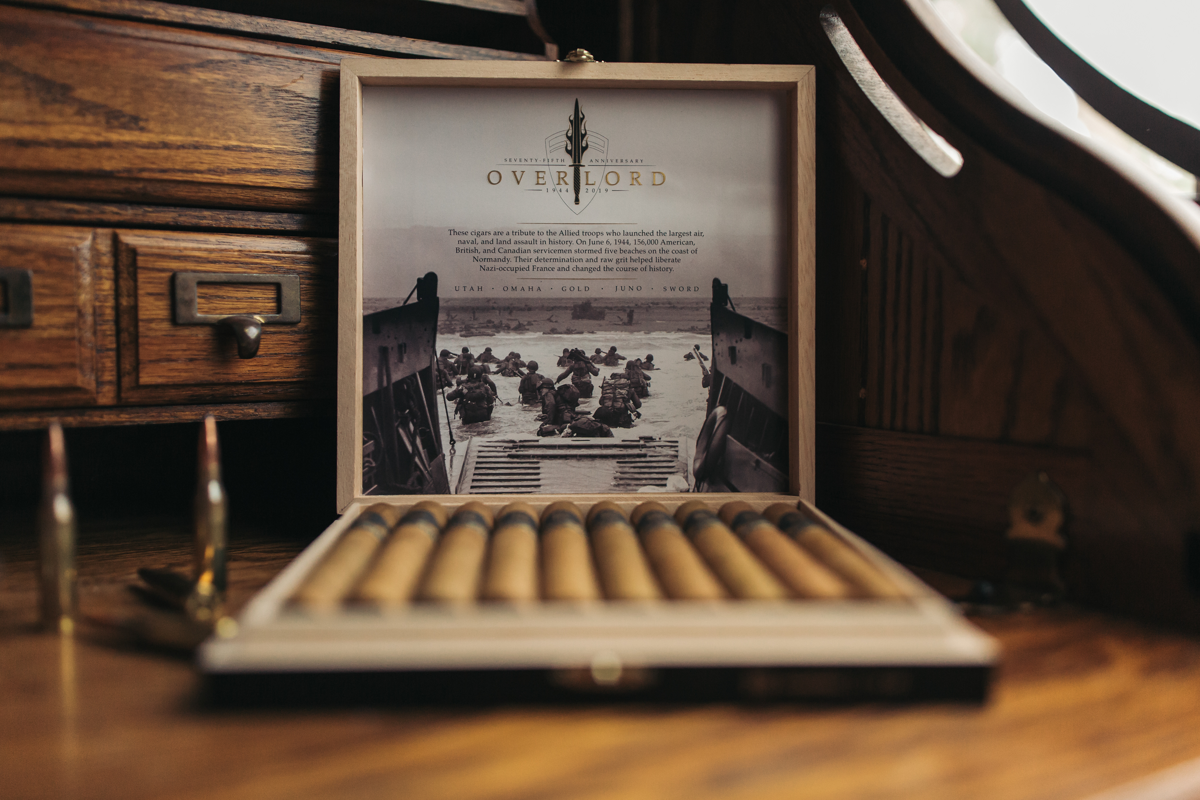
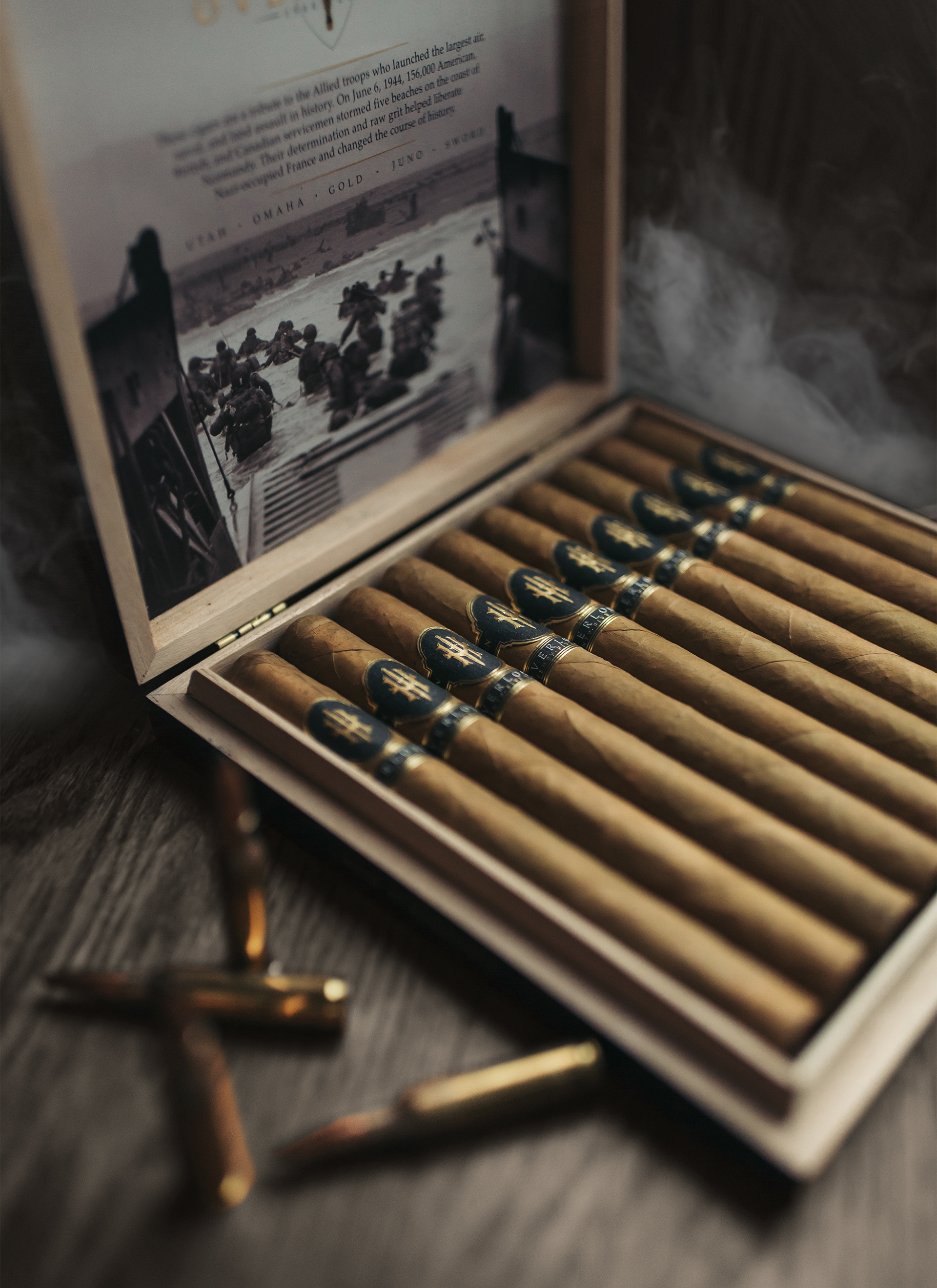
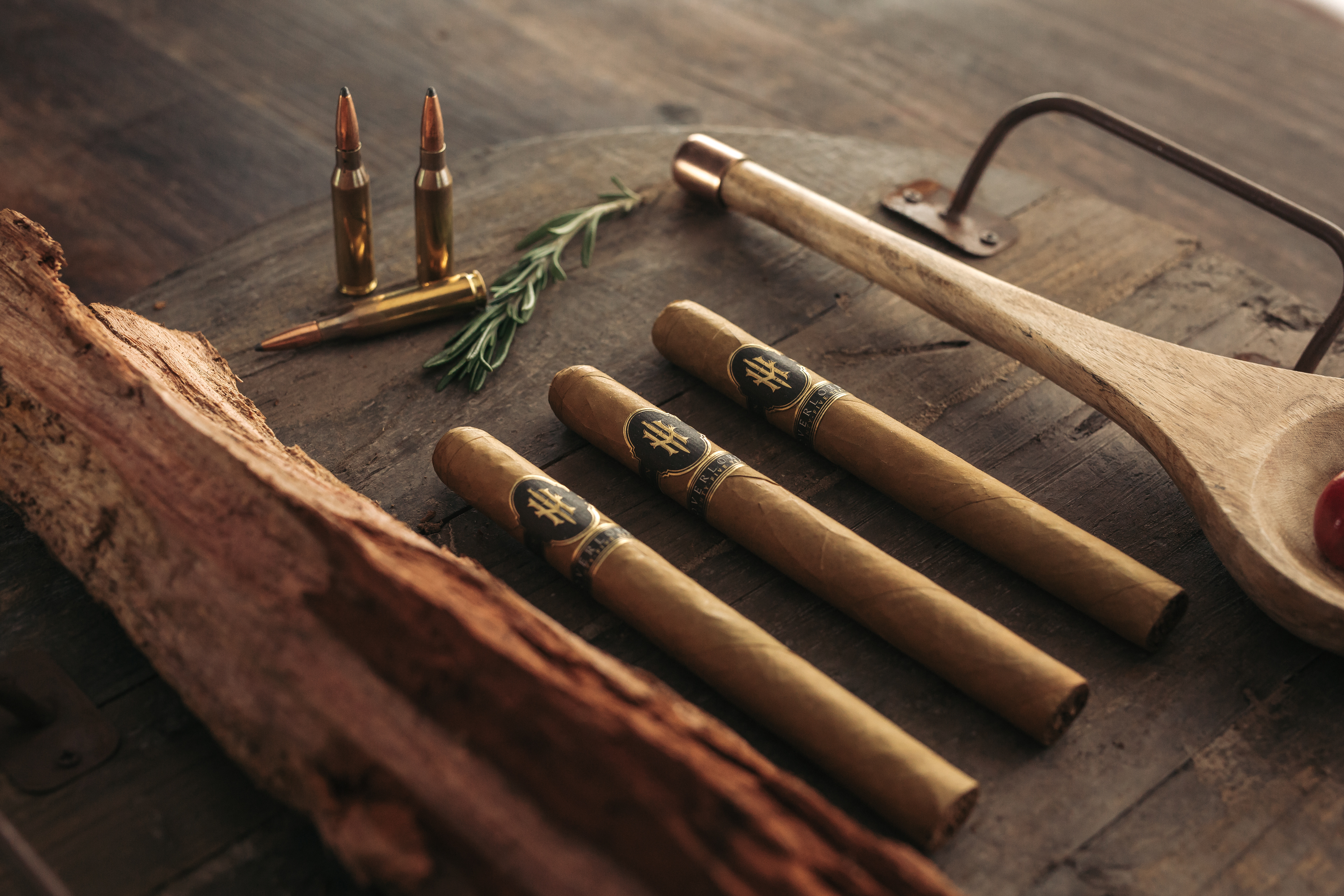
O V E R L O R D C I G A R S
|
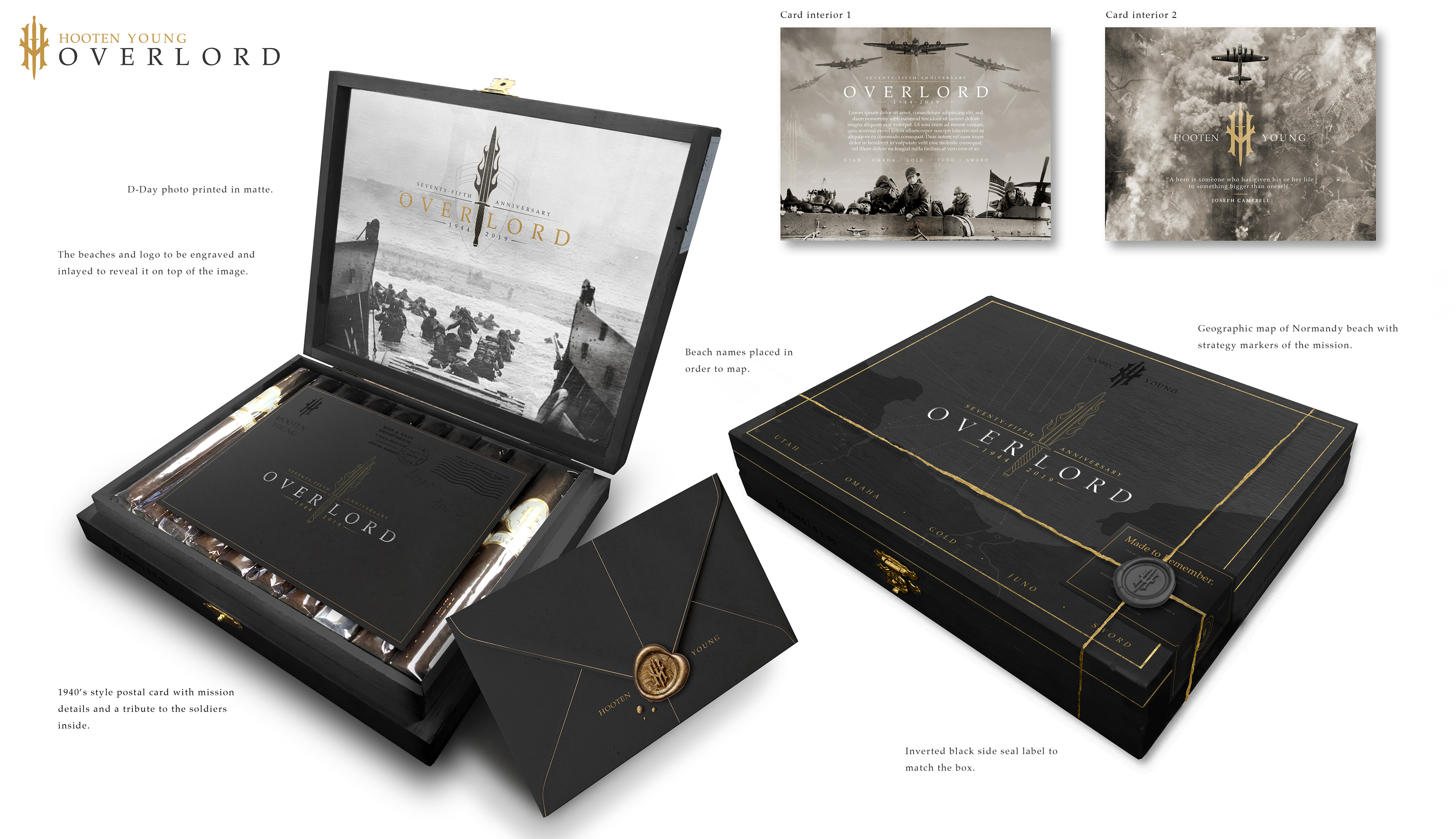
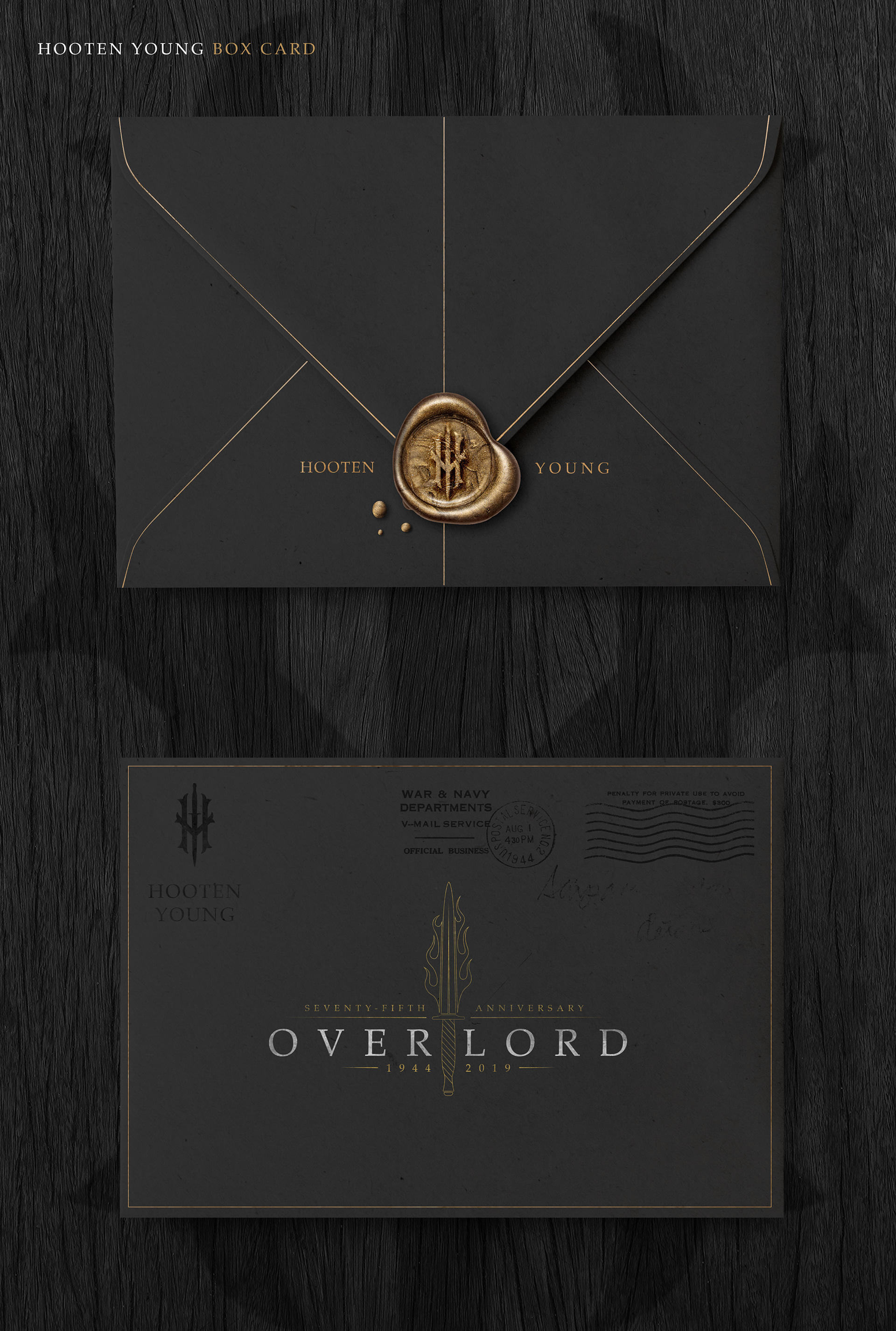
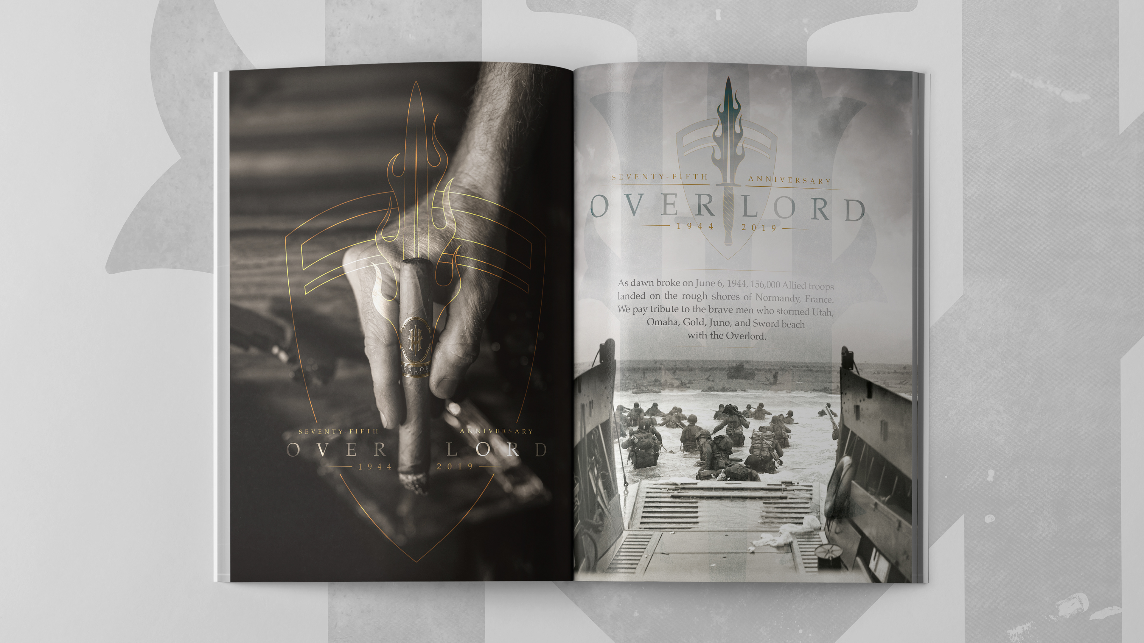
This line of cigars was created to commemorate the 75th anniversary of the D-day landing. The fight on the beaches of Normandy will forever be a story of immense courage, thus it was imperative that we showed respect to those who fought.
H O O T E N Y O U N G -
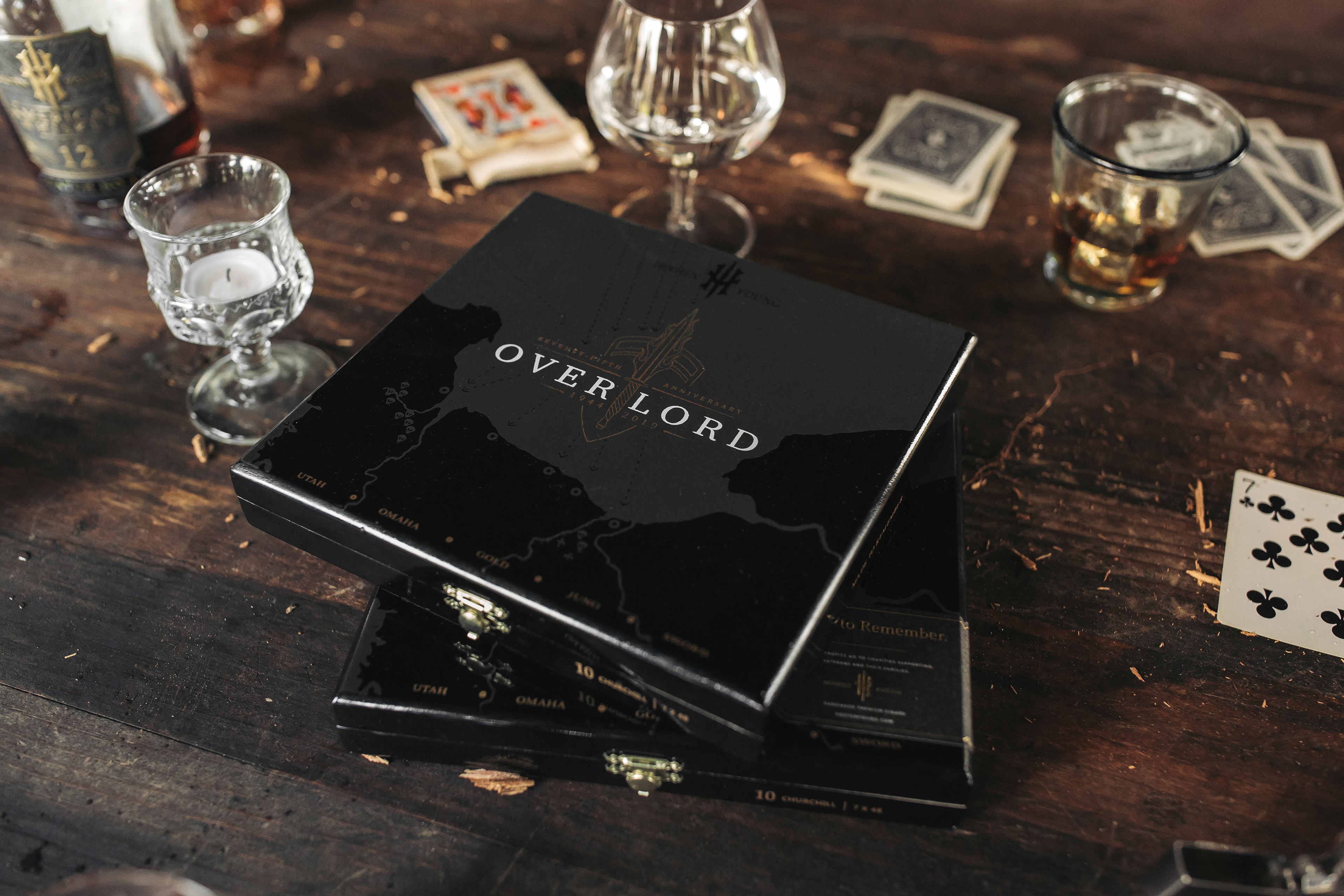
O V E R L O R D
|
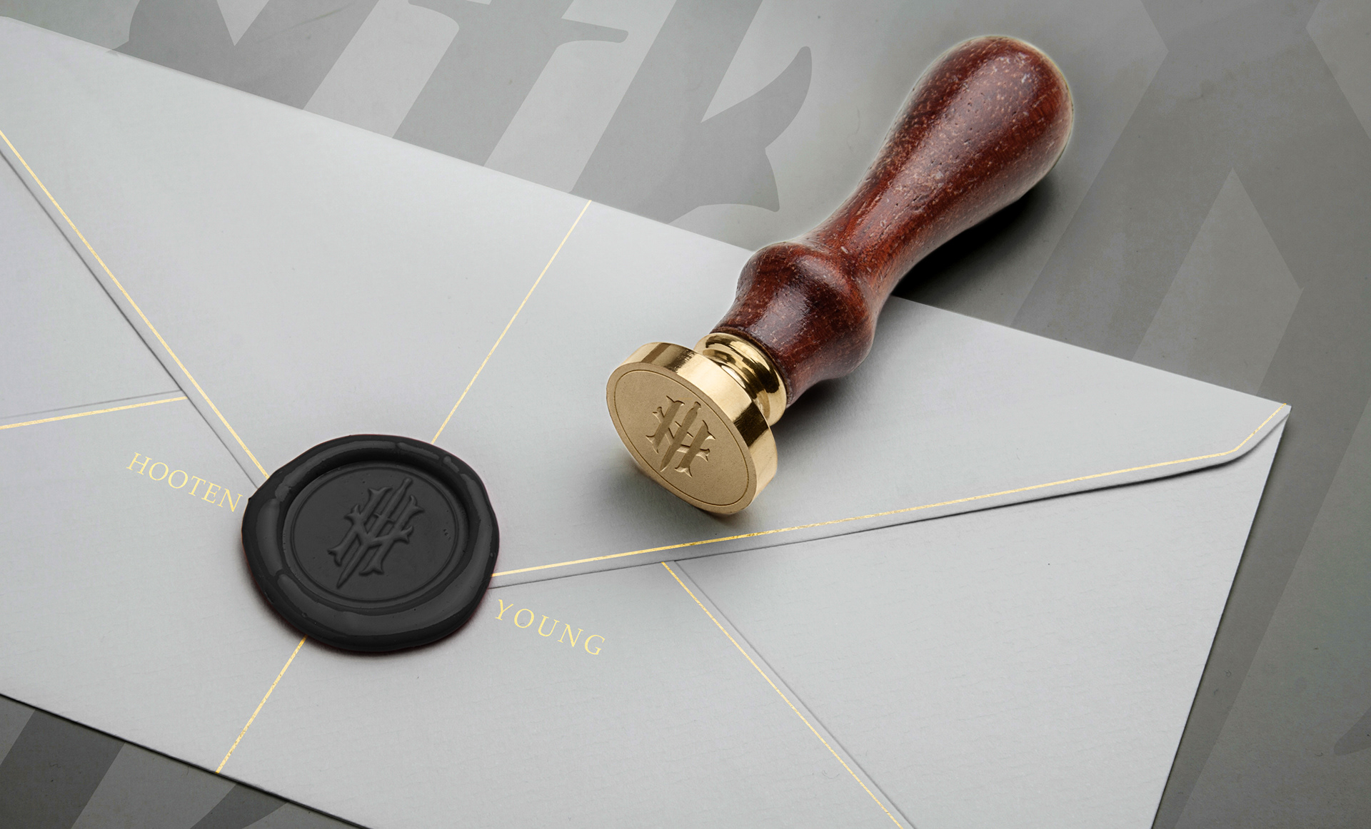
The flaming knife was a symbol on the original patch from the 1940's. The top of the box has the illustration of the beach and the strategic routes taken by those who fought. Also engraved into the box are names of the beaches that where stormed.
I wanted the box to look like a parcel from the 40s with gold twine and a wax seal stamp. Keeping with that theme, there would also be a letter inside with the exact printing stamps used on wartime letters. Inside the envelope would be the mission facts and a statement honoring the troops and lives lost.
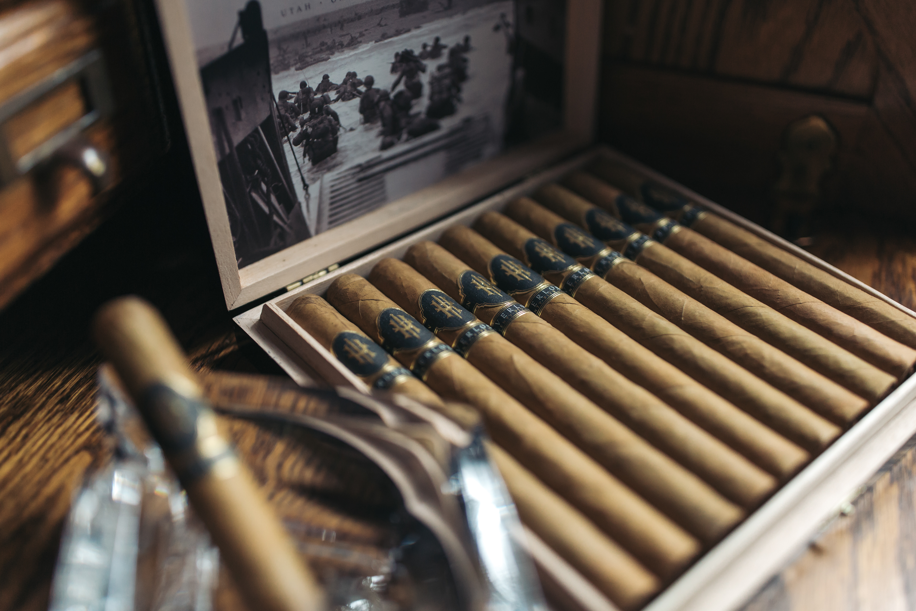
Inside the box, I wanted to portray the point of view from inside the duck boats used in the landing, giving the viewer a true sense of what was experienced.
- O V E R L O R D -
P H O T O G R A P H Y
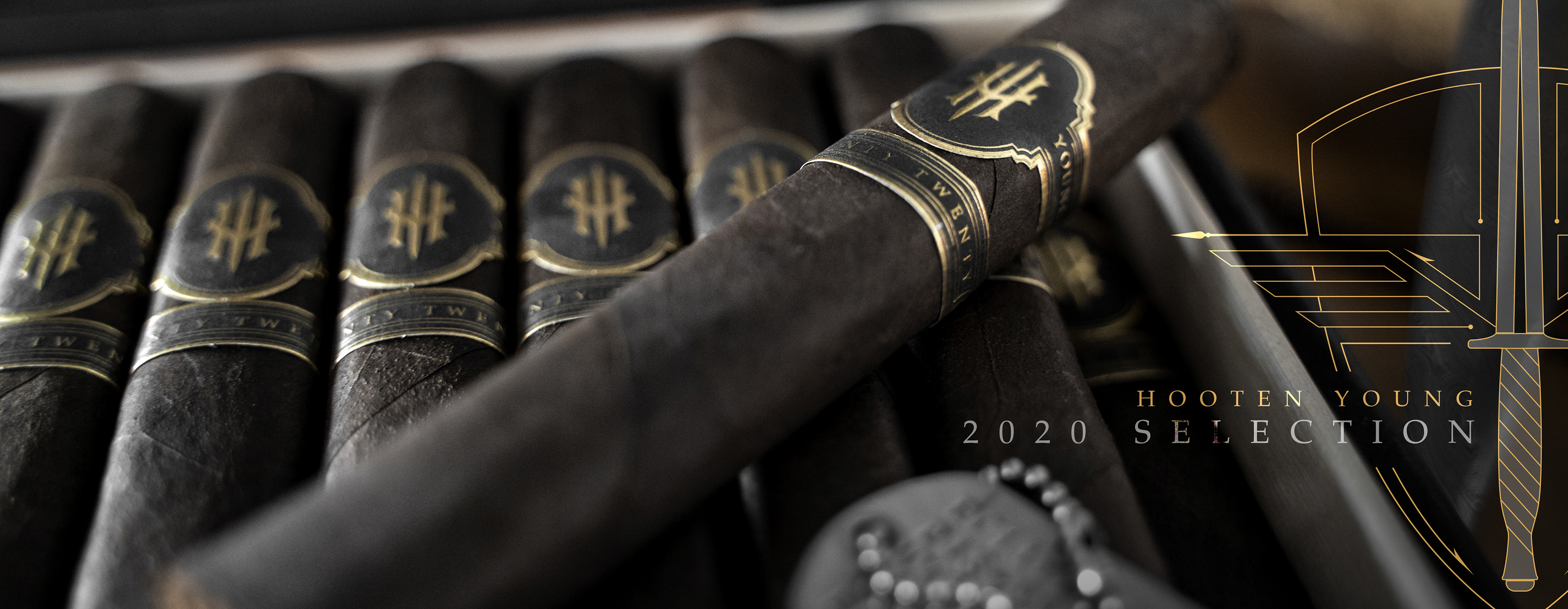
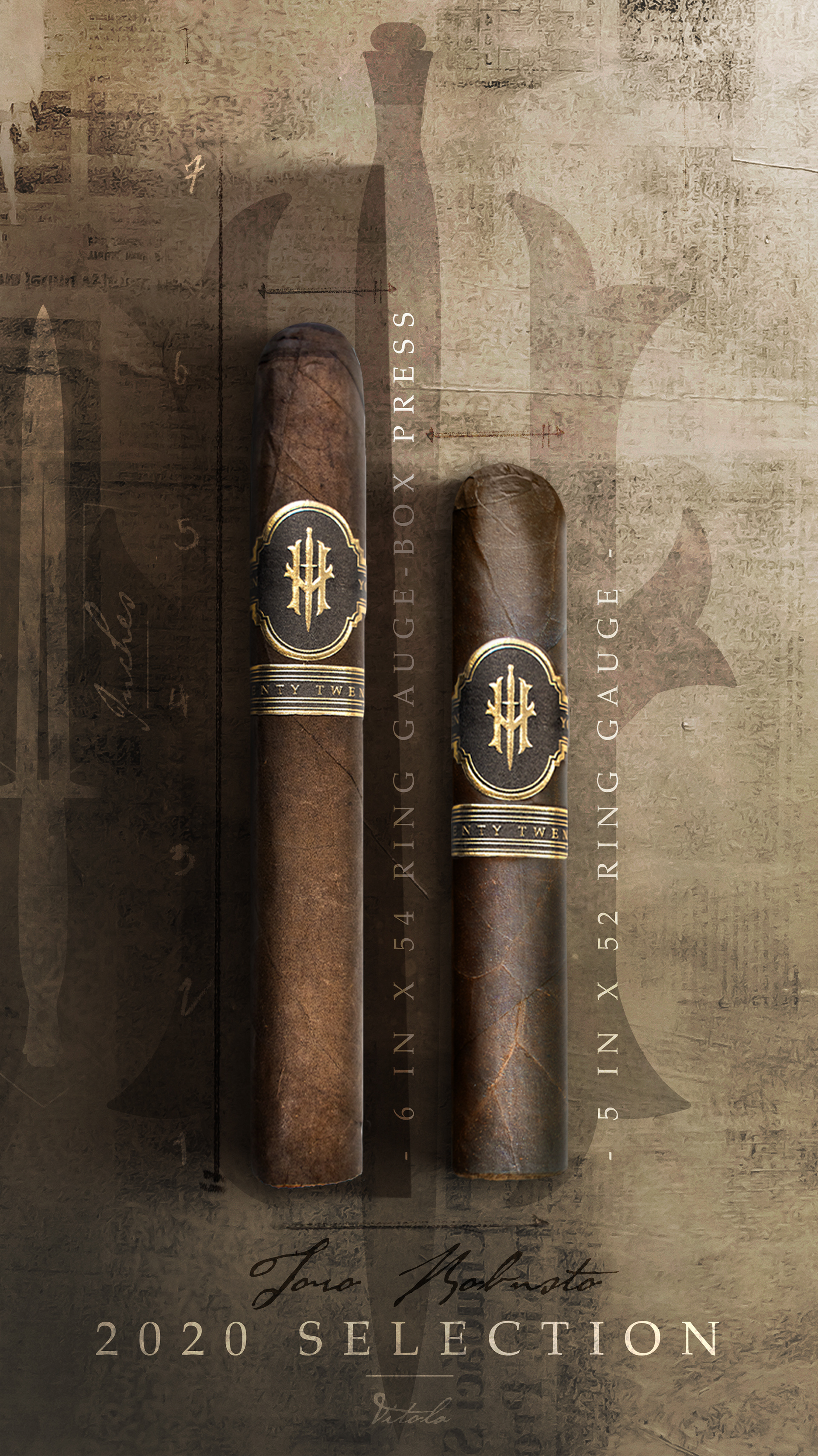
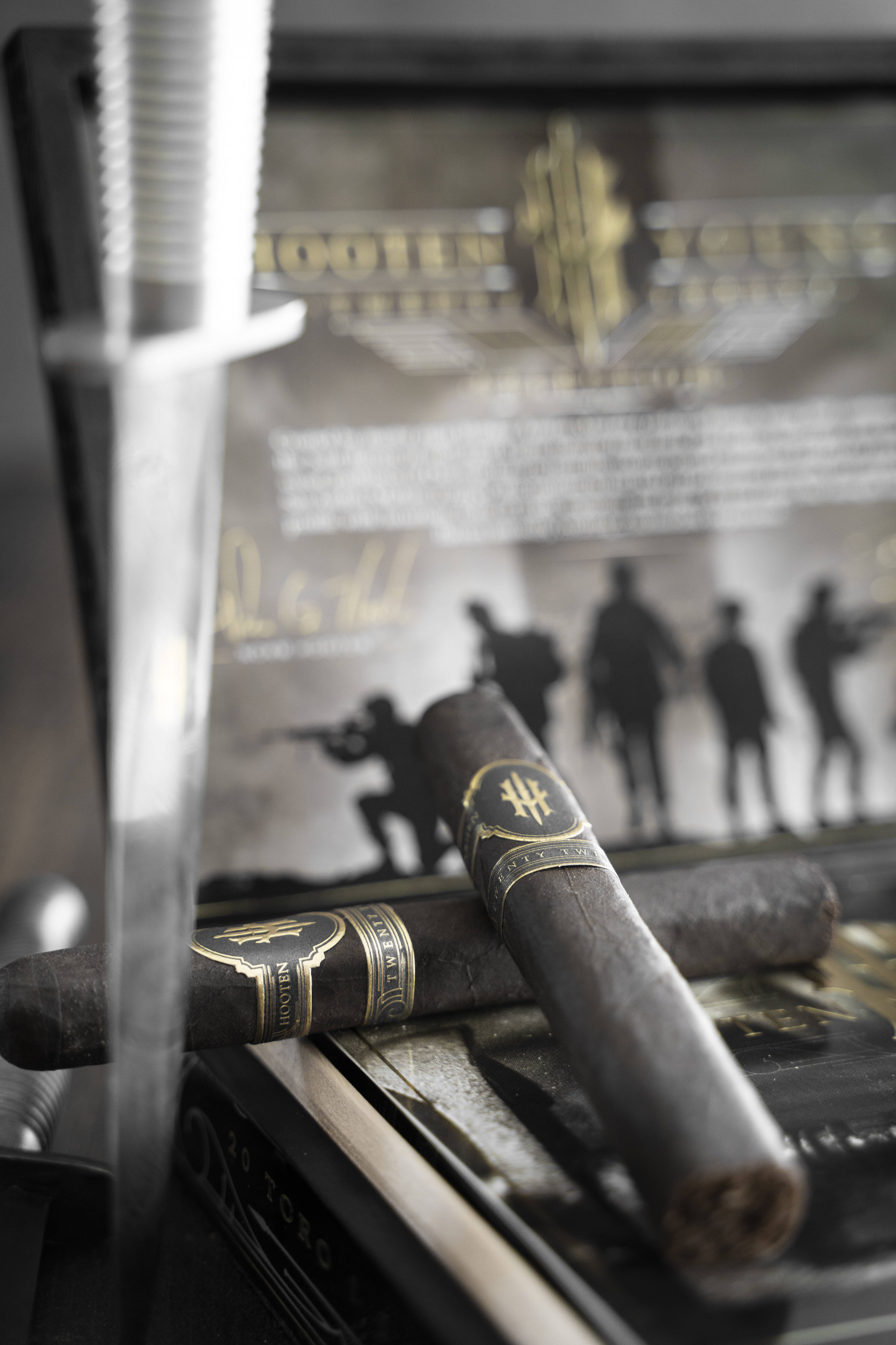
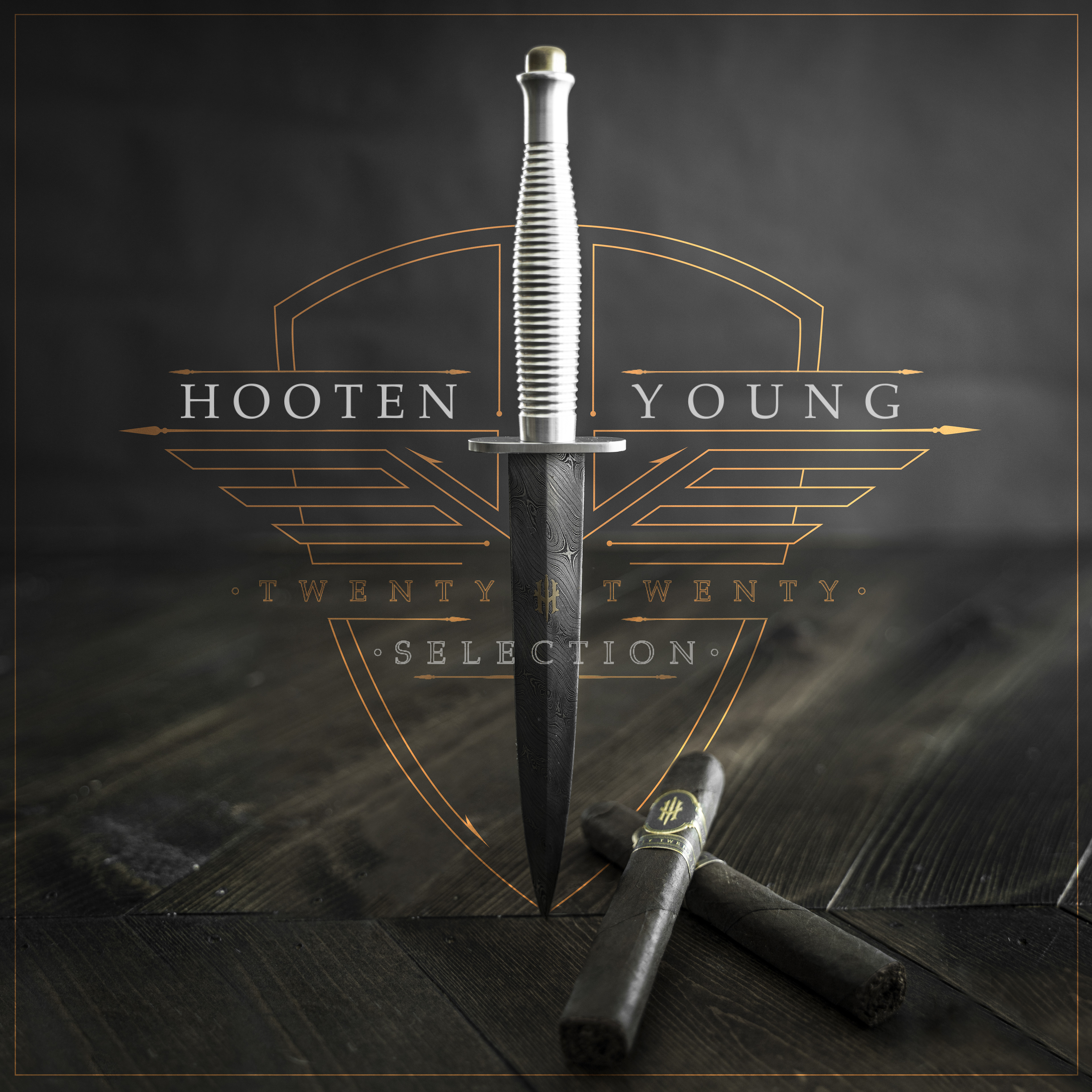
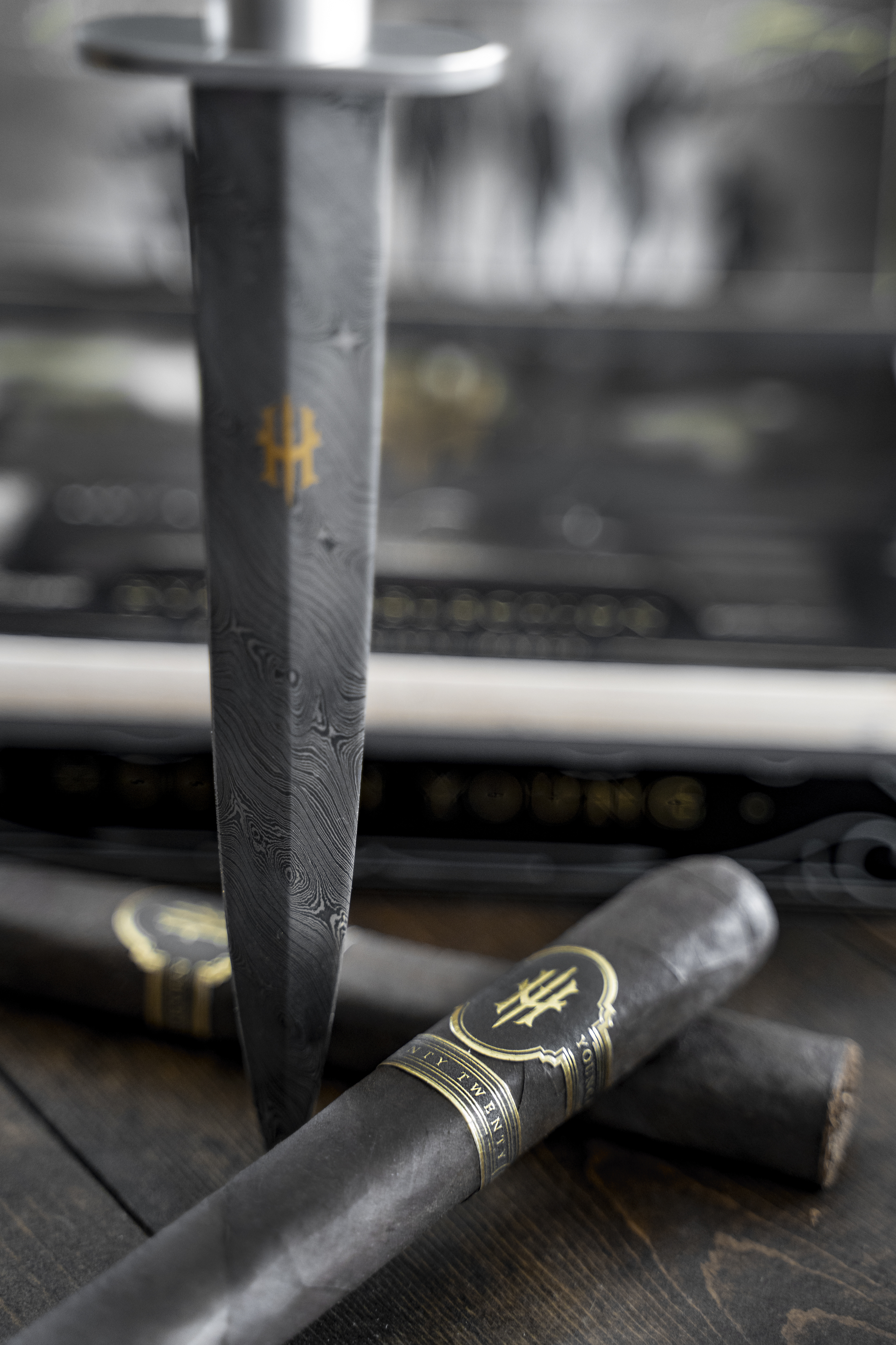
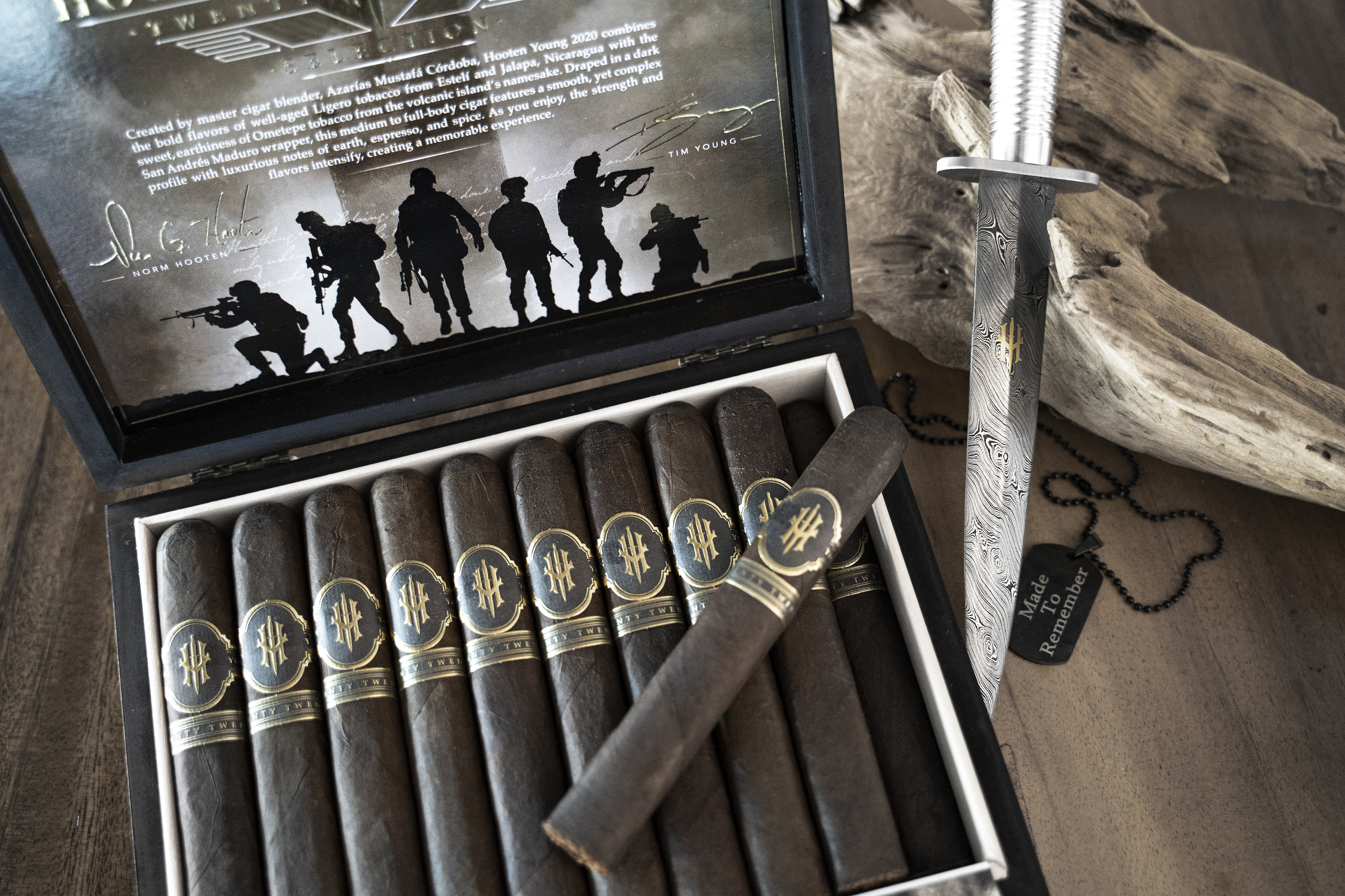
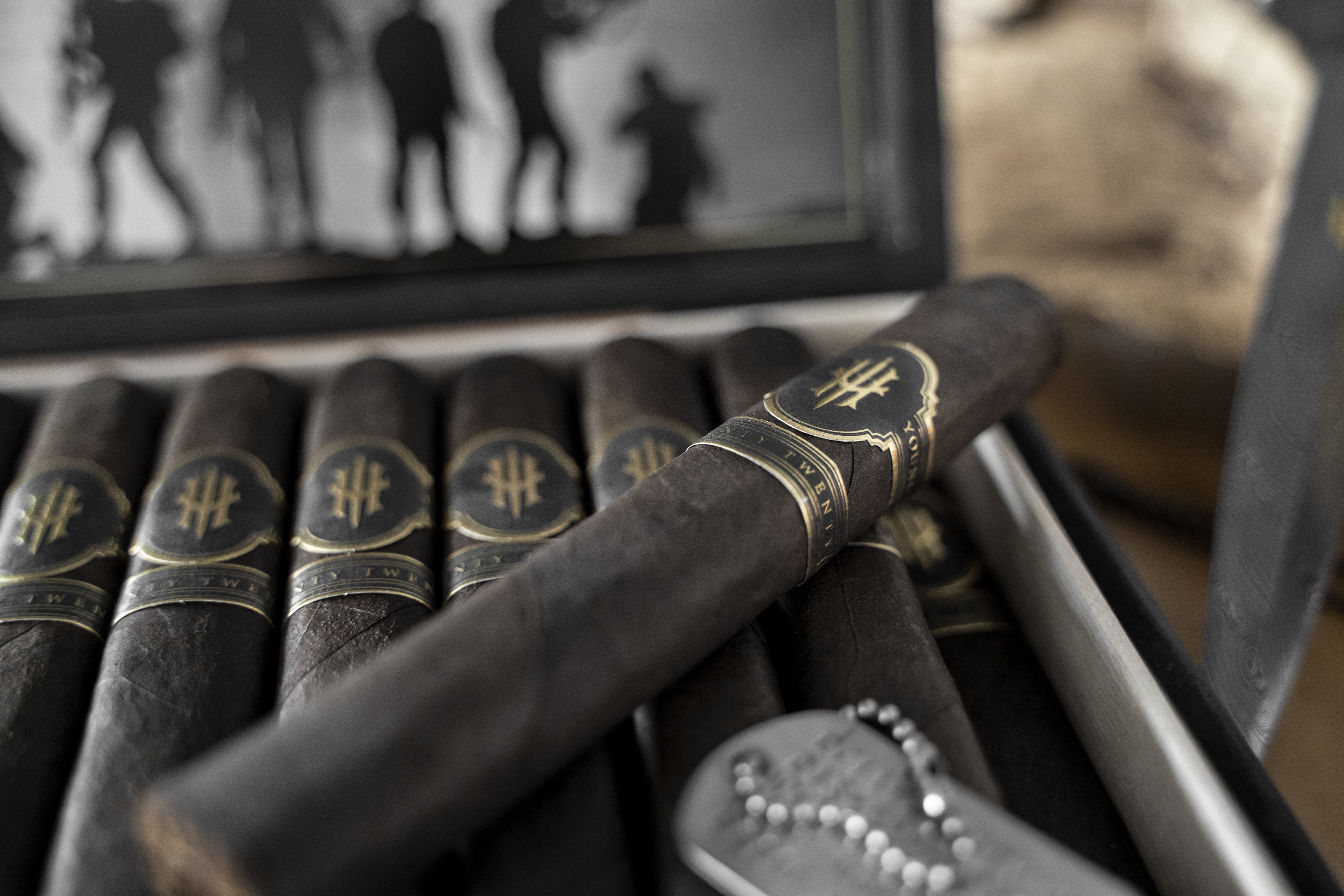
- H O O T E N Y O U N G -
2 0 2 0 s e l e c t i o n
|
The 2020 Selection was the first line that wasn’t centred around a mission. Its purpose was to honor the master cigar maker and to deliver another high quality product.
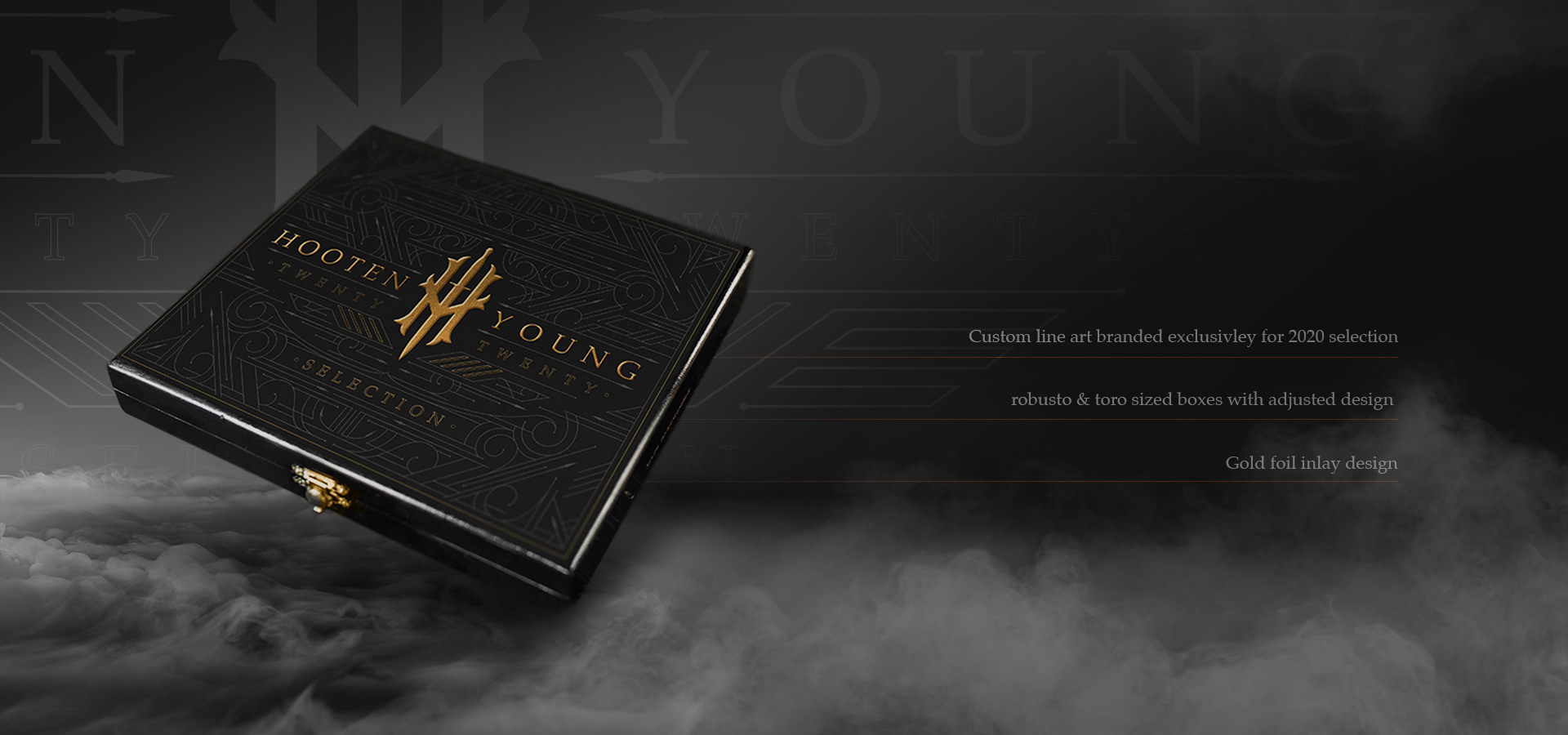
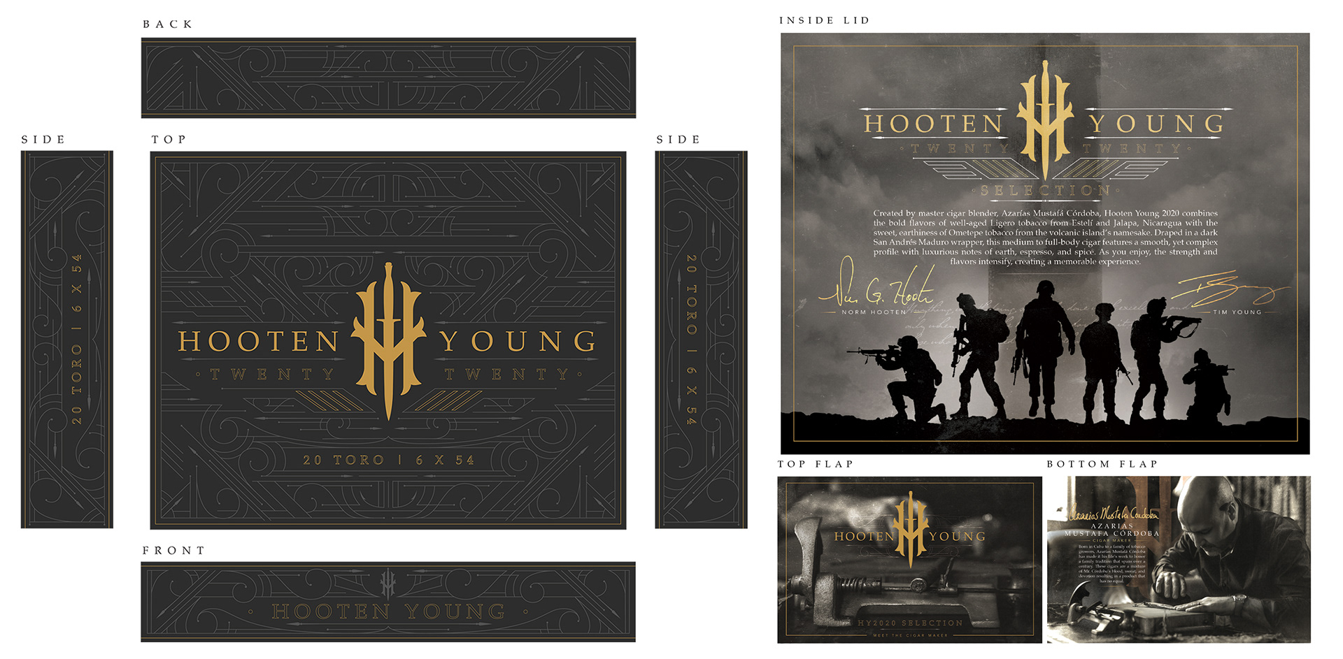
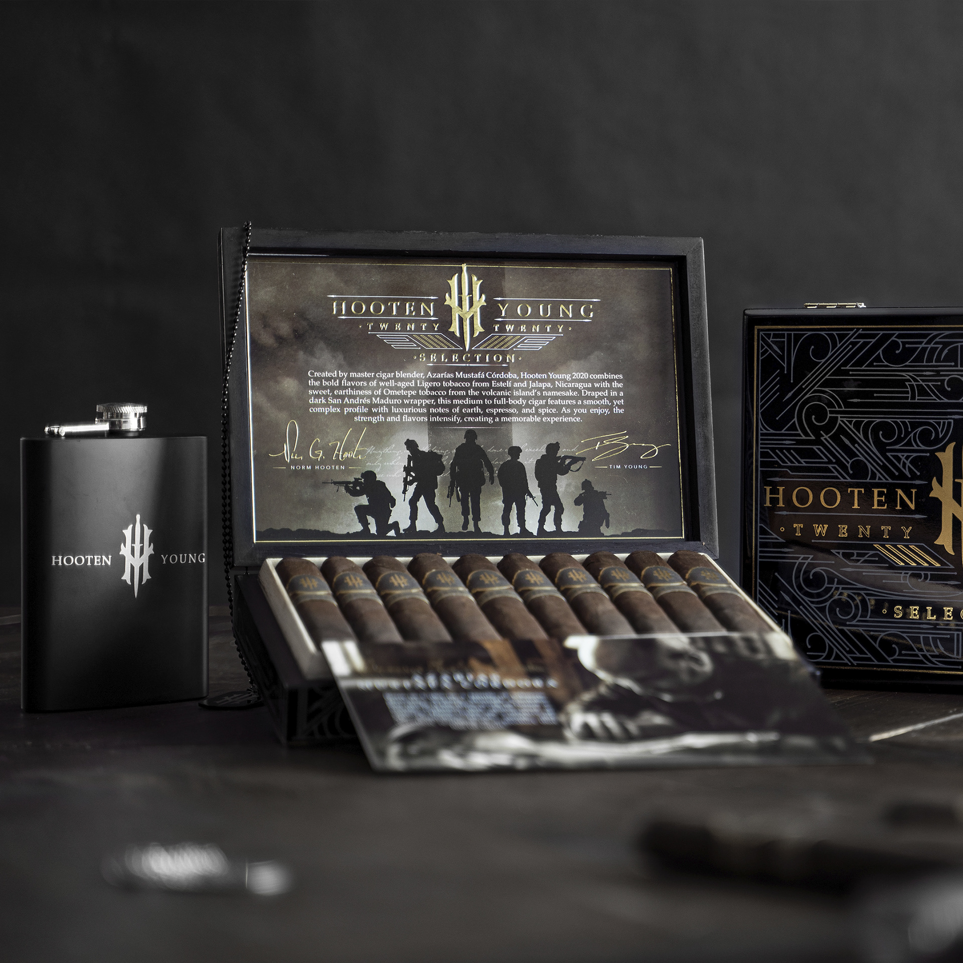
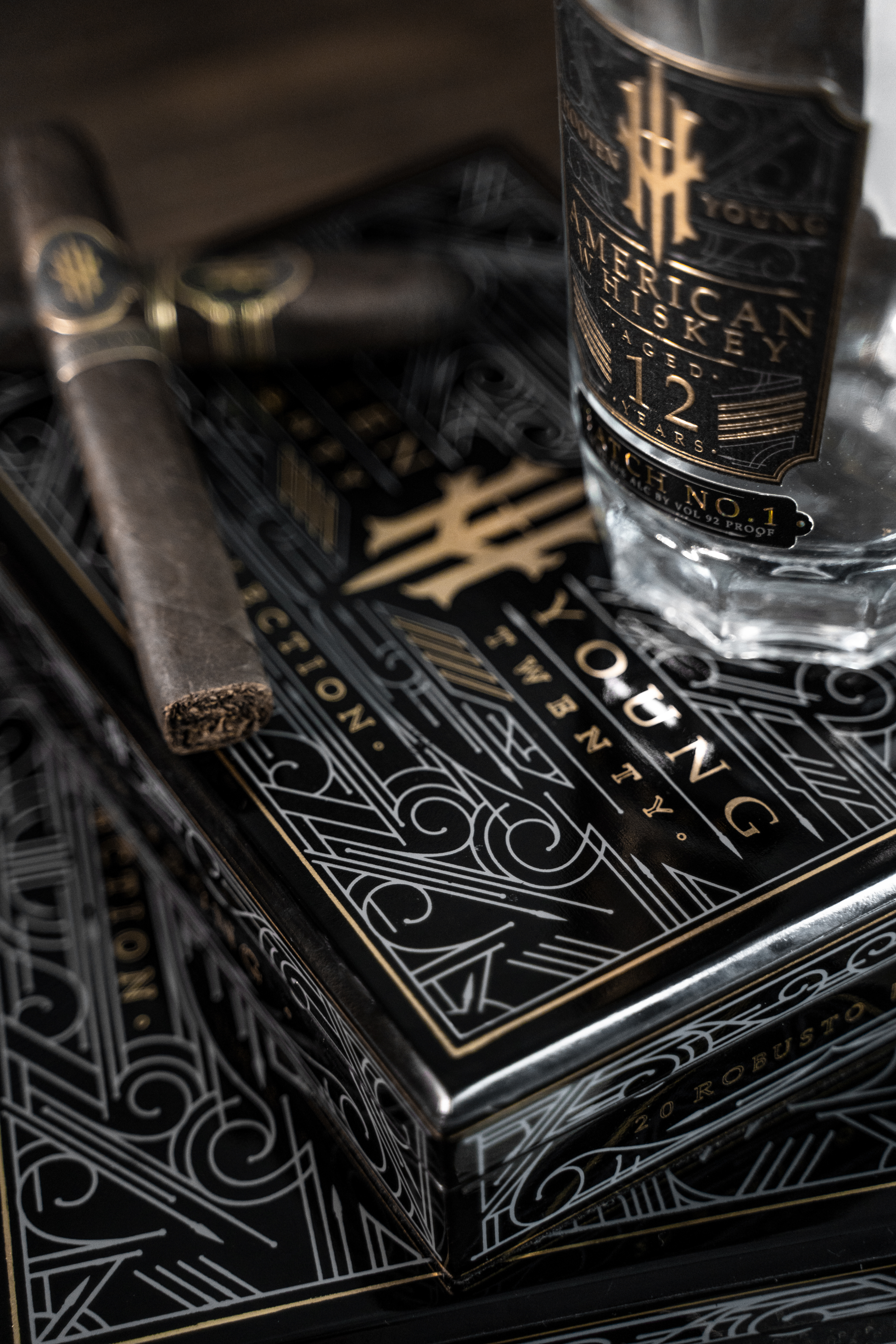
H O O T E N Y O U N G -
2 0 2 0 s e l e c t i o n
|
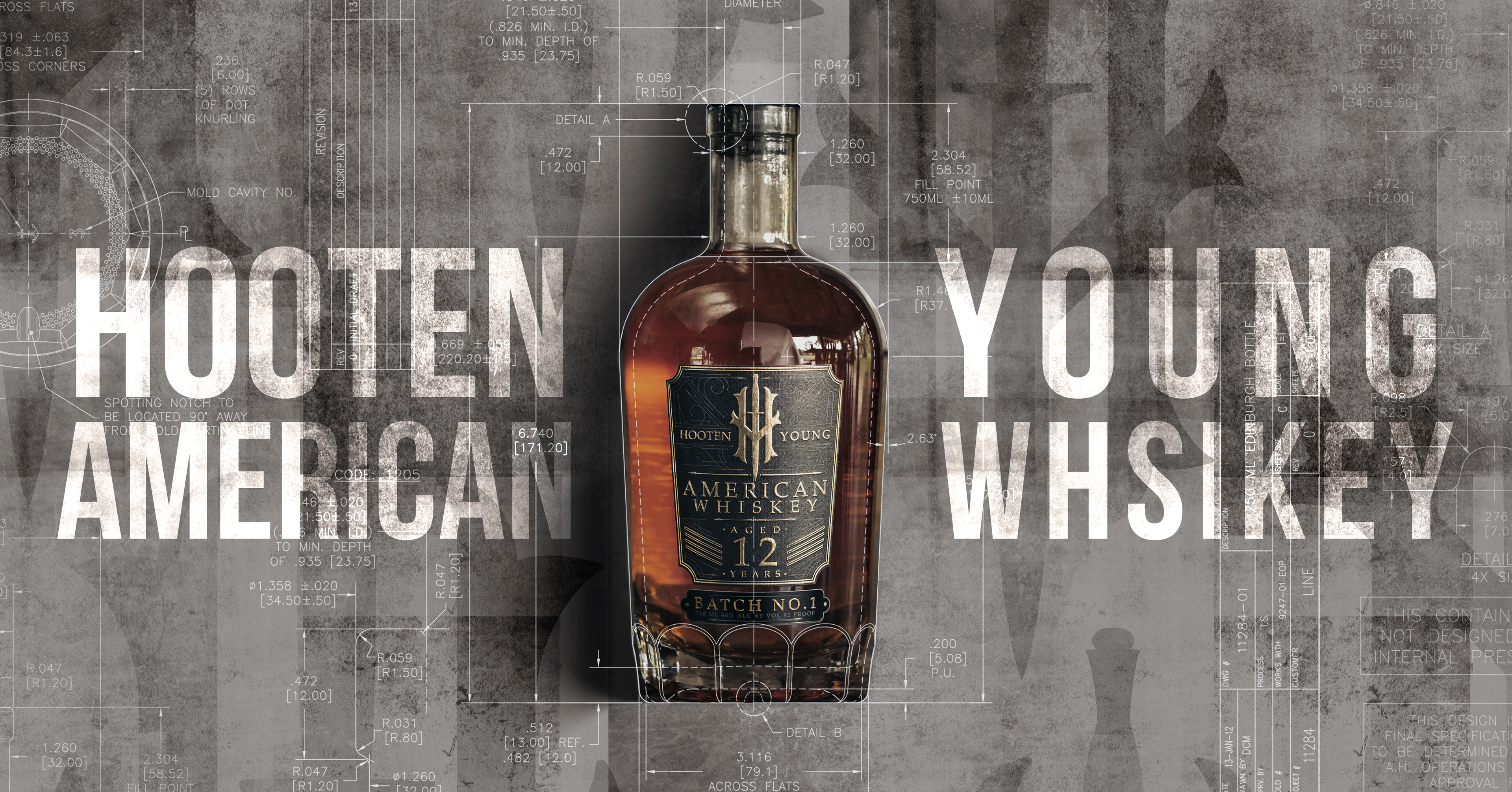
The Hooten Young whiskey had just been released, and I wanted to create a box that would perfectly pair with the design on the bottle labels by expanding on the custom line work motif.
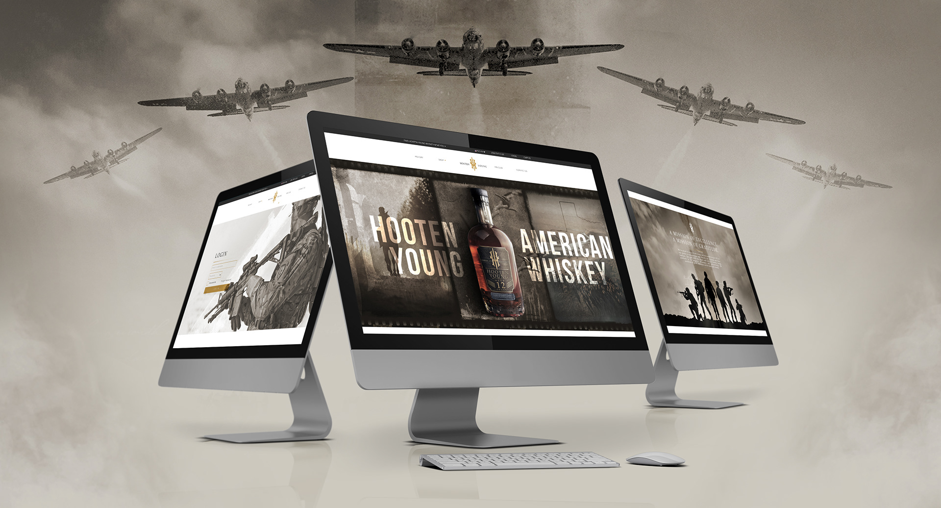
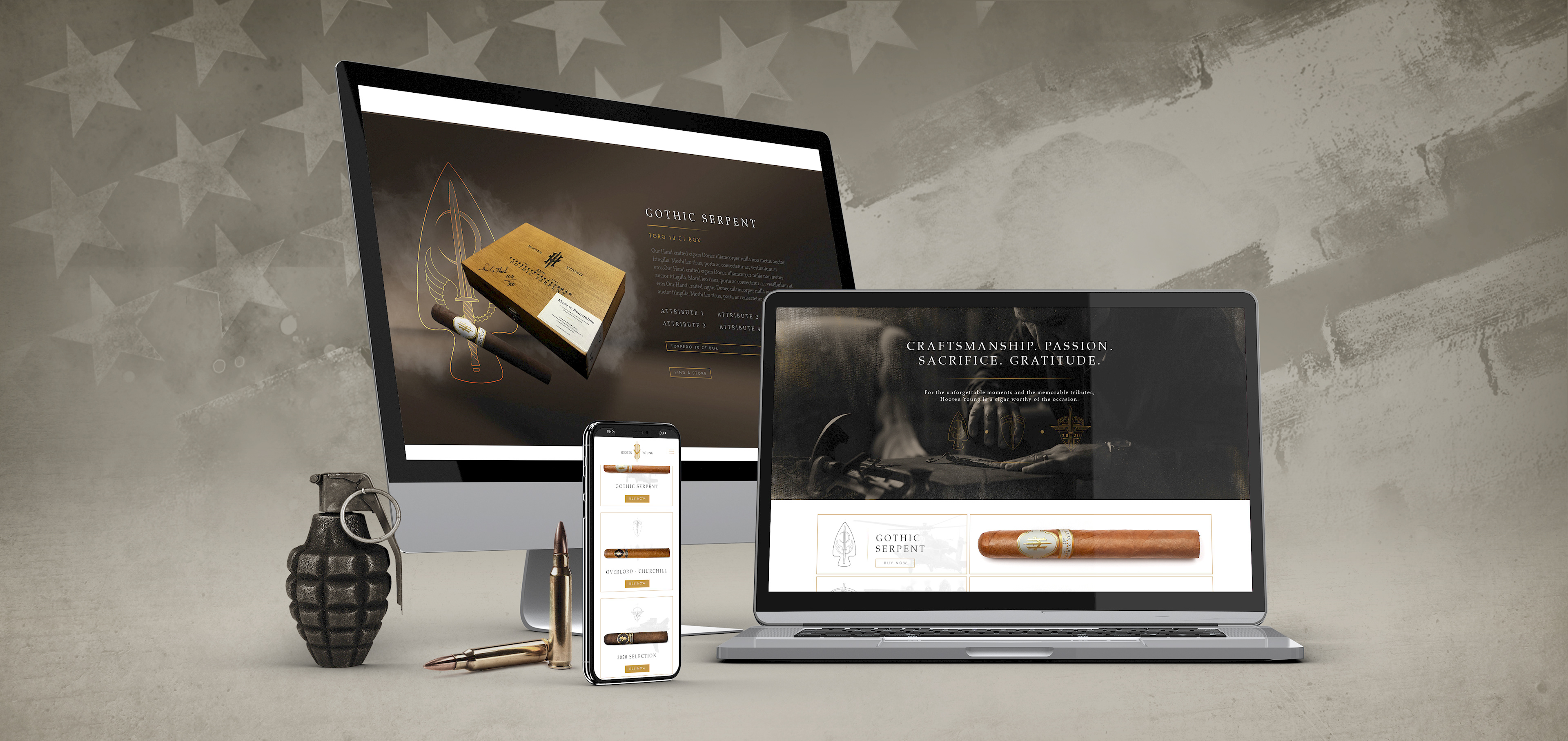
- h o o t e n y o u n g -
W E B S I T E
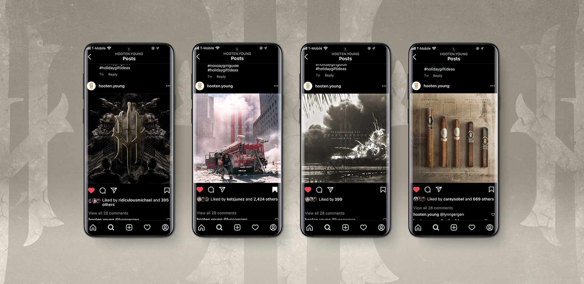
- h o o t e n y o u n g -
S O C I A L P O S T S
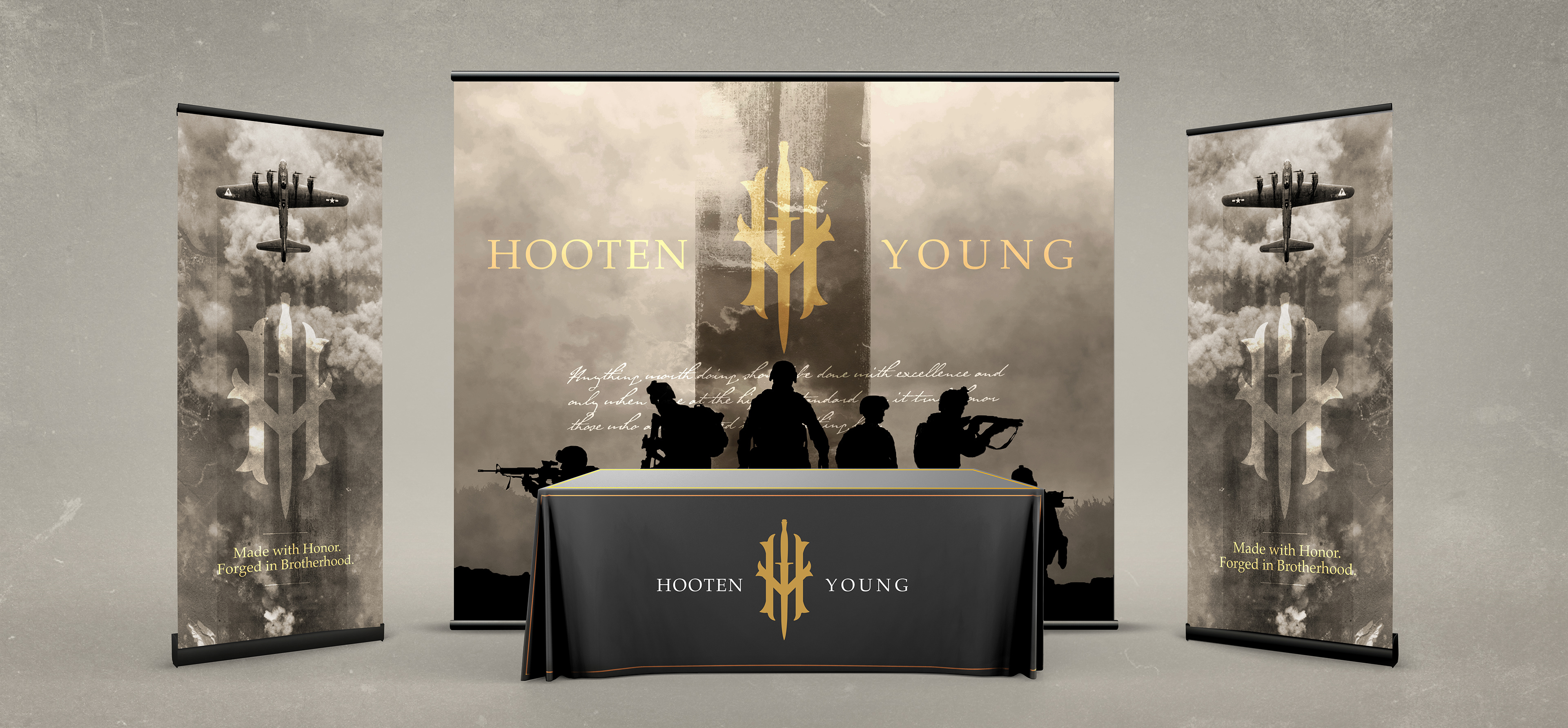
- h o o t e n y o u n g -
T R A D E S H O W S T A N D
- C L I C K T H E I M A G E B E L O W -
T O S E E H Y A M E R I C A N W H I S K E Y