- H O O T E N Y O U N G -
A M E R I C A N W H I S K E Y
|
Designing cigars was an incredibly awesome venture for me as a designer, so when Hooten Young introduced a 12-year aged whiskey, I couldn’t have been happier to make it look as smooth as it tasted.
L O G O D E S I G N // I L L U S T R A T I O N // P A C K A G E D E S I G N // M O T I O N G R A P H I C S //
A R T D I R E C T O R O F P H O T O G R A P H Y // P H O T O G R A P H Y B Y : J E A N N I E A L B E R S
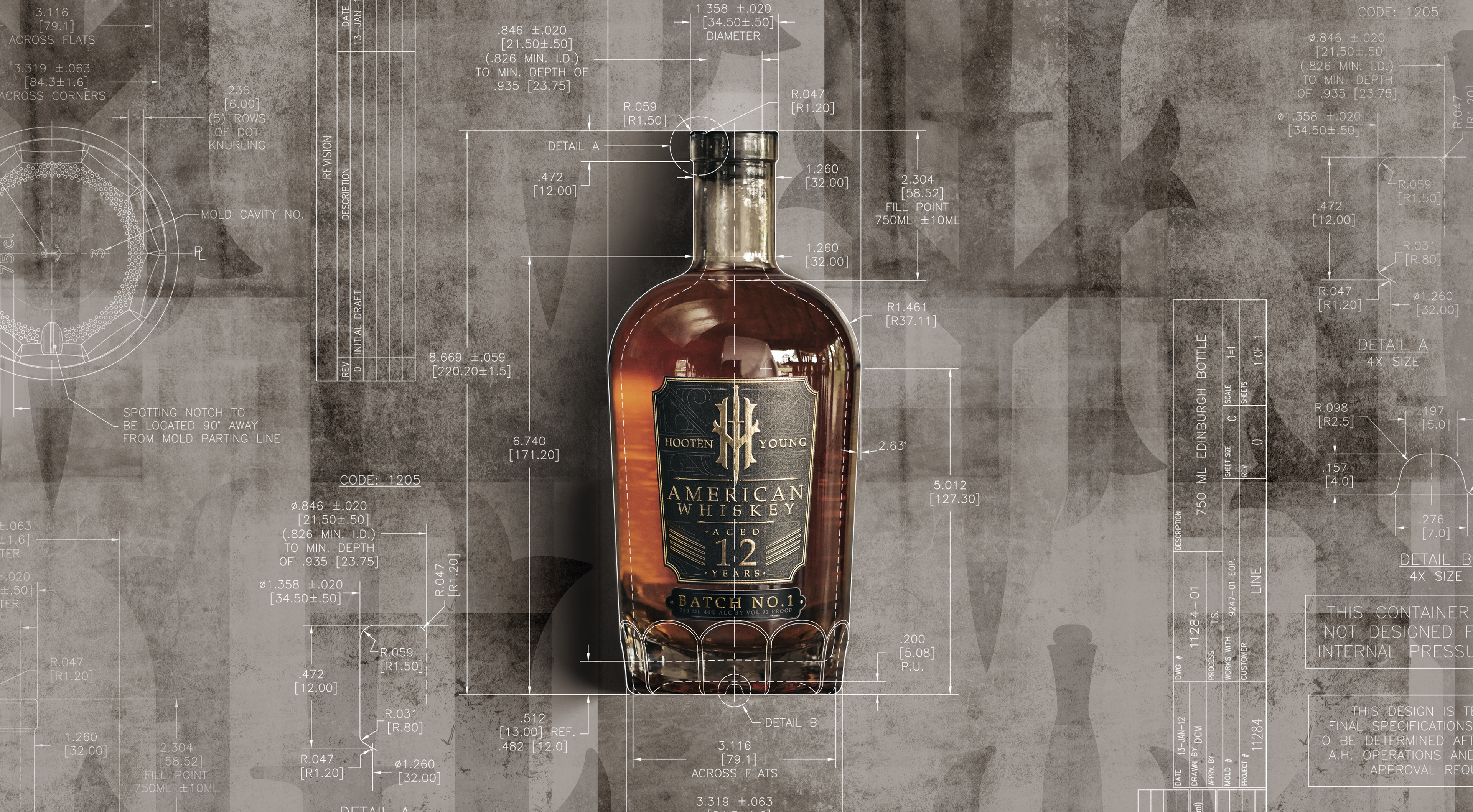
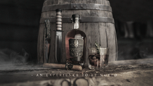
B O T T L E D E S I G N -
C O N C E P T E X P L O R A T I O N
|
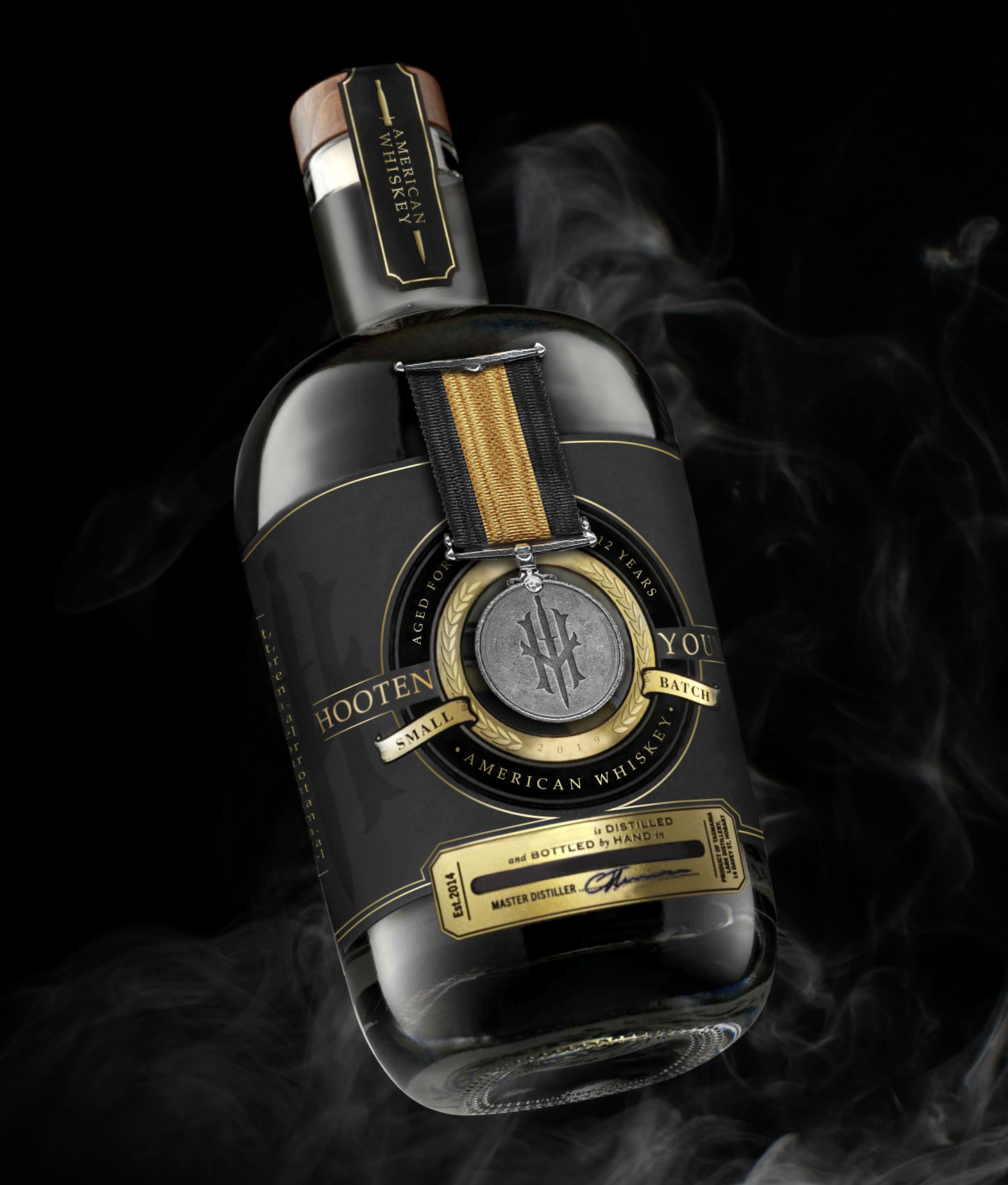
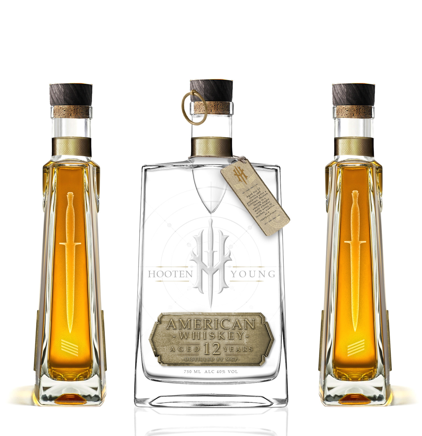
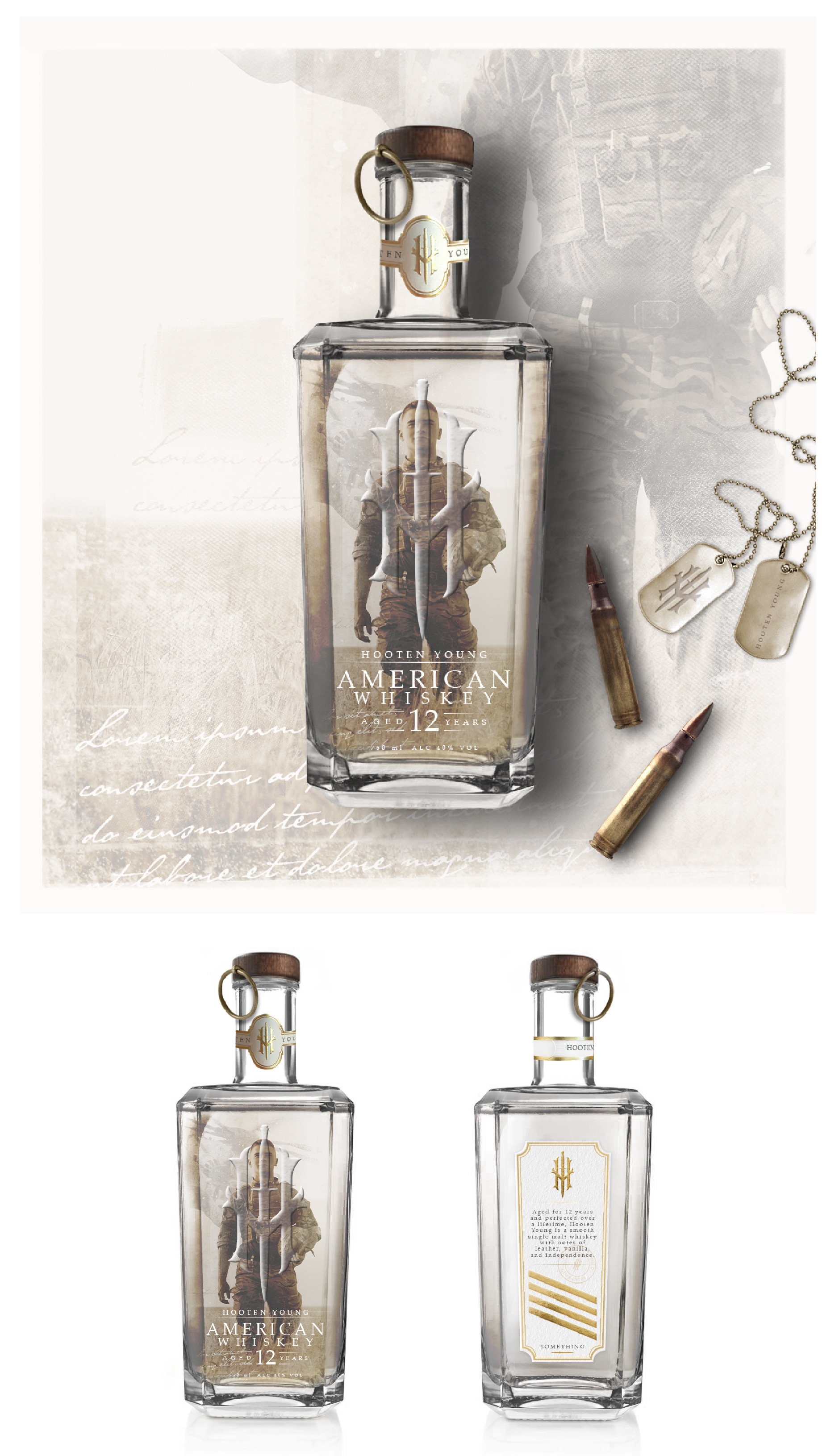
Right out of the gate, my designs were slightly tenacious in face of the bottle’s budget. My goal was to create exactly what I had imagined in my mind for the brand’s aesthetic considering their patriotic and militant character. Early drafts included multiple printing and etching treatments that not one bottler in consideration was able to produce. Among those early drafts was the concept to have a real Hooten Young branded medal on the front that could be detached as a collectible.

- B O T T L E D E S I G N -
T H E L A B E L & B O T T T L E
|
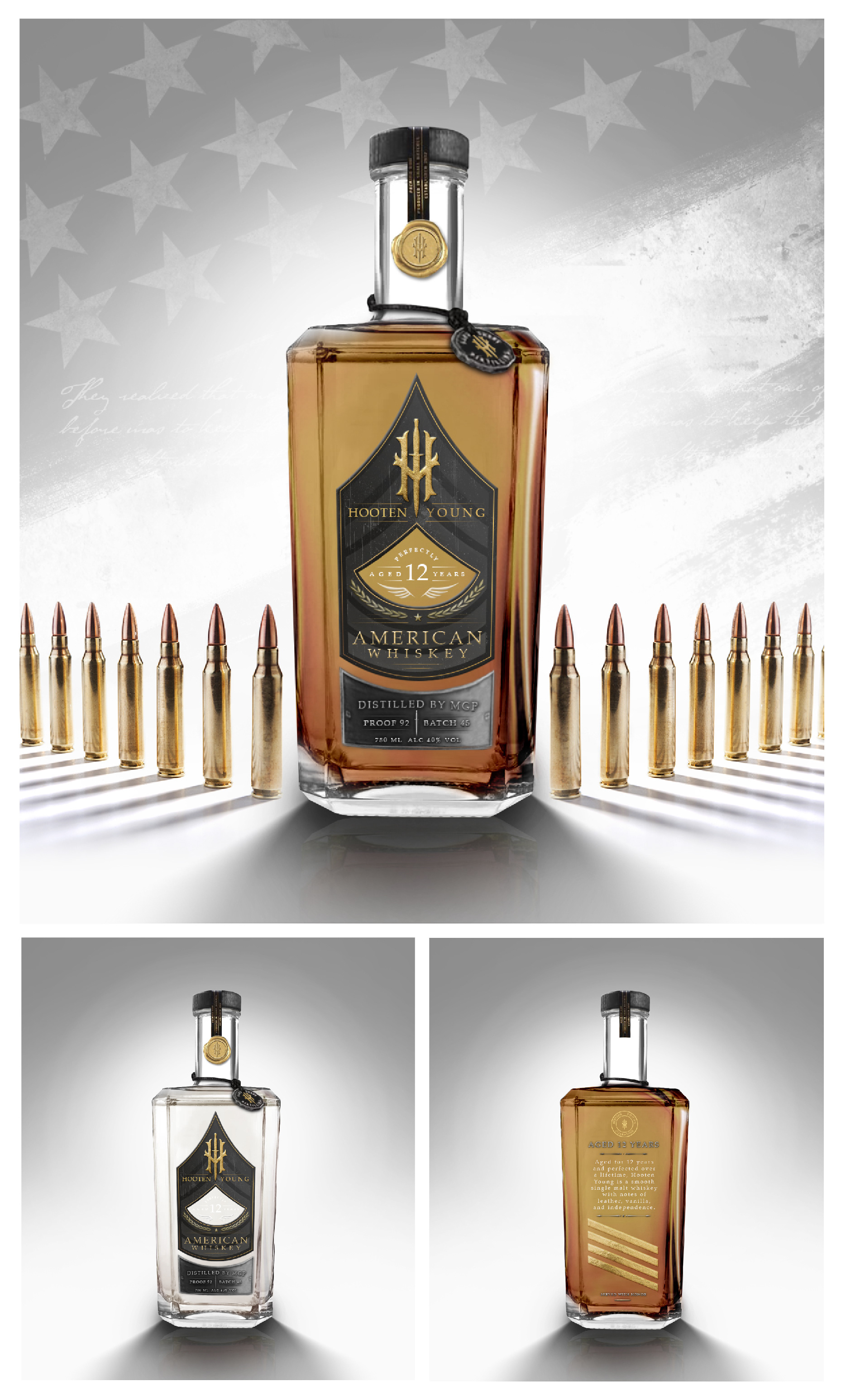
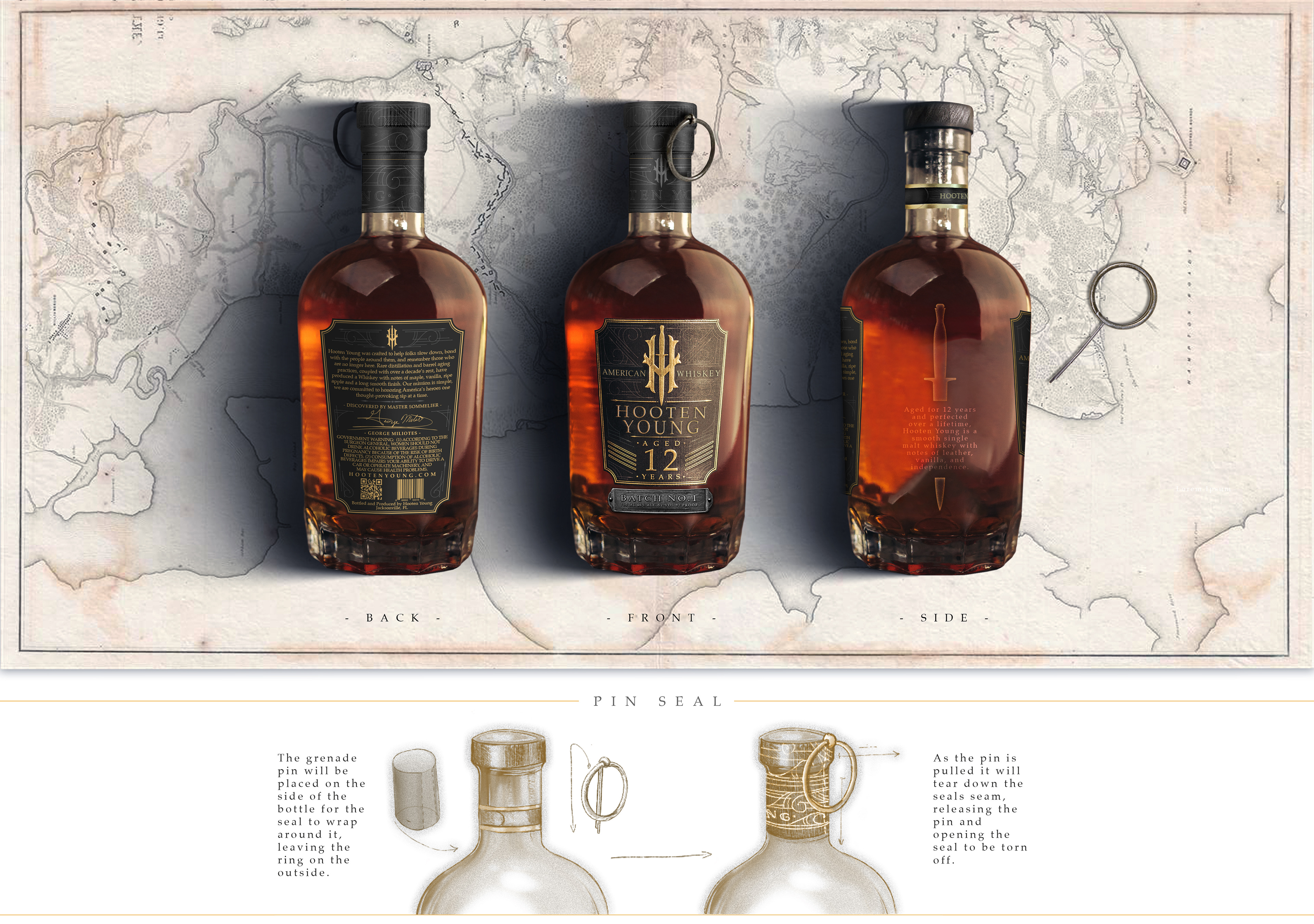
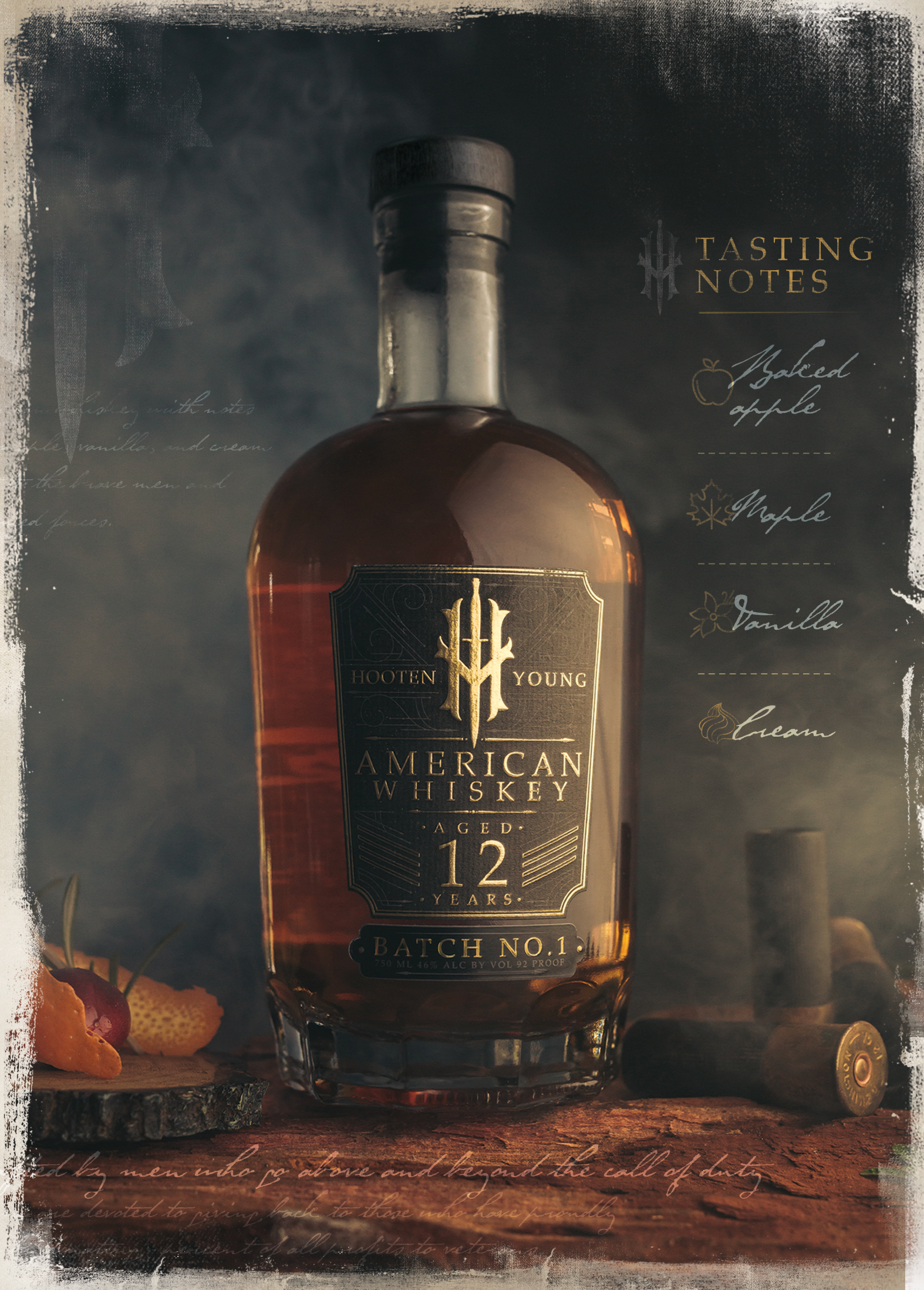
After creating a custom line pattern for the branding, I looked into military symbols and meanings and learned that a soldier receives a service stripe on their sleeve for every three years served. I wanted to honor this gesture by branding the whiskey with four service stripes, symbolizing the 12 years it spent aging in the barrel.

- H O O T E N Y O U N G -
B O T T L E D E S I G N
|
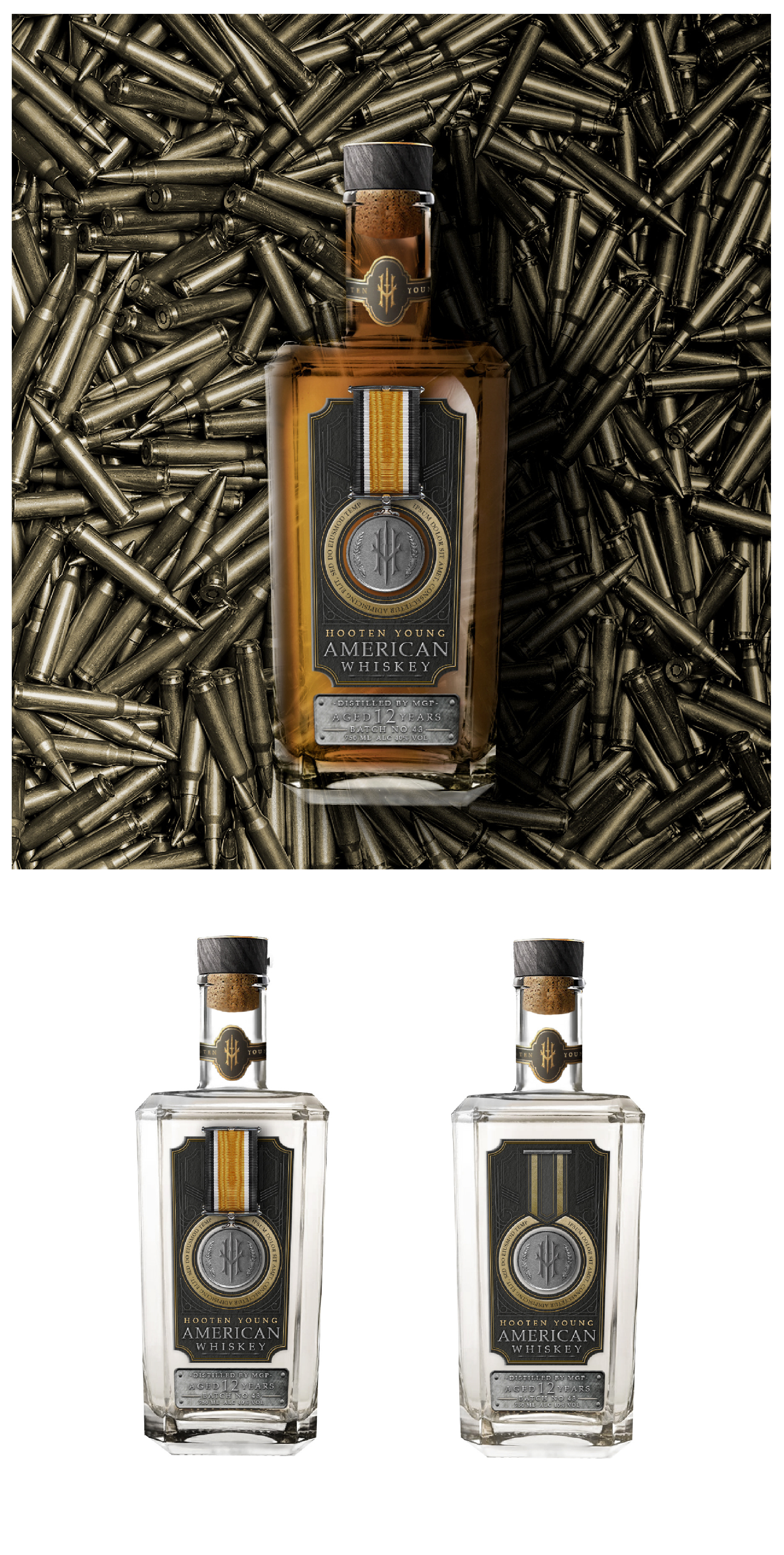
Choosing the bottle itself was actually quite simple. Its dimpled base reminded me of a grenade shell, which led to other design concepts and choices. When considering the seal and how awkward they usually are to peel off, I wanted a novelty that would take the wrapper off quickly and in a unique manner. By putting a repurposed grenade pin inside the seam, bartenders and consumers would be able to quickly rip off the seal in a memorable fashion.
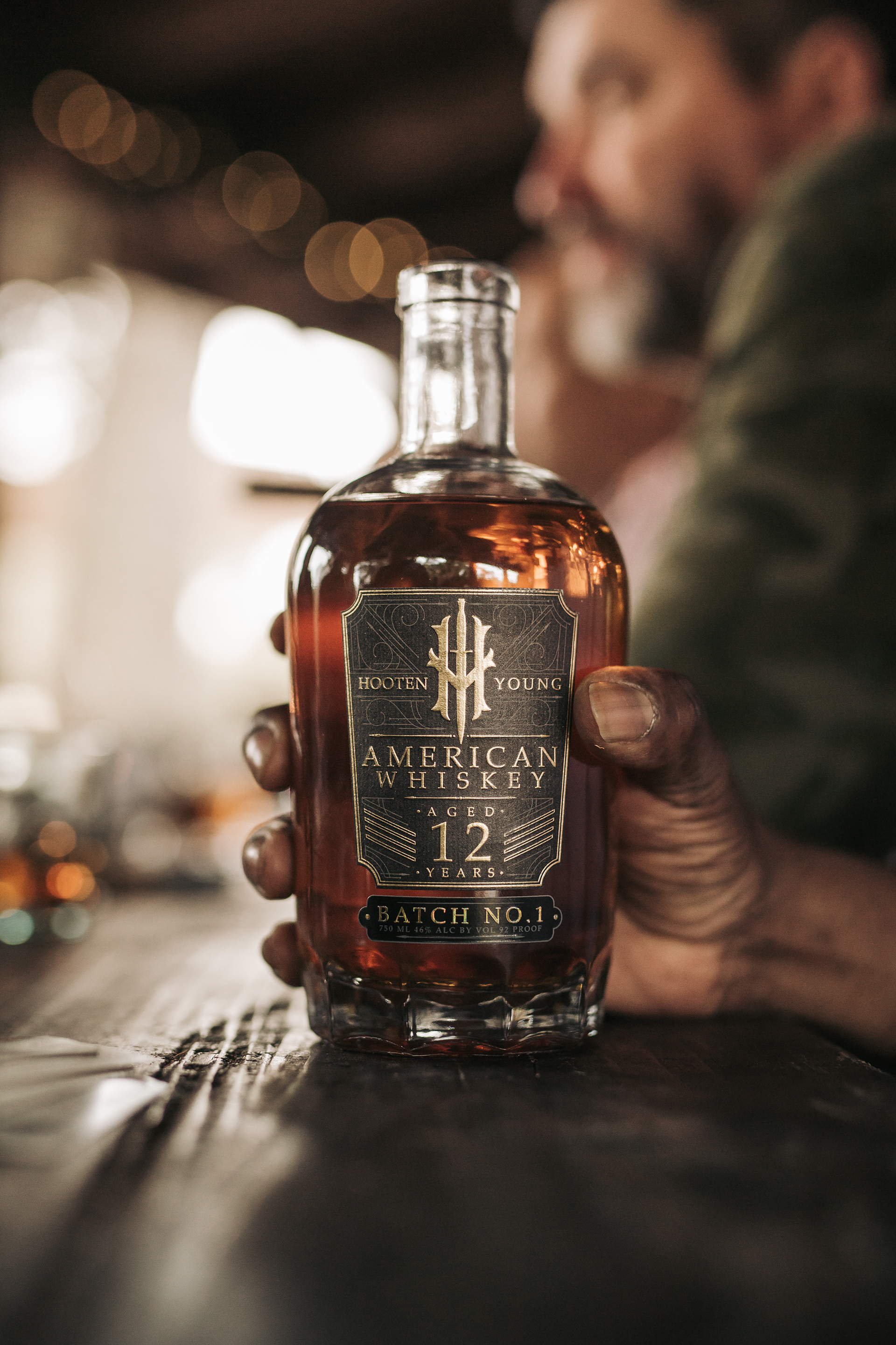
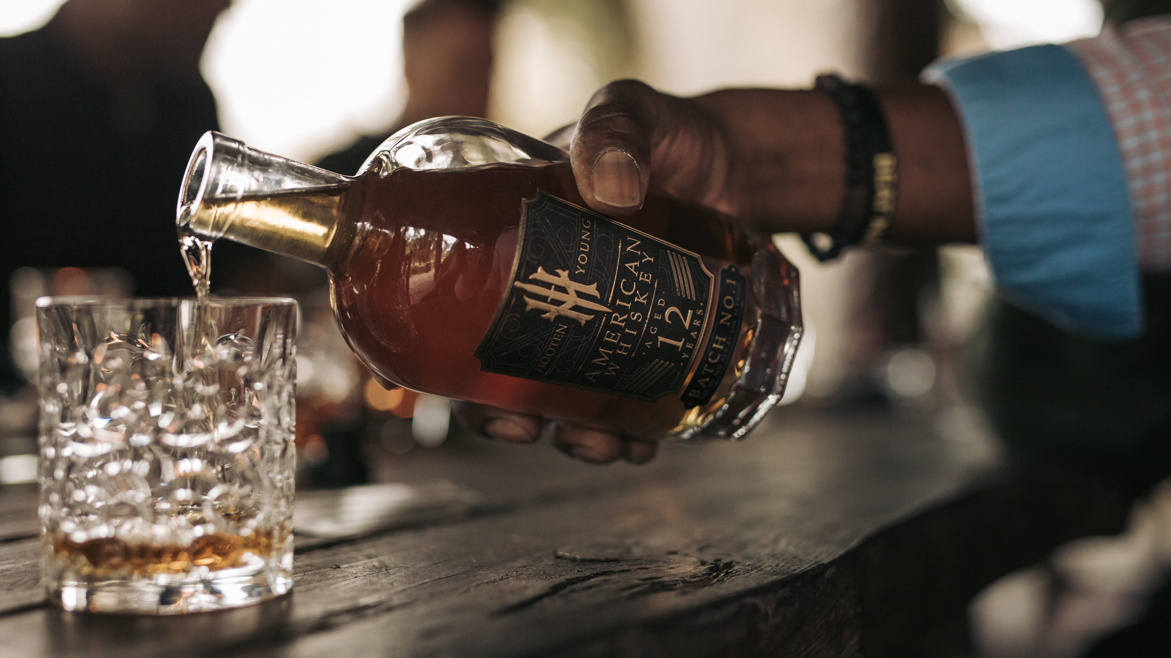
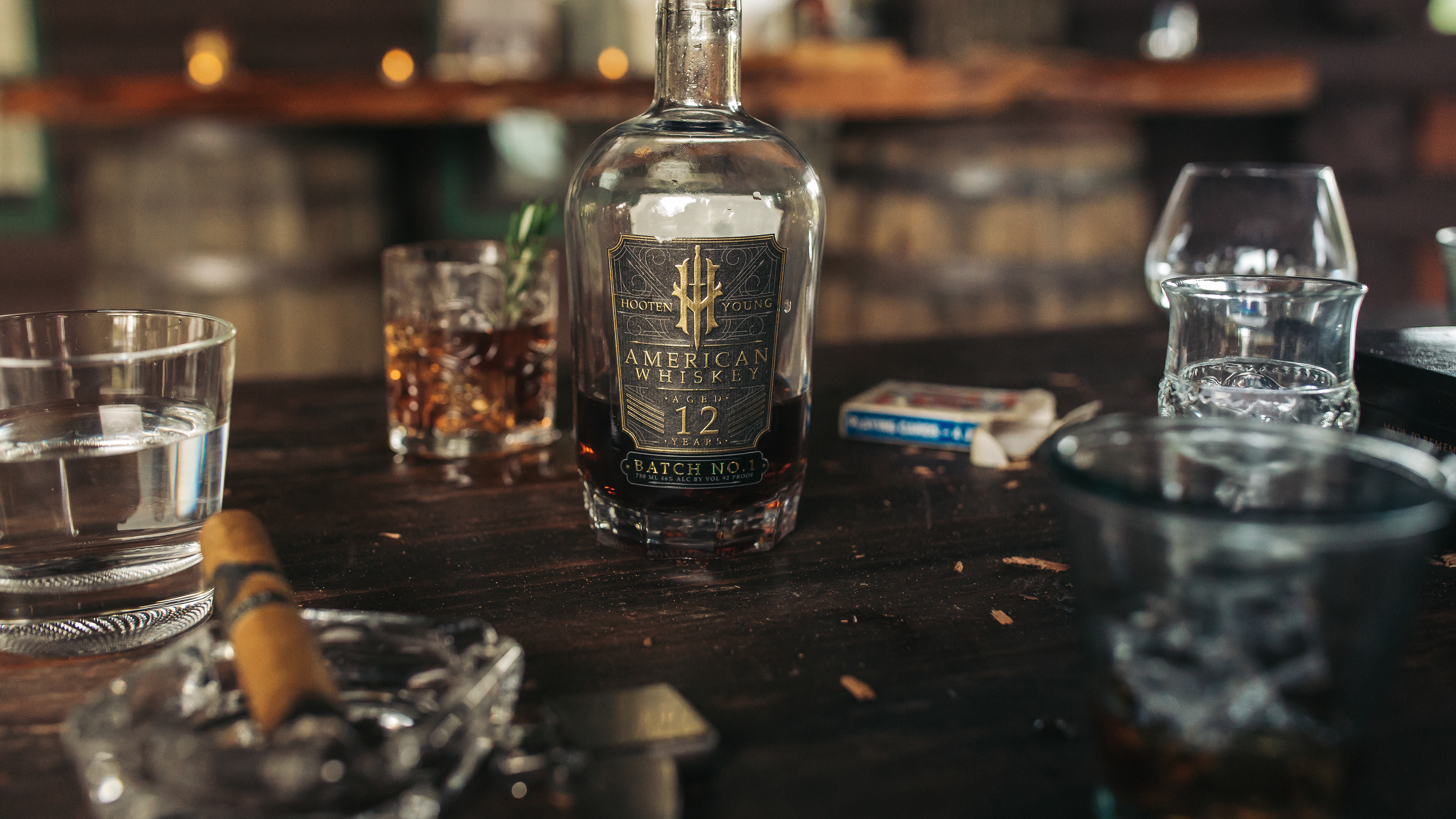
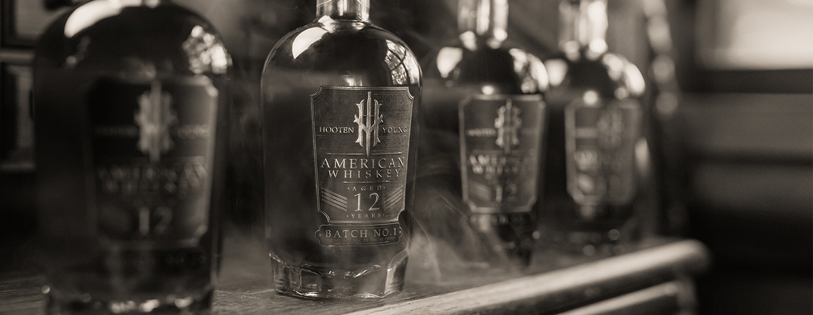
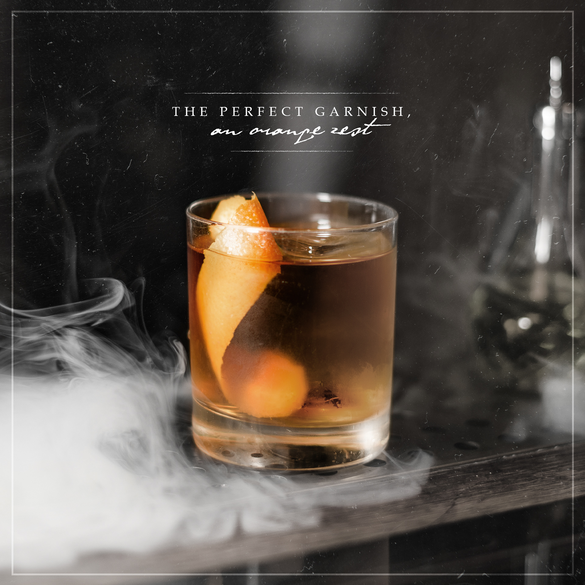
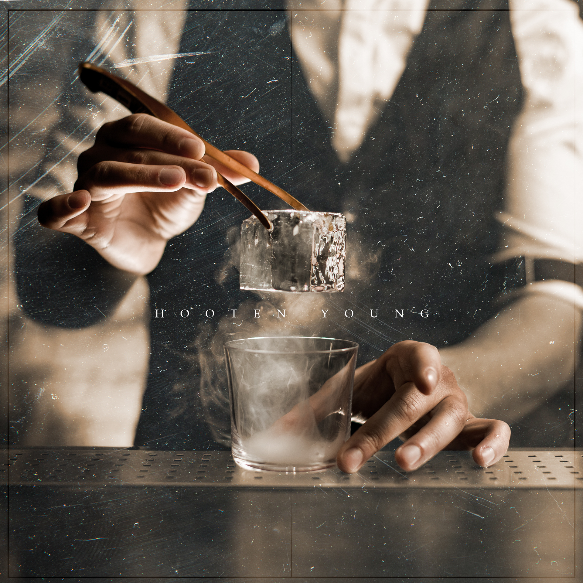
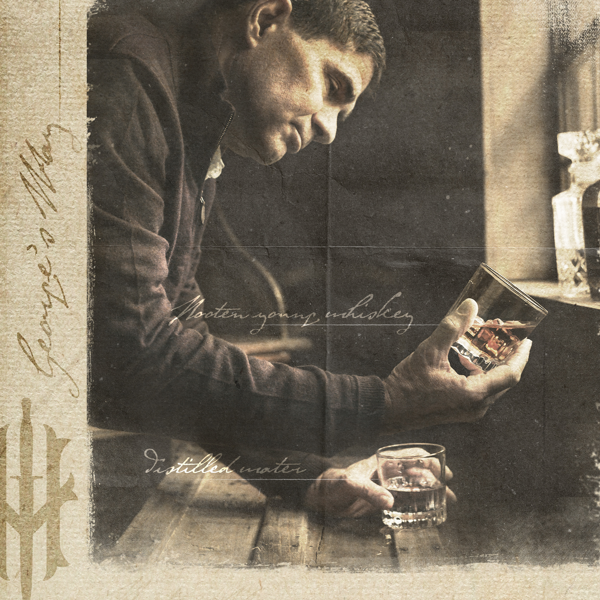
- A M E R I C A N W H I S K E Y -
L I F E S T Y L E P H O T O S H O O T


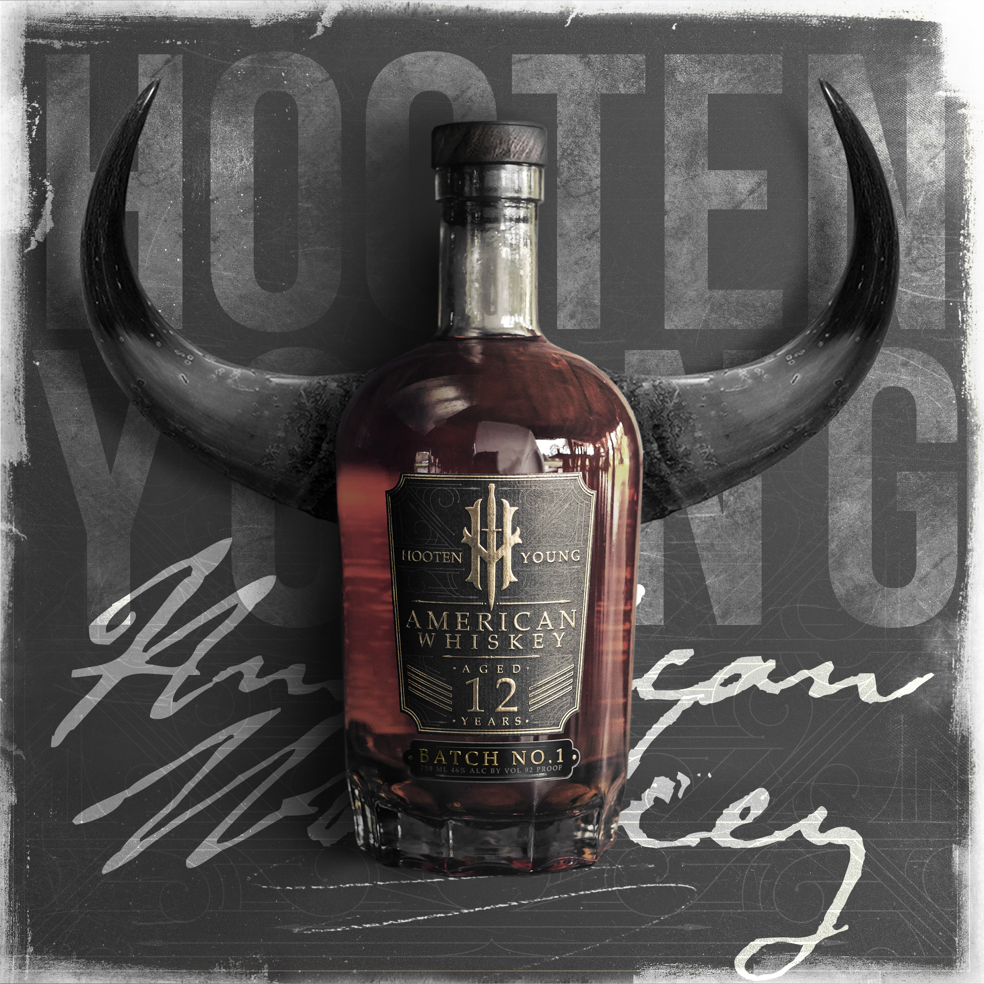
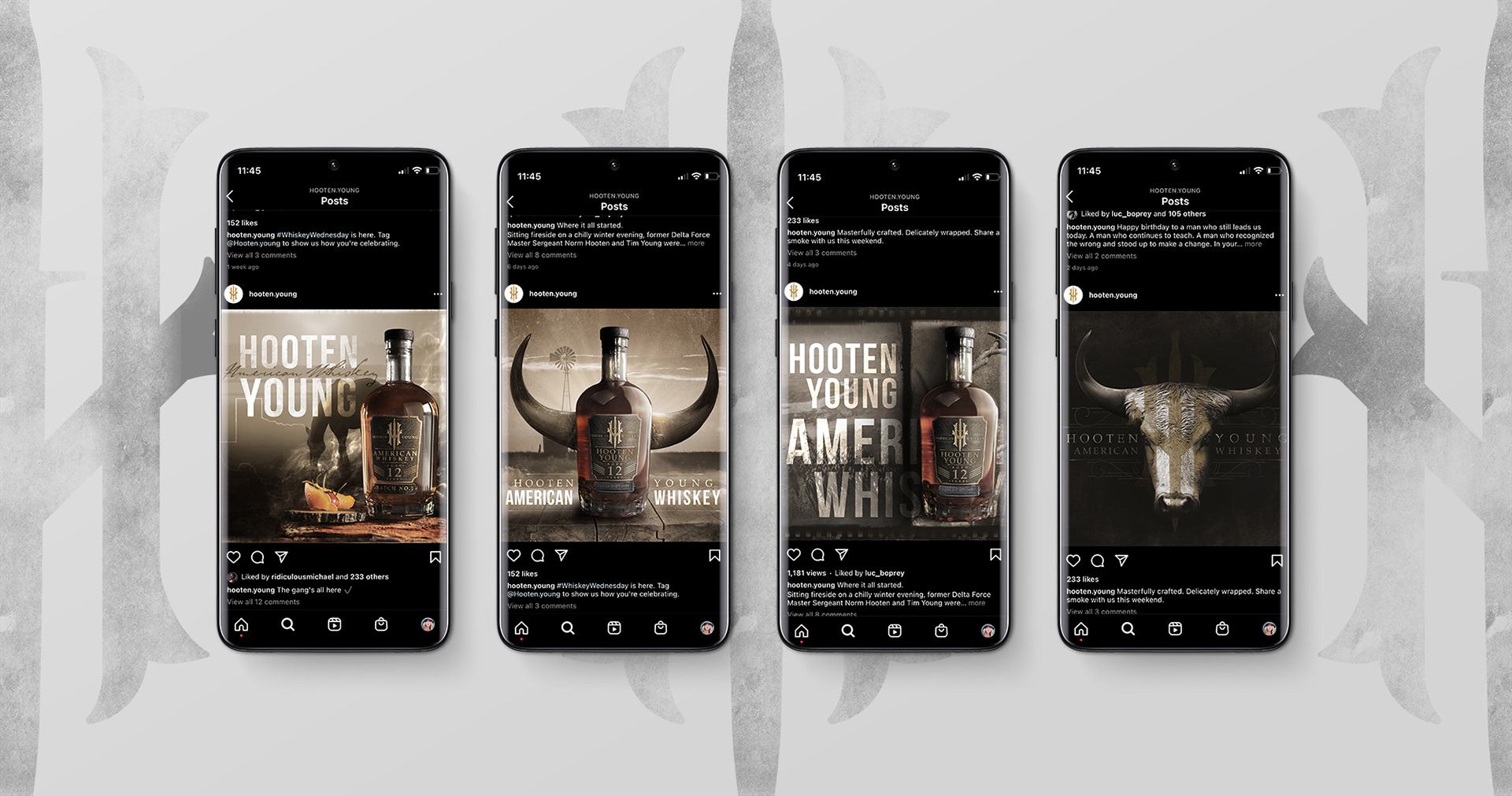
- H O O T E N Y O U N G -
W H I S K E Y S O C I A L P O S T S
- H O O T E N Y O U N G -
t e x a s l a u n c h P O S T S
- H O O T E N Y O U N G -
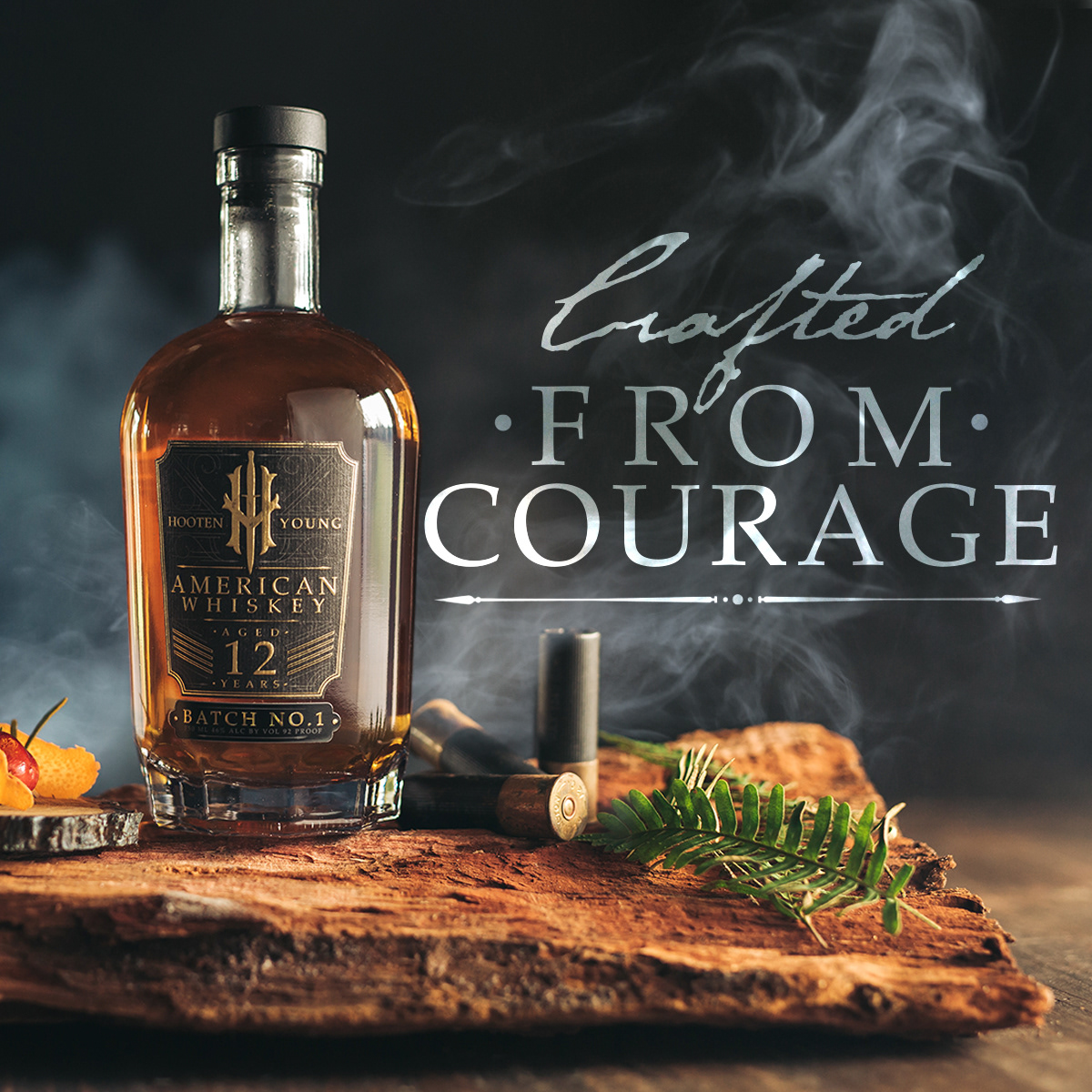
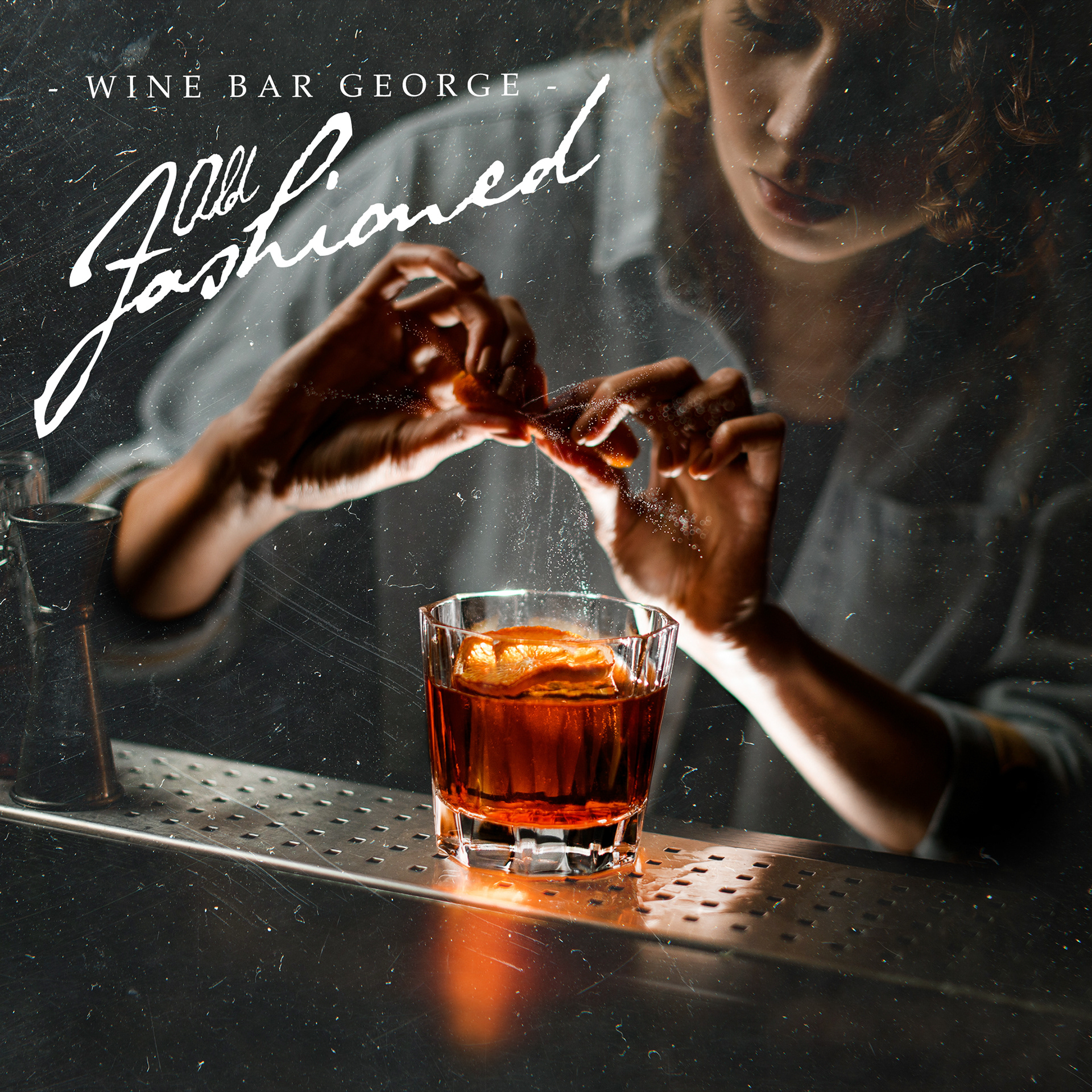
P A I D S O C I A L A D S
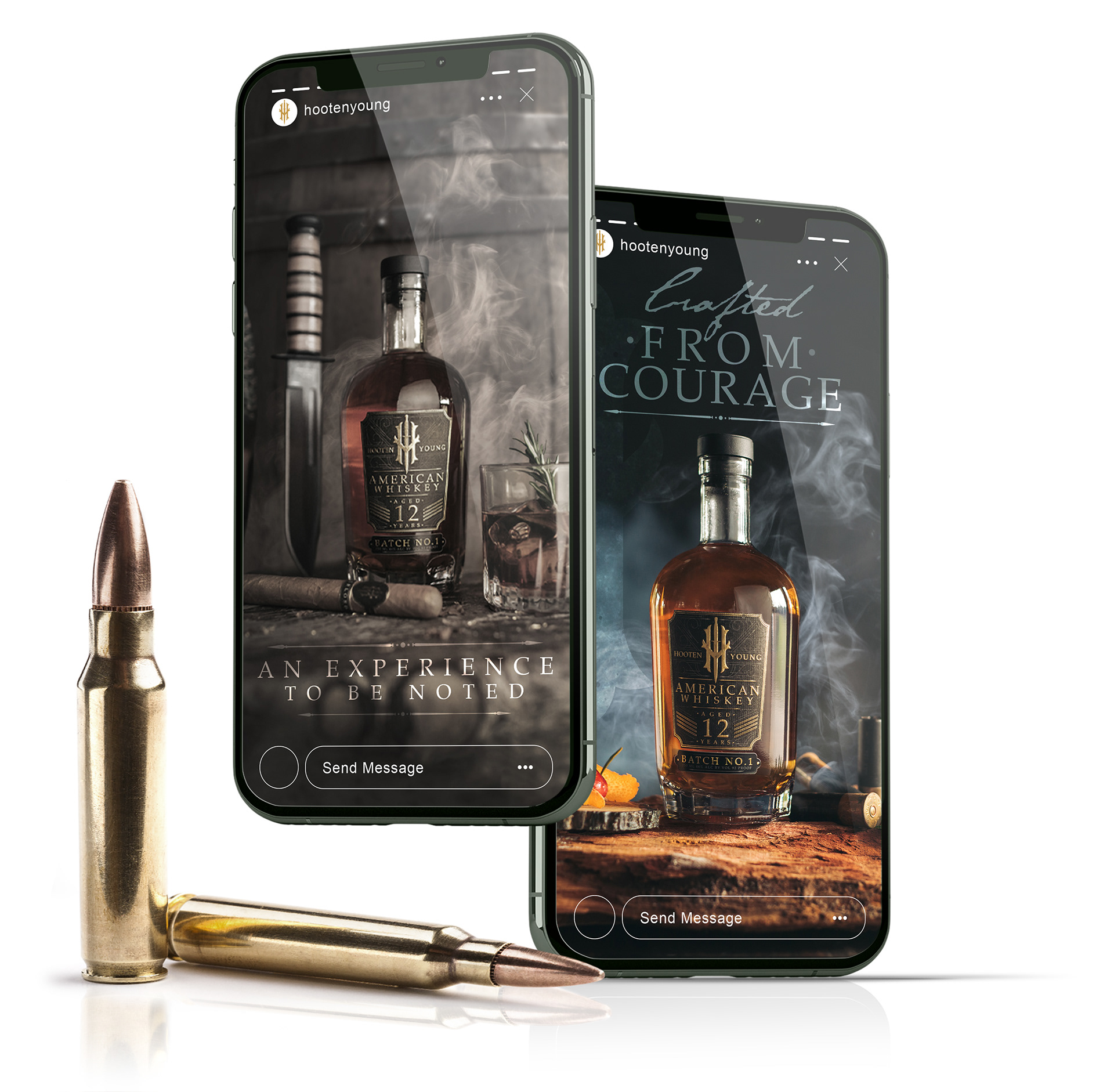
P A I D A D S -
A D S I N M O T I O N
|
I wanted to turn several of the paid ads into a series of cinemagraphs to reveal the grit and smokey textures that the brand has.
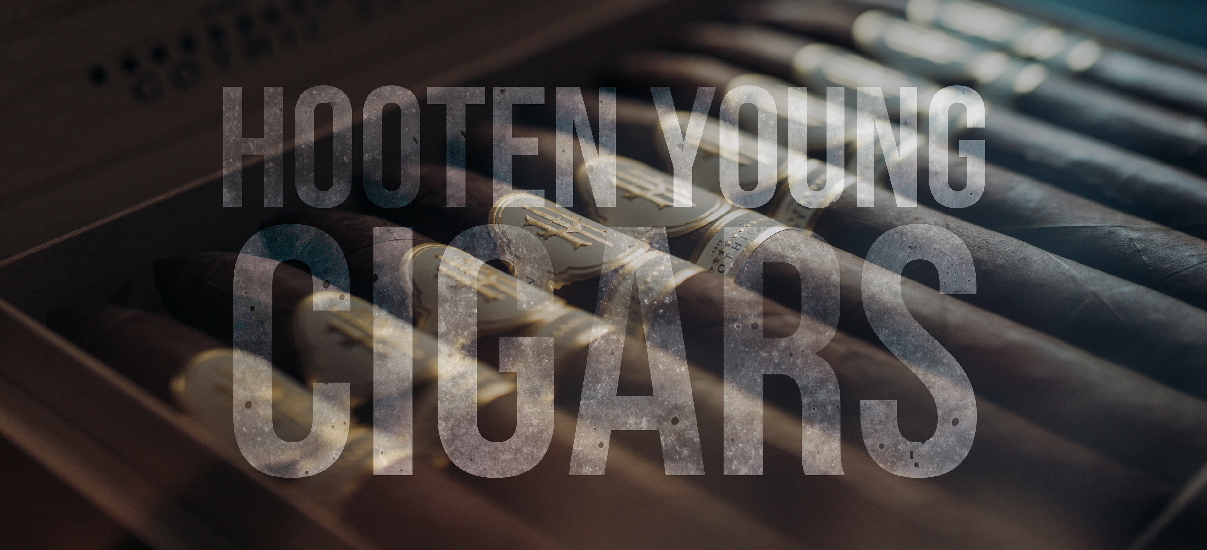
- C L I C K T H E I M A G E B E L O W -
T O S E E H Y C I G A R S